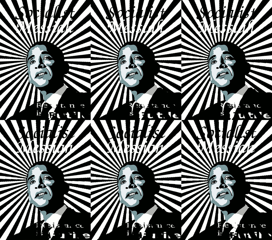
I am a graphic designer and artist who spent a few college credits studying the history of graphic and fine arts. It's more than just the portrait that is indicative of Soviet-styled propaganda. The typographic treatments, the colors, subject matter and the bold, contrasty style of the "Hope" poster are all pulled right out of the early 1930's-era Cubist/Constructivist/Socialist graphic arts. Those posters depicting the Laborers, especially those with the main figure holding a flag or hammer, I have seen over and over again among the Obama propagandists. Just look at the masthead of the Daily Kos - that's Commie graphic work straight out of 1931. It looks like something that mural artist and Mexican Revolutionary Diego Rivera would have done. Here are some comparisons I found between Obama propaganda and vintage Soviet posters. I didn't include the vast array of "Bauhaus" inspired posters (very graphic block type set at an angle) that are also used by Obama artists... that style was utilized overall throughout Europe and is more indicative of the time period rather than Socialism/Communism.
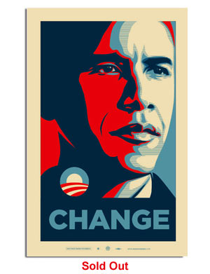
1) "Noble Leader" portrait treatment:

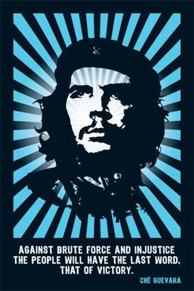
2) Radiant savior/ Messiah treatment:



2, v.2) Glowing, floating head/ coin profile treatment:

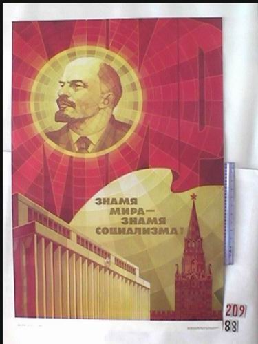 ("The symbol of peace- symbol of socialism.")
3) Radiating symbol/ "O" / Soviet seal:


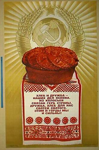 (This one supposedly says: "Bread and Friendship are our basis." But note the radiant treatment of the communist seal behind it.)
4) Environmental Theme:

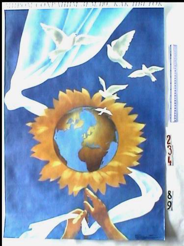 ("We will care for the Earth like a flower to promote Peace.")
Look at 'em quick before they change all the links again!
