Posted on 01/09/2009 5:45:39 PM PST by Yo-Yo
2008 ranked 15th coldest of the thirty years of records for the University of Alabama MSU based lower tropospheric temperatures (right in the middle of the pack). It was the coldest year since 2000. It continues the downtrend of the last 7 years. This compares with the Hadley Center data which (together with the equally alarmist WMO) claims 2008 will rank 10th warmest since 1850. (159 years!). How can an “average year” in one data base appear be a “top 6%” warmest year in another?
Well the global data bases of NOAA GHCN, NASA GISS and Hadley CRUT3v are all contaminated by urbanization, major station dropout, missing data, bad siting, instruments with known warm biases being introduced without adjustment and black box and man made adjustments designed to maximize warming (Steve McIntyre found more urban areas had their temperatures adjusted up then down). Also ocean temperatures are an issue with a change in the methods of measurement and incomplete coverage. Hadley uses their own merchant ship data and that covers some heavily travelled routes but has no coverage of the vast southern oceans (the oceans cover 70% of the world’s surface).
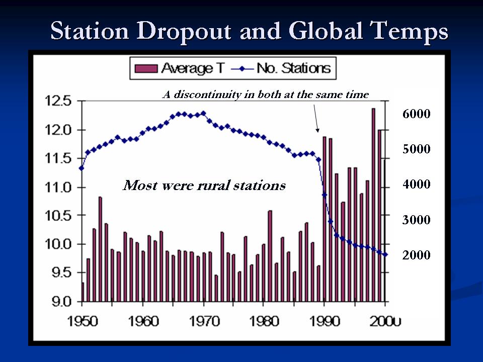
The biggest issue is station dropout. 2/3rds of the world’s stations, many rural areas in the FSU stopped reporting around 1990. Climatologist David Legates at the University of Delaware are prepared this animation. See the lights go out in 1990. The below plot of the NOAA/NASA station count (blue line) and average annual temperatures (brown columns). It clearly shows the big dropoff of rural stations. The animation above shows that Siberia is one area with the biggest change.
Average temperatures for the station categories jumped when the stations dropped out, suggesting that it was mainly the colder stations that were no longer in the record. The global data bases all set up grid boxes globally and populate the temperatures for the box using data from within that box or now with many empty boxes using the closest stations weighted by distance in nearby boxes. Thus a box which had rural stations, will find temperatures now determined by urban areas in that box or distant boxes. This is why the global data bases suggest the greatest warming has been in Siberia.
Also a factor is that in the FSU era, the cities and towns temperatures determined allocations of funds and fuel, so it is believed that the cold was exaggerated in the past introducing an artificial warming. See the details of these numerous data integrity issues here.
The Hadley monthly and UAH MSU monthly lower tropospheric temperatures are shown. Both show cooling (0.2C (0.3F)) for MSU and (0.15C (0.25F)) for Hadley. Note the significant NEGATIVE correlation of temperatures with CO2.
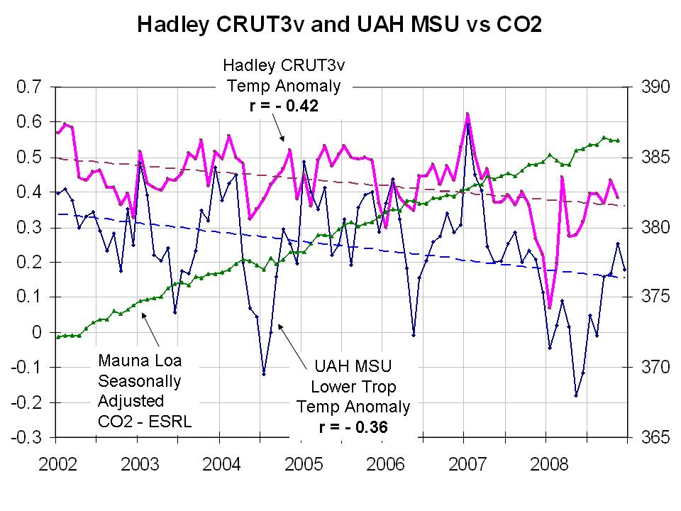
Anomaly differences come from the base period to compare to and compute anomalies. The Hadley used 1960 to 1990 and the satellite centers 1979-1998. Satellite microwave sensing is not subject to any of these problems and provides full global coverage. It integrates local warming due to urbanization. It is as a result is the most reliable and trustworthy. Unfortunately the data extends only back to 1979. Nonetheless, you can use the above to conclude this past year was not the 10th warmest year as the alarmists are claiming. Read more here.
GloBULL Warming is crumbling before our eyes.


 Climate Research News
Click on POGW graphic for full GW rundown
Ping me if you find one I've missed.
BOOKMARKED.
Thanks for the info.
BTTTFL
Pleased vote for “Watts up with that”
Best anti AGW site in this years Poll.
http://2008.weblogawards.org/polls/best-science-blog/
Please vote often.
Disclaimer: Opinions posted on Free Republic are those of the individual posters and do not necessarily represent the opinion of Free Republic or its management. All materials posted herein are protected by copyright law and the exemption for fair use of copyrighted works.

