Now this is art. (Mostly. The Rothko stuff is useless.)
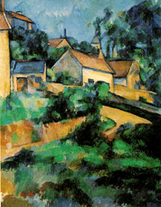
I prefer the Cezane to the first Poussin. Due to the more realistic colors its easier to get 'into' the Cezane. I can picture myself walking the trail there to the buildings in the background while the Poussin doesn't draw me in as well.
I like the Davids also. These work over the sofa so to speak. I guess being a fan of the imagery of those eras helps. The broken blocks in the wall in The Death of Socrates make the whole scene real. Minor details are important. I guess that's why I tend more to the realist types of paintings and shun the abstracts and some impressionists
Again in Ingres Grand Odalisque and Delacroix’s Odalisque I greatly prefer the first over the second. Even with the extended version of the lower back Ingres image is of a woman. Delacroix is merely some smears of color on canvas. One thing I will give D credit for though is the smear of color in the right background. Gives the impression of several people back there looking in.
Rubens. Ugly fat chicks. Enough said.
Delacroix's The Death of Sardanapolous The nude in the first is the only redeeming feature I see in this one. But then I tend to like ladies posteriers and this one is shapely and well rendered. The rest of the image is too dark and cluttered for my taste. The nude doesn't really seem to add anything to the picture as the image is overwhelmingly full as it is. It's like "Where's Waldo" in paint.
Liberty Leading the People. Why are her breasts hanging out? doesn't add anything to the image at all. Just serves as a distraction. I think it would have worked far better if she were draped somewhat Romanish (Greekish?). As it is her image is incongruous with the whole and thus detracts from the story. What would be a good battle type painting now leads to the sole question "why is that lady half naked?" It's not even battle damage to her clothes. It's more like she's playing the slut in the middle of a battle. Just doesn't fit.
Raft of the Medusa. Again far too cluttered for my taste. The story behind the painting is cool but how could you tell that from looking at the picture. The father doesn't look like he's mourning. looks more like Rodin's "the thinker" (?)
David’s Napoleon Crossing the Alps vs. Gerricault’s Mounted Officer. David wins hands down. I don't do exageration very well.
Goya. Looks far too cartoonish for my taste. The colors are just strange to me. The central 'victim' is wearing a spotless white shirt and spotless trousers yet he's presumably been imprisoned.
Friedrich. these I like. The first has an almost photographic realism of an obviously not real subject. Like the Cezane earlier it draws me in. Whose being buried there. What's behind the ruined cathedral? I can see myself exploring the area.
Constable. I also like these. While thefirst is somewhat blurred it's light enough to still look real (or at least close enough). I've always liked landscapes though so I'm biased here.
Turner I don't care for. Too blurry (or perhaps too close to monotone?) I can't relate to something that's not there.
Rothko. My five year old daughter colors better than this.
Kind of long I know but it's been a while since I've played. All in all a much better period and style for me.
Good to hear from you again. It has been a while. Actually, that isn't a Cezanne as the fourth down in the original post. I probably didn't make that clear that that was Poussin's
St. John on Patmos Island. But now I'm putting a Cezanne of Mt. Ste. Victoire next to the Poussin; maybe you can see how the balance is similar, even if Cezanne has brighter colors and is more abstract. (Yeah, now I don't think you'll like Cezanne much; am I right?!)


In Delacroix's Odalisque, the image in the back may be the man leaving after doing his "duty;" a kind of wham-baam-thank-you-ma'am, if you will.

In Liberty, the half nude torso is because she is a symbol of Liberty. She is not really there in the battle (well, the whole thing is a bit contrived and symbolic, the telling way that the dead bodies are conveniently posed and all). She is holding the flag and urging those on to battle; symbolically, as I said. This is just a detail, but it focuses on what your interest was.
Thanks for joining the discussion.


