Skip to comments.
Savannah Guthrie Photographed Two Different Birth Certificates
Youtube ^
| June 20, 2012
| Chatter4
Posted on 06/20/2012 8:49:32 AM PDT by chatter4
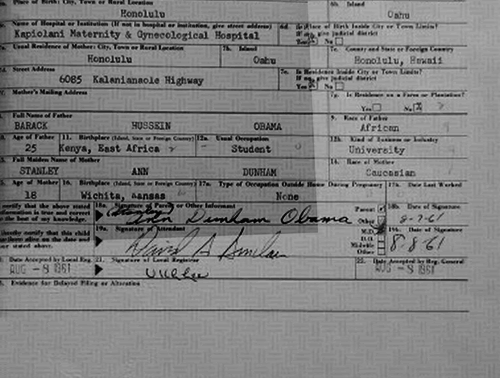
Savannah Guthrie posted two pictures she took of Obama's long form Birth Certificate, but, it can be clearly seen that she photographed two different documents.
TOPICS: Conspiracy; Government; Military/Veterans; Politics
KEYWORDS: birftards; birthcertificate; certifigate; congress; elections; naturalborncitizen; obama; teaparty
Navigation: use the links below to view more comments.
first 1-20, 21-30 next last
Great video. It can clearly be seen that the text of one certificate is different than that released by the Whitehouse. http://youtu.be/xgqlaco9OHY
1
posted on
06/20/2012 8:49:36 AM PDT
by
chatter4
To: chatter4
Whichever document Obama presents is the real document, I believe. Unless he presents BOTH, in which case I will believe that there are two of them. Bob
2
posted on
06/20/2012 8:57:17 AM PDT
by
alstewartfan
("You were trying to chisel a perfect truth When the instrument broke in your hand." Al Stewart)
To: chatter4
To: chatter4
It would be nice to have the actual images rather than videos of the images. One looked like a very low resolution copy and a lot of strange things can happen to the edges of characters and solid blocks if you change the resolution between high and low res a couple of times. If the stretching of that "S" in Hussein was multiple pixels in the low res image then I consider it far more important than if it was only a single pixel.
4
posted on
06/20/2012 9:03:13 AM PDT
by
KarlInOhio
(You only have three billion heartbeats in a lifetime.How many does the government claim as its own?)
To: KarlInOhio
Things happen below the unaugmented optical range of the human eye ~ every single time. That’s why photoshop is so much fun.
5
posted on
06/20/2012 9:06:37 AM PDT
by
muawiyah
To: chatter4
Obama’s intellect is so massive it required two deliveries.
6
posted on
06/20/2012 9:11:43 AM PDT
by
Joe 6-pack
(Que me amat, amet et canem meum)
To: alstewartfan
Well Bob, to date, Obama has presented at least three different versions of his “original” long form Birth Certificate, and they are all different. He presented Xerox copies to those present at the press conference, one of which was scanned by the AP; one was presented to the public in Pdf form on the White house servers, and two were photographed by Savannah Guthrie. One of her photos, closely matches the text of the first two documents, and the 2nd photo shows that it is entirely different than the first two versions in a number of ways.
7
posted on
06/20/2012 9:32:30 AM PDT
by
chatter4
To: KarlInOhio
“It would be nice to have the actual images rather than videos of the images.” Links to those images were provided in the info below the video.
8
posted on
06/20/2012 9:36:03 AM PDT
by
chatter4
To: chatter4
Look at the ‘ty’ in University in box 12b.
Compare ABCs blue background scan to the ‘official’ pdf.
Note that ABCs version has much better detail on the curling tails.
The ‘ABC’ version is definitely different than the ‘official’ version.
9
posted on
06/20/2012 9:41:09 AM PDT
by
bluecat6
( "A non-denial denial. They doubt our heritage, but they don't say the story is not accurate.")
To: Joe 6-pack
The guys a complete ANTI AMERICAN FRAUD. He can’t produce anything except SMOKE SCREENS. DECEPTION is his only way forward. And the LAPDOG whimps infested in the MSM are still kissing his royal heinie. It doesn’t get any more pathetic than that.
10
posted on
06/20/2012 9:41:58 AM PDT
by
spawn44
(mu)
To: KarlInOhio
I messed with this a little. First, I got screen captures of the two different images.


Then, I overlaid one atop the other and did a video of the transition between the two. Pay attention to the first "a" in the words "East Africa" and the first "S" in "Hussein".

Why do several elements of the foreground appear to be moving independently of the background in that animation? Notice on the right, the numbers 9, 12b, and 14 appear to move to the left, independent of the background. Definitely weird. I agree that strange things can happen, but I've never seen whole letters move up and down a page like this, nor foreground elements ever move across a "safety paper" background. Notice also the dot below the "S" in the David A. Sinclair picture. The last name in the signature moves in relation to the dot, but the first name/MI stay put. WHY?
11
posted on
06/20/2012 9:48:07 AM PDT
by
FLAMING DEATH
(Are you better off than you were $4 trillion ago?)
To: chatter4
WRONG. I have overlapped these two images in Photoshop and they are without question, IDENTICAL. Any visual differences are optical illusions because when they are stacked on top of each other in layers they match up perfectly.
The birth certificate is still forged but these two photos are of the same document, without any doubt.
To: FLAMING DEATH
The shrinking capital E on East Africa is hilarious.
BTW, can someone do a close-up of the raised seal on Savannah’s photos and compare it with the seal on the letter of verification sent to the Mississippie Democrat Excecutive Committee?? The latter is what an official raised seal looks like. The seal on Savannah’s, I’m pretty sure, looks nothing like that. It’s as clear a sign as any that the the LFBC is a sham.
13
posted on
06/20/2012 10:05:43 AM PDT
by
edge919
To: FLAMING DEATH
Your animation is much more convincing than anything posted by chatter4. The fact that the numbering shifts so far to the left and the way the signatures realign is a bit strange.
14
posted on
06/20/2012 10:07:58 AM PDT
by
bolobaby
To: FLAMING DEATH
When you line two layers up in Photoshop, ONE LAYER MUST BE SCALED, SKEWED, OR DISTORTED TO MATCH THE OTHER IDENTICALLY due to differences in camera angles of the original photographs and here they are not lined up precisely. This accounts for the shifting in your animated gif.
To: FLAMING DEATH
I'm not worried about the safety paper background. It is not from the original BC but rather what the microfilm (or digital scan of the microfilm depending on how they store it now) is printed on. Tweak the printer and the letters can move around the background because of slight changes in the paper location, twist in the printer or zoom level when printed from two different printings of the same Hawaiian originals.
The most interesting parts are the shift of the 9, 12b and 14 relative to the vertical line next to it. I don't know if that shift is from sub-pixel scanning errors on the low resolution grayscale image or if it is real. I'm not willing to brush it off like I have a lot of other claims to proof of a forgery which were obvious image processing artifacts. Very interesting. Thanks.
16
posted on
06/20/2012 10:20:24 AM PDT
by
KarlInOhio
(You only have three billion heartbeats in a lifetime.How many does the government claim as its own?)
To: FLAMING DEATH
Here you go.. These are the two Savannah Guthrie photos, aligned and layered into an animated gif. The document is the same:
To: GeorgeWashingtonsGhost
Perhaps so, but the real problem I have is with the letters in HUSSEIN and EAST rising mysteriously.
Also, when the image distorts, all elements within the image, especially those in close proximity, should move the same direction.
The last name in the DAVID A SINCLAIR signature appears to move INDEPENDENTLY of the elements above it and below it, especially the black dot below the S in SINCLAIR. If it was due to “skewing” of the image, that element would move also. It does not.
18
posted on
06/20/2012 10:33:31 AM PDT
by
FLAMING DEATH
(Are you better off than you were $4 trillion ago?)
To: FLAMING DEATH
My last comment on this.. Since color is not an issue in this analysis, it helps to convert both images to grayscale prior to comparing.
To: chatter4
20
posted on
06/20/2012 10:37:14 AM PDT
by
skinkinthegrass
(WA DC E$tabli$hment; DNC/RNC/Unionists...Brazilian saying: "$@me Old $hit; different flie$". :^)
Navigation: use the links below to view more comments.
first 1-20, 21-30 next last
Disclaimer:
Opinions posted on Free Republic are those of the individual
posters and do not necessarily represent the opinion of Free Republic or its
management. All materials posted herein are protected by copyright law and the
exemption for fair use of copyrighted works.
FreeRepublic.com is powered by software copyright 2000-2008 John Robinson