To: RobinMasters
I appreciate and support the idea that the so-called long form is problematic, but minutely examining character shapes seems a waste of time, since scanning commonly introduces distortions like this.
49 posted on
07/18/2011 8:15:56 AM PDT by
Genoa
(Starve the beast.)
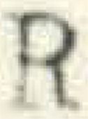
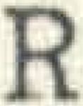
To: Genoa
I appreciate and support the idea that the so-called long form is problematic, but minutely examining character shapes seems a waste of time, since scanning commonly introduces distortions like this. To you, I say, "BS"!
I just happen to have a scanned copy of a Xerox copy of a letter I typed back in 1971 on a manual typewriter with a cloth ribbon. Here are the four capital 'R's from that letter:
The differences are entirely due to the force with which I struck the key when I typed.
ML/NJ
57 posted on
07/18/2011 9:28:45 AM PDT by
ml/nj
To: Genoa
Show how scanning makes similar distortions, that sounds very unlikely to me.
105 posted on
07/18/2011 3:46:50 PM PDT by
Triple
(Socialism denies people the right to the fruits of their labor, and is as abhorrent as slavery)
FreeRepublic.com is powered by software copyright 2000-2008 John Robinson