I appreciate and support the idea that the so-called long form is problematic, but minutely examining character shapes seems a waste of time, since scanning commonly introduces distortions like this. To you, I say, "BS"!
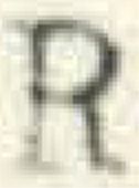
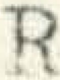
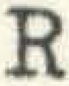
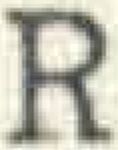
I just happen to have a scanned copy of a Xerox copy of a letter I typed back in 1971 on a manual typewriter with a cloth ribbon. Here are the four capital 'R's from that letter:
The differences are entirely due to the force with which I struck the key when I typed.
ML/NJ
Your four images are all a little different from each other. That’s the kind of distortion I was referring to. For example, one R has a flat-looking serif and another R has a curly-looking serif. Scanning gives a rough image, especially if the DPI isn’t real high. I guess I just don’t know what anyone hopes to prove from this sort of thing. The nine layers—now that I understand.


