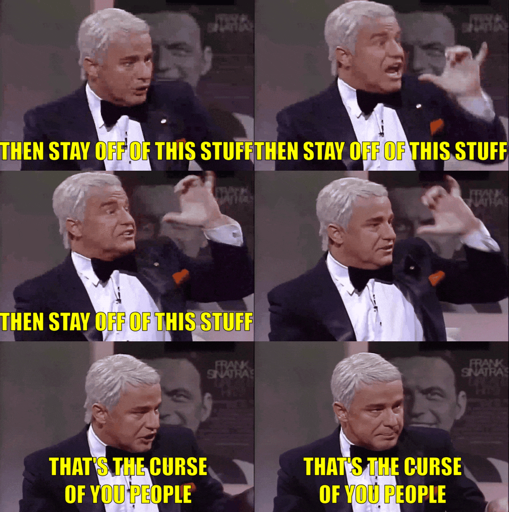
"They're always after me Lucky Charms"
Posted on 08/22/2025 7:11:27 PM PDT by MinorityRepublican
The Notre Dame Fighting Irish are one of the most iconic and legendary teams in the history of college football. However, it looks like one of the team's iconic logos will look a little bit different this season.
Notre Dame has two primary logos. The primary logo is its "ND" wordmark, which features an "N" layered on top of a "D," which obviously stands for Notre Dame. The secondary logo has long been a cartoon Leprechaun with its fist up, appearing ready for a fight.
Ahead of the 2025 college football season, Notre Dame is making a significant change to one of those logos.
Notre Dame Changes Leprechaun Logo On Thursday afternoon, Notre Dame officially announced that it would be changing its iconic Leprechaun logo for the upcoming football season.
The new logo features a more modern illustration of the Leprechaun holding a football with a serious look on his face while appearing to march across a football field. This is in contrast to the previous logo, which showed the Leprechaun in a fighting stance.
(Excerpt) Read more at mensjournal.com ...
Where is the jug?
And the pipe! Gotta have a pipe with your jug.
The old logo can be used for all sports. The new one is only good for football.
There are certain stereotypes that the ethnicities represented by and large do not mind.
The Irish do not mind being represented as being pugnacious and scrappy.
Italians do not mind being represented about being particular about food.
The Dutch and the Scots do not mind being labeled cheap (they might suggest frugal, or thrifty).

"They're always after me Lucky Charms"
😆😄😂
” All this drinking, violence, distruction property. Are these the things we think of, when we think of the Irish.”🤣🤣
It looks angry like it’s taking the football and going home after losing the game. ZLOL

Heh, that’s exactly what I was thinking. Great job making (or finding?) the graphic!
No longer “The Fighting Irish”, now its the “ The Ball Pinchers”
While it’s taking a knee.
I don’t see the need for the change but there isn’t anything wrong with the new logo.
They could at least have given him more hair.
Looks like what you would get if you crossed a bald leprechaun with a Dutch maid.
Well...that is a totally pointless change. Seems like a waste of time and money to repaint, resew, or switch everything over for that.
At least the feet are both going in the same direction now.
Can you imagine a college with the “Fighting Italians” logo? Oh, the memes...
Have him drinking a Bud LITE !
Why can you make fun of the Irish, but you can’t make fun of anybody else?
Disclaimer: Opinions posted on Free Republic are those of the individual posters and do not necessarily represent the opinion of Free Republic or its management. All materials posted herein are protected by copyright law and the exemption for fair use of copyrighted works.