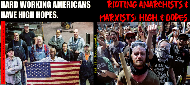
That’s great. I love contrast and the use of the different fonts. Love it: High Hopes vs. High. & Dopes.
It’s catchy!