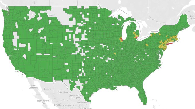
(Looks like arbitrarily-grouped per capita data to me...)
However, without the grouping bounds, the graphic representation is suspect... ("Lower third. Middle third, Upper third"?)
Nonetheless, the emphatic "Eastern-Urban"concentrations do reflect reality.
~~~~~~~~~~~~
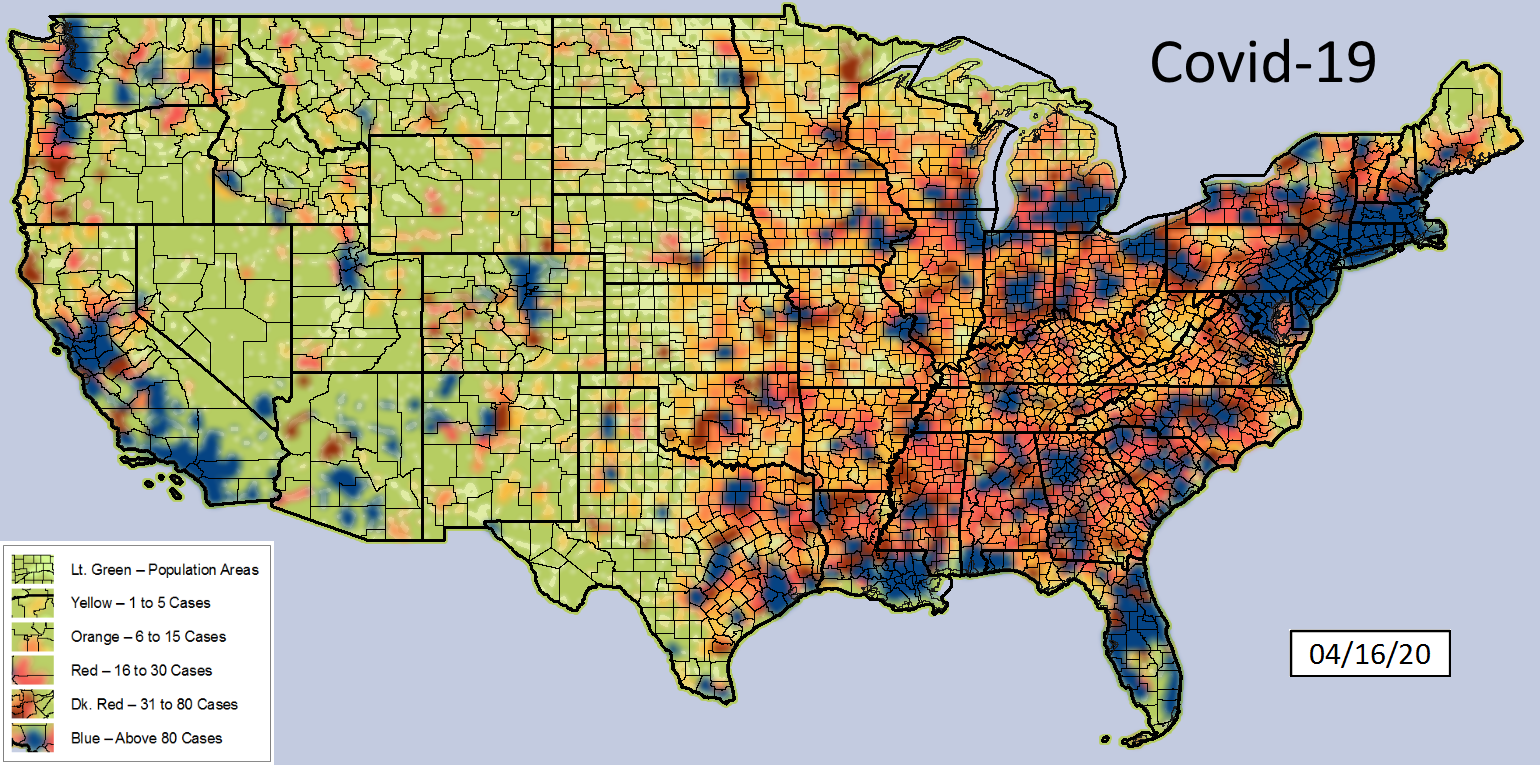
Here are two "more granular" (smaller groupings) choropleths showing
1. Raw Case counts
2. Per 1,000 population counts
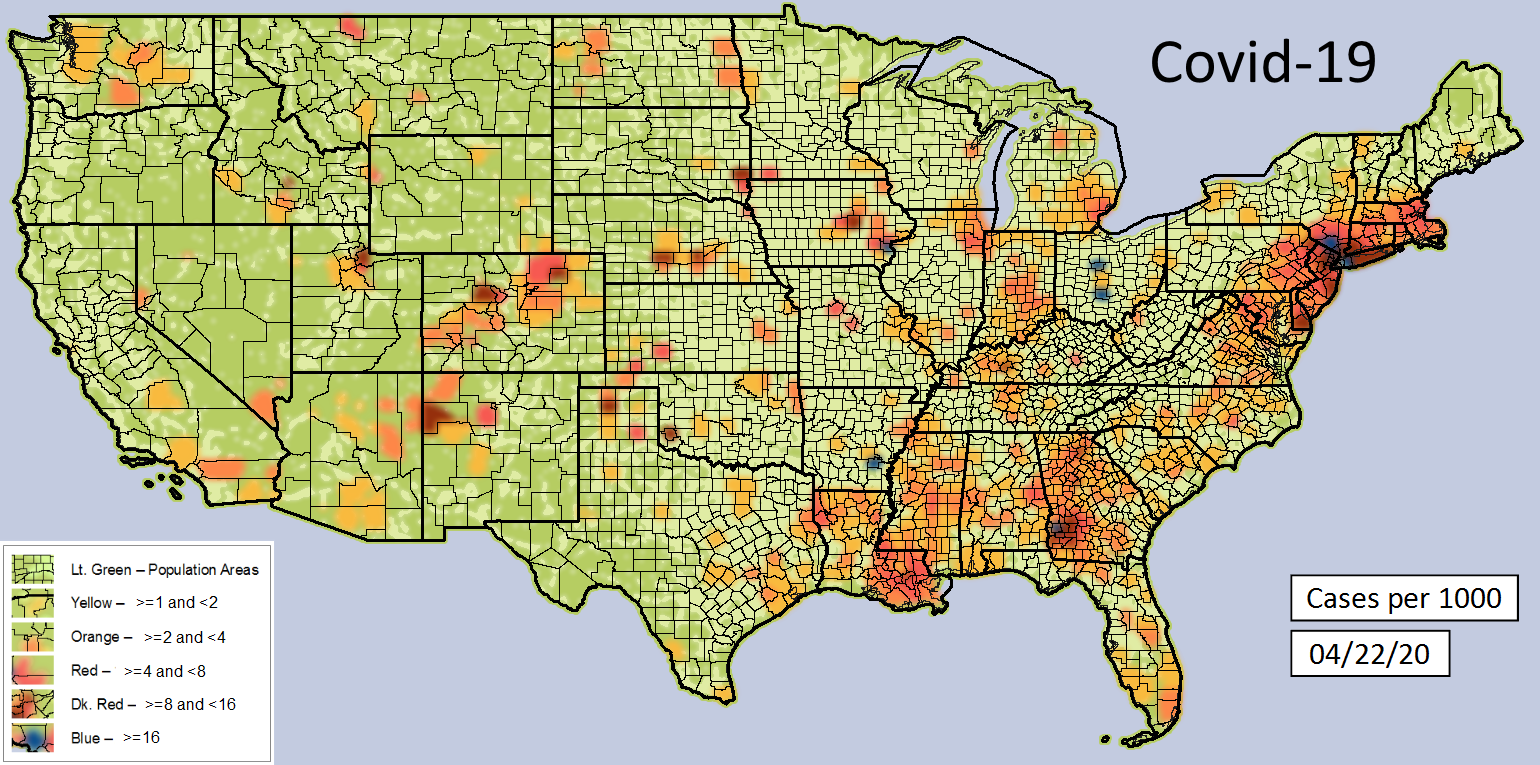
NOTE: These are not on the same date, but are fairly close together. When the mapping source changed to per 1000 capita" representation, they no longer posted raw count maps...
Thank you for posting that "in perspective" look at reality!
TXnMA

Quarantine those areas and let the other states get back to normal.