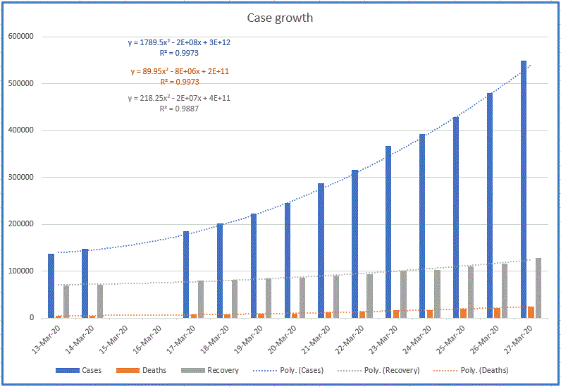
The equations are generated through the polynomial curve-fit trendline function of Excel. Even though the growth is exponential, a polynomial also shows the curve to within a few thousands of the actual value.
The R squared is a measure of how closely the curve fits the data.
What I see here is that the number of cases is rising faster than deaths or recoveries. Since deaths occur from 2 to 8 weeks after the infection, I expect the rise of deaths will lag behind the rise of new cases. The same applies to recoveries.
I only started keeping a record since Mar. 12. Prior to that, I was only checking the death rate, which held steady at about 2.5% for a while. Now I wish I had that data to compare.
I get my data from Johns Hopkins. Refresh the website for the latest data.