To: butterdezillion; cousteausghost
Okay, let's try this:
Here is a screen shot from the KITV video:

Now I'm going to zoom in on the rectangle I drew on the image (notice the vertical mullion that disappears into the top of the legislators' signature plaque):

Now I will zoom in again on the rectangle I drew on this image:

And compare that last zoom to the full screen image of the her hands from KITV:
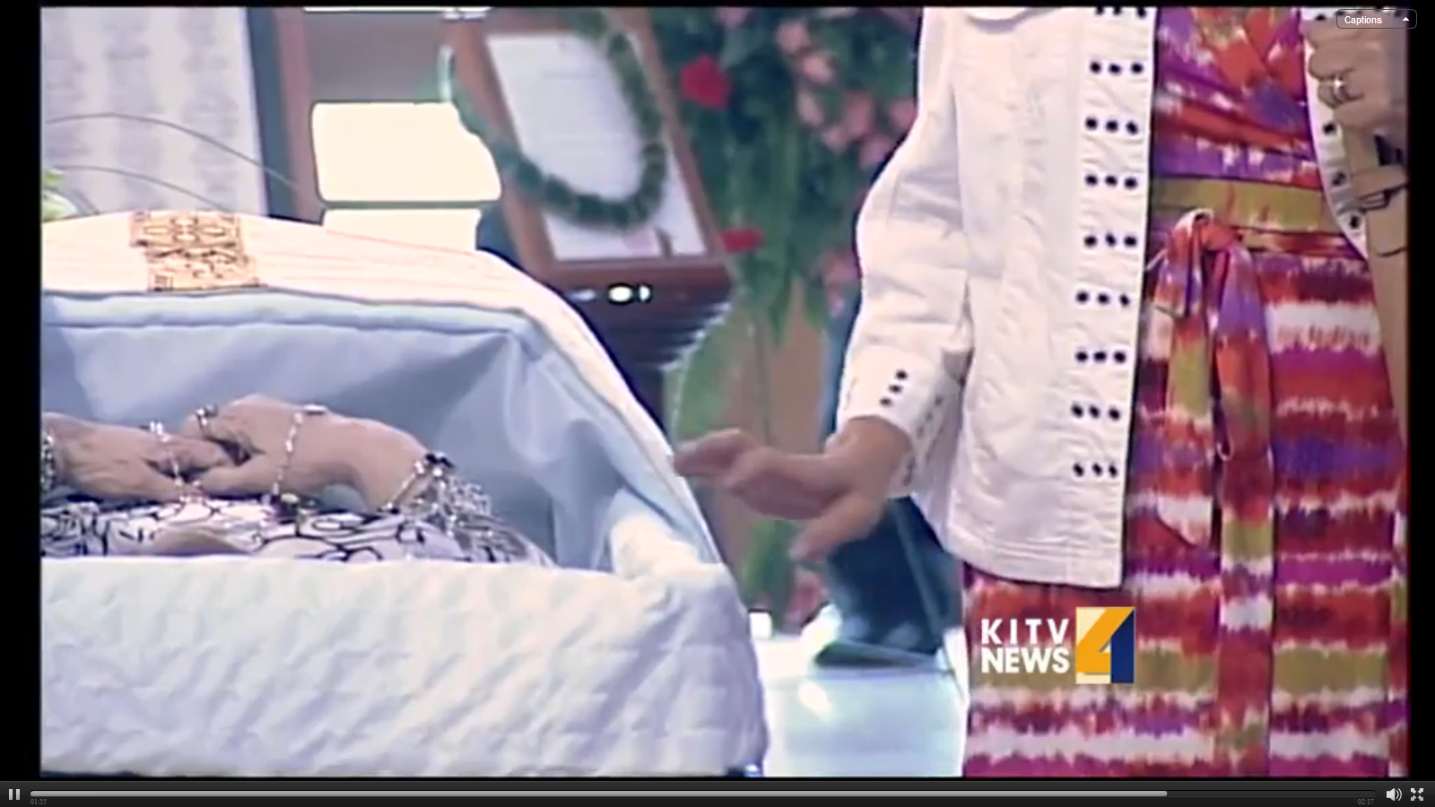
And that's only by zooming in on the image. Looks to me like for the close-up of the hands, the camera was a little higher and maybe slightly more to the right.
689 posted on
05/15/2014 2:00:14 PM PDT by
4Zoltan
To: 4Zoltan
Of course a mullion will disappear if the plaque covers it up. But would you expect to be able to take another straight-on photo of the casket where the stand, plaque, and casket all showed the same basic perspective/angles/shadows as in this photo - BUT THE MULLION WAS NOT HIDDEN BY THE PLAQUE?
Also, this doesn’t seem to be the same location/positioning as the casket was in, in the other photos - just to my casual glance.
690 posted on
05/15/2014 2:16:23 PM PDT by
butterdezillion
(Note to self : put this between arrow keys: img src=""/)
To: 4Zoltan
I wonder how they got everybody’s face to disappear in that top photo. It’s a really bad photo. The speaker at the podium is especially bad - almost like one of the Wordpress profile icons, with an outline of a head but no face.
About the only thing that’s semi-clear is the bouquet of flowers at the very forefront.
694 posted on
05/15/2014 3:34:57 PM PDT by
butterdezillion
(Note to self : put this between arrow keys: img src=""/)
FreeRepublic.com is powered by software copyright 2000-2008 John Robinson