That's not ugly, that's cutting-edge early 1950s industrial design.
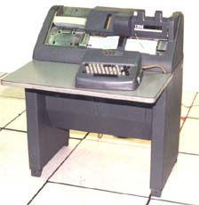
IBM (always the company nickname, not officially changed until 1954) commissioned the designer Raymond Loewy (who also did the Coke bottle) to design their new generation of unit-record gear. This was BC, before computers, when everything was done in punched cards. Here's his design for the 026 key punch. I used one of these until 1969.
Everything was available in one color, gray. Hence the term "gray iron", which referred to a large herd of these beasts.

And if it was good enough for people to wear suits and dresses to run the equipment for the IBM publicity photo, the customer made sure his people dressed accordingly. You might never know when a publicity shot would be needed.
Management demanded lab coats when running the early computers, because that's what they saw in the movies and news clips. That also gave them the opportunity to put the company name or logo on your back.
IBM went to color with the 1400 and 7000 series, their first solid-state computers. "Big iron gray" was still available, but the most popular was the "IBM Big Blue". "Old Rose" was a distant second, followed by "Cloud White", and the rare-but-ghastly yellow (official name unknown). With the black end panels on all these colors, the yellow model (I only saw one or two computer rooms with that color) certainly kept everyone awake on the midnight shift.