To: ETL
Thanks ETL.
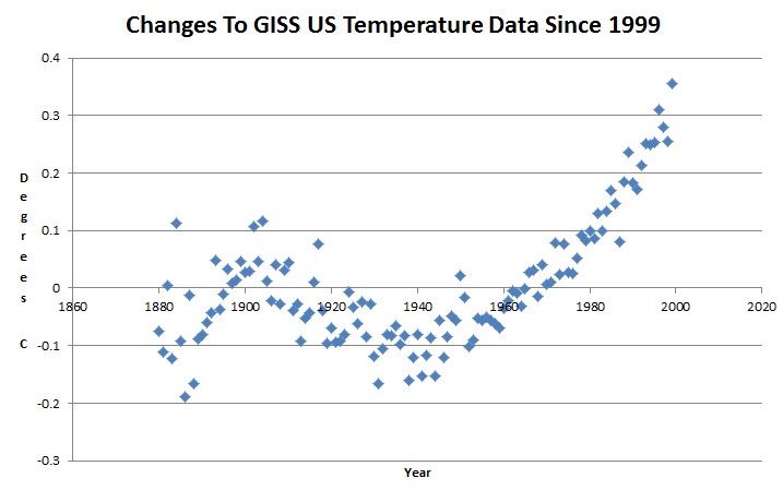
I’d like to draw the thread’s attention to the graph “Changes to GISS US Temperature Data since 1999”.
This graphs shows the amendments to the real temperature record - the NOAA have added this sickle-shaped pattern on the data to suit their political masters. It’s completely fabricated.
Note that these fabricated, not true, amendments include a -0.1 degree C change to 1930’s/1940’s data and a +0.3 degree C change to most recent data. This turns the cooling trend since the 1930s into a straight increase.
12 posted on
08/23/2015 2:10:46 AM PDT by
agere_contra
(Hamas has dug miles of tunnels - but no bomb-shelters.)
To: agere_contra
I’d like to draw the thread’s attention to the graph “Changes to GISS US Temperature Data since 1999”. This graphs shows the amendments to the real temperature record - the NOAA have added this sickle-shaped pattern on the data to suit their political masters. It’s completely fabricated.
Note that these fabricated, not true, amendments include a -0.1 degree C change to 1930’s/1940’s data and a +0.3 degree C change to most recent data. This turns the cooling trend since the 1930s into a straight increase.
______________________________________________________
The next graph shows the difference between the 2012 version of the GISS US temperature graph, and 1999 version.


16 posted on
08/23/2015 2:25:39 AM PDT by
ETL
(ALL (most?) of the Obama-commie connections at my FR Home page: http://www.freerepublic.com/~etl/)
To: agere_contra
Someone please educate the pope!
44 posted on
08/23/2015 4:22:48 AM PDT by
silverleaf
(Age takes a toll: Please have exact change)
FreeRepublic.com is powered by software copyright 2000-2008 John Robinson
