
Posted on 09/19/2019 9:41:26 AM PDT by re_tail20
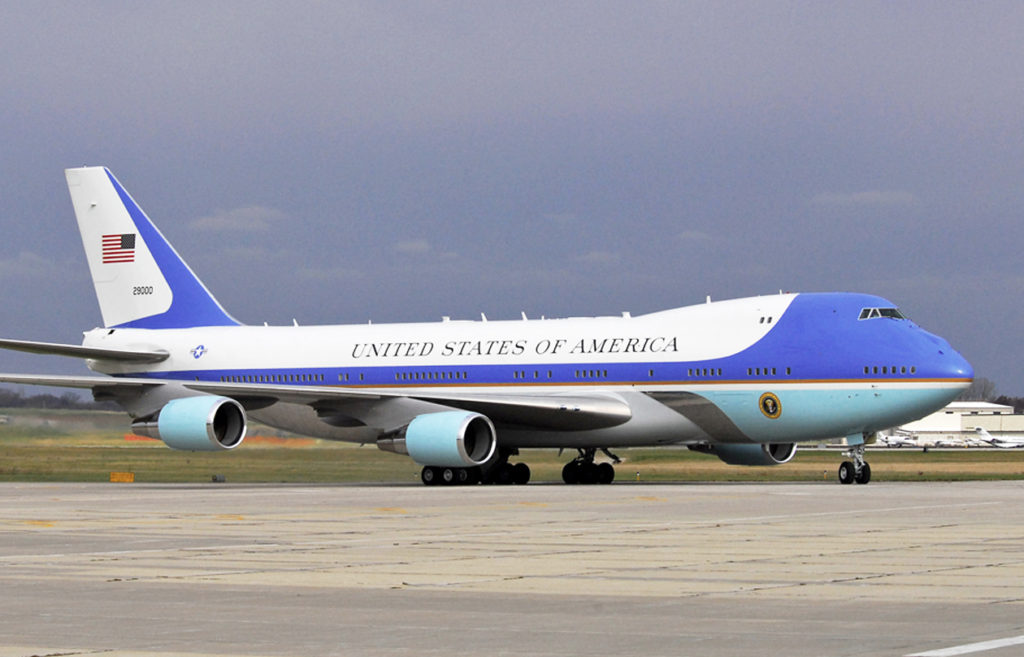
President Donald Trump unveiled a plane model on Thursday demonstrating the new color scheme for Air Force One.
The model was spotted on a table in the Oval Office during a meeting between President Donald Trump and Canadian Prime Minister Justin Trudeau.
“I would say the plane basically is an upgrade over that model. We actually are getting things that they didn’t get. We’re saving about $1.5 billion. So it’s going to be terrific,” Trump told reporters.
the new Air Force One will go into service in 2024.
Despite some critics lamenting the loss of the baby blue and gold paint scheme, Trump is ready for a change.
“You know what? It’s been a long time and it fits the plane better … and I like the concept of red white and blue, and the classic,” he said in an interview with Fox and Friends on Friday. “I think it’s going to look much better actually.”
He said the new colors were inspired by first lady Melania Trump’s fashion style,...
(Excerpt) Read more at breitbart.com ...
I think it is “OK”, but I still prefer B-17 nose art.
I think AF-1 would look great with something like “MISS LIBERTY”, “D-DAY DOLL”, “LITTLE MISS MISCHIEF”, “BOMBER DEAR”, “SHOO SHOO SHOO BABY”, “ALUMINUM OVERCAST”, “LUCKY LADY”.
But considering the fact that it is the PRESIDENTS plane, perhaps it should have something more in keeping with the Office.
Perhaps something like;
1: WE THE PEOPLE
2: UNITED WE STAND
3: FREE BORN - FREE BRED
4: etc, etc.
You all get the picture.
But in keeping with the fact that I am an OLD CORPS MARINE; all you LADIES out there in Freeper Land, my primitive, neanderthal, sexist ideas, still demand a hot babe painted on the nose also
Perhaps a stunning picture of our gracious FIRST LADY in a flowing gown?
Of course the PRESIDENT would have the last word on that.
Let the INCOMING BEGIN!
Your Obedient Servant
5th MEB
Very nice. I like it.
If you see the current or old Air Force One in post 76 the flag is oriented the same way and has probably been that way for a long time. It is done that way so as to simulate an actual flag. The other side has the correct orientation and can be seen that way if you do a search. If you wanted to avoid this problem one would have to have a flag that is symmetrical down the middle which the current US flag isn’t.
Classy.
First thing I thought of also.
Oopsie. Someone forgot to tell the painters of the existing AF1. ;)
“Compare that to the prior model. Did Michelle pick the previous color?”
No, it is very nice and that color scheme goes back to JFK.
You must be a youngster.
Jackie Kennedy.
Yes, it looks femme, but it’s just a plane.
“Beat you by 4 minutes..”
And with a picture to boot.
Gotta be quick on the trigger in these parts! :)
I wish I was a youngster.
DACA!
Just kidding, a democrat President can change anything.
I wish I was a youngster.
The current color scheme of AF 1 is still beautiful. Michelle Obama could never design something of beauty.
Mixing two blues.....yuk....
Port side flag is not shown but no doubt has field upper left or forward side so appears “correct” as viewed...
Starboard flag faces forward as a “charging flag”, and is correctly displayed...
I wore a right sleeve charging flag on my turnout coat for many years...All our rigs had them on right side as well...
That baby blue is very similar to the color the USAF called “air superiority blue”...
Meant to be used as a high altitude camo, and saw one of the first F15s at Andrews AFB painted entirely that color...
never did get the colors of AF1 as is. Yuck and i like blue.
Making AF1 great too.
Plane looks great—much more forceful—not baby blue Worry now—the Canadian boy wonder will be out of office soon and an adult will lead the Glorious North.
Disclaimer: Opinions posted on Free Republic are those of the individual posters and do not necessarily represent the opinion of Free Republic or its management. All materials posted herein are protected by copyright law and the exemption for fair use of copyrighted works.