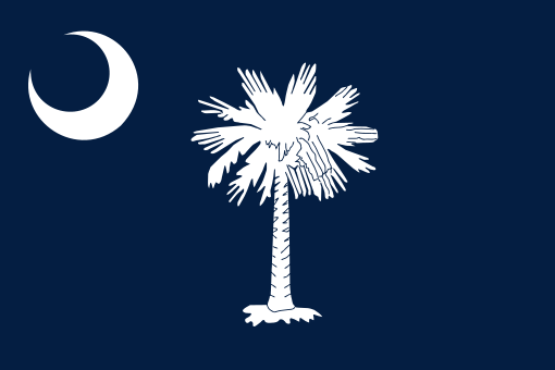
South Carolina's design says: "Keep head attached."
Posted on 05/21/2023 11:04:28 PM PDT by nickcarraway
Looks more like a corporate or sports logo that a state flag.
BFD
Compared to the existing flag, it looks more modern, but it drops three key elements, namely, U.S. flags, an eagle, and arrows to symbolize six tribes of native people living in Utah. All it retains from the current flag is the beehive, Utah’s well-known symbol of industry. The word industry and dates of Utah’s admission to the union, as well as the arrival of the Mormons in 1847, are also gone. A stylized mountain range was not on the original version.
A lot of specific historical context is being removed, I suppose the debate would be whether that is good, bad, or indifferent. Two words, Utah, and industry, also disappear, along with the sego plant which is supposedly on the current flag.
If you want to see more details about the original flag and other designs that were finalists, would recommend the article “flags of Utah” on wikipedia.
What was wrong with the old flag?
Does it have a silhouette of Mitt Romney?
South Carolina's design says: "Keep head attached."
(IMHO, the old one was better.)
Compare them here:
Honoring the Mormon work ethic seems to exclude the non-Mormon citizens.
I agree. The old one is more visually interesting, and the elements look as though they have some stories to tell. The new one just looks like an company logo.
Agreed - the new flag looks very “corporatetish”.
I concur. But what I also find interesting is that it has a single white star on a blue background. The "Bonnie blue" flag of rebellion is a single white star on a blue background.
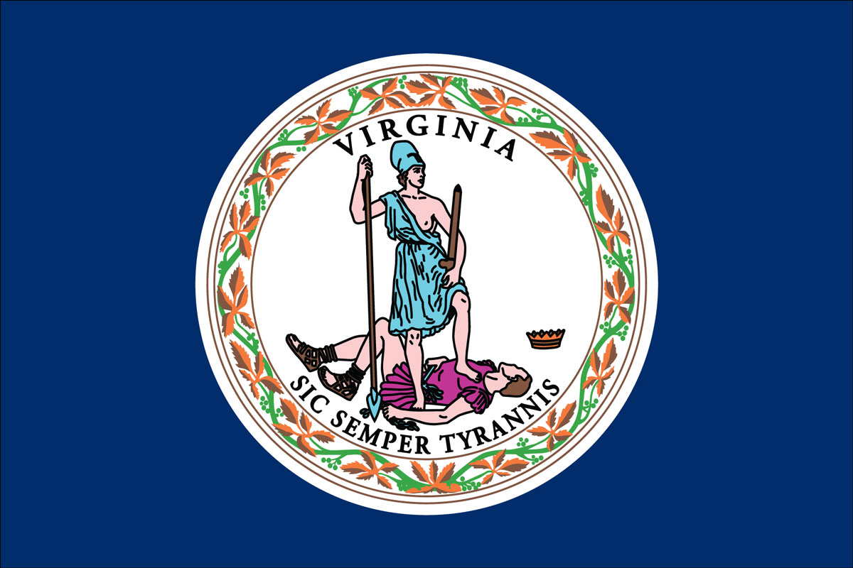
For state mottos and a flag with a powerful message, you just cannot beat Virginia…
Wow. I read the comments here expect the worst. Then I went to the link and saw the new one. It was worse than I expected. Looks like something out of hunger games.
Ugly - way too busy. Putting a mountain range onto a flag rather than simple horizontal stripes, is just ugly.
We keep going down hill. Designers used to shoot for “classy” and sophisticated. I don’t know what designers today are thinking. They shoot for different and edgy and get stupid adn ugly.
I agree with that. I really like our state’s flag.
Sorry, it is BUTT ugly. All’s I see is someone bent over and they missed putting the star on the critical spot. ;-)
From the link in post 9. Looks like they gave folks a general theme and people submitted their images. Then they probably selected a few and put them to a poll. Isn't their some adage that talks about decisions by committees?
Our old church came up with some various logo designs and polled people (not me!?) and came up with dark yellow letters with the the initials of the church.
Our new church (no - we didn't leave because of the new logo) did a similar thing about 3 years later. Their “experts” came up with a very similar logo - and the same dark yellow and similar font. I imagine they used the same marketing firm as the other church, in spite of being a different denomination.
Disclaimer: Opinions posted on Free Republic are those of the individual posters and do not necessarily represent the opinion of Free Republic or its management. All materials posted herein are protected by copyright law and the exemption for fair use of copyrighted works.