Free Republic
Browse · Search
News/Activism
Topics · Post Article

To: Outland
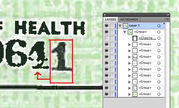
The document has been manipulated. It is so obvious even amateurs can see it. Notice the number "1" which is on a separate layer is pixellated, the other part of the number is not pixellated. That doesn't happen by itself. Someone's been messing around. I agree something is wrong. Photobucket
20 posted on 04/27/2011 4:53:10 PM PDT by vortigern
[ Post Reply | Private Reply | To 14 | View Replies ]


To: vortigern

It’s so bad it’s laughable.


28 posted on 04/27/2011 5:17:44 PM PDT by SouthernmostFreeper (Three If By Government)
[ Post Reply | Private Reply | To 20 | View Replies ]

To: vortigern

Right there is the screen cap that proves this thing at best has been manipulated and at worst has been forged.


36 posted on 04/27/2011 5:52:00 PM PDT by EscapedDutch ("Socialism is great until you run out of other people's money" - Lady Margaret Thatcher)
[ Post Reply | Private Reply | To 20 | View Replies ]

To: vortigern
What I don't understand is that some of the characters on the birth certificate seem to have "dithering", i.e., they are made up of a bunch of different colors or shades, like the "1" in your example above. At least I think that's correct terminology. Every document that I've seen straight out of a scanner looked like this.

Some letters in the birth certificate, however, don't. Some are very "flat" and look like they've been desaturated and the contrast has been increased. But why would some be that way and others not, unless the contrast on the original was "pushed" somehow, and then extra letters with dithering were added later? And if that was so, it seems like it would completely wash the light background out when they pushed the contrast on the original text.

I'm an amateur photographer, and I've worked with lots of different types of scanned images, and different types of image manipulation. I have NEVER seen two characters side by side scan so differently.

Usually, right out of the scanner, text looks like it does on the left, that is, black and white with shades of gray that the computer adds to represent smoother curves. To improve readability and copy-ability, though, you can push the contrast so that it looks more like that on the right. But, you simply don't get both results in the same document without manipulation, ESPECIALLY two characters side by side. If someone can do it, I'd be delighted to see the results.

38 posted on 04/27/2011 6:01:30 PM PDT by FLAMING DEATH (Are you better off than you were $4 trillion ago?)
[ Post Reply | Private Reply | To 20 | View Replies ]

To: vortigern

Keep fighting the good fight. I see that clear as day. I don’t know why others cannot. I guess too many anti-birther elites are more concerned about their egos.


44 posted on 04/27/2011 6:36:50 PM PDT by CommieCutter (Promote Liberal Extinction: Support gay marriage and abortion!)
[ Post Reply | Private Reply | To 20 | View Replies ]

To: vortigern

The ‘manipulation’ was they scanned in the document with OCR settings on, that’s all.


81 posted on 04/27/2011 10:54:38 PM PDT by WOSG
[ Post Reply | Private Reply | To 20 | View Replies ]

To: vortigern
I think we're seeing more pixellation with one numeral than the others because a multi-layered PDF document has been optimized without first flattening the layers. Though this seems to be done as a single operation, in reality each layer is optimized sequentially for greatest visual clarity independent of the other layers. When the software optimizes a layer with a lot of visual data—many characters or numerals—the overall effect is different than when the same process is applied to a layer containing a single or very few characters.
94 posted on 04/28/2011 8:10:01 PM PDT by DrZarkov
[ Post Reply | Private Reply | To 20 | View Replies ]

Free Republic
Browse · Search
News/Activism
Topics · Post Article


FreeRepublic, LLC, PO BOX 9771, FRESNO, CA 93794
FreeRepublic.com is powered by software copyright 2000-2008 John Robinson