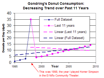
Since you don't see the point with the real climate data, here's a very quick simplified graph to illustrate why a linear regression trend taken from a statistical and physical anomaly is inappropriate handling of data. Note that this is an important consideration even if using a trend analysis technique like Mann-Kendall.
By your reasoning, I can claim that I have an 11-year (in magenta) downward trend of donut consumption, even though looking at the 10-year, 12-year lines, or whole dataset (navy) would give me a different result.