From WWW.SELECTRIC.ORG, the Selectric Typewriter Museum:
Sorry, but due to excessive hits, this page is temporarily out of service.Please check back after the election.
For those who want my opinion...the documents appear to be done in Word, and then copied repeatedly to make them "fuzzy". They use features that were not available on office typewriters the 1970s, specifically the combination of proportional spacing with superscript font. The IBM Executive has proportional spacing, but used fixed type bars. The Selectric has changeable type elements, but fixed spacing (some models could be selected at 10 or 12 pitch, but that's all). The Selectric Composer was not an office typewriter, but apparently did use proportional spacing. These were very expensive machines, used by printing offices, not administrative offices.
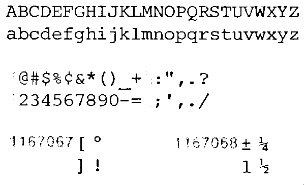
Here are scans of the Courier 12 font,
and the Prestige Elite 72 font.
Both were commonly used, and are sort of close to the font in the documents, but not quite. Notice that they are not proportionally spaced, so the typing looks very different from that on the memos. There is a superscript available for numbers, as used with footnotes, on the Symbol type balls. These balls were generally used for academics, such as preparing scientific and mathematical papers. I can find no "th" superscript in any of the IBM literature I have.
These are scans from a mid-1970s IBM Selectric Typewriter Type Styles brochure, IBM publication G542-0053-7, which does not appear to be explicitly copywrited.
update: I dragged my Executive up from the basement, it's not working too well...but I did type some of the 19 may 72 memo. It doesn't fit on the page using a real vintage proportional spacing typewriter...and it looks different.
At least my low opinion of TV news remains intact.

