To: Sacajaweau; Travis McGee
Just a reminder - original estimates were worst case scenarios BASED UPON NO SOCIAL DISTANCING.
Here is what real data shows - these are not model based projections, but reported data to date [based upon worldometer CSSE and JHU - see note on graph]:

Please note that countries that adopted very strong public health measures - social distancing, strict contract tracing - had very different trajectories than the FLUBRO approach which every country in the world has now departed from.
While the FLUBROs advocate just standing on the track in front of the freight train, everyone else has chosen to get off of the effin RR track.
Get it through your heads folks. The FLUBROs are trying to kill people.
And we didn't need to destroy our economy over this. Singapore, SK, Japan and Taiwan didn't. They took it seriously and got ahead of it. Folks who hold CV-19 parties, lick toilet seats and hug an infected minority are locked up, welded in, or in the case of NK - shot.
To: AndyJackson
I believe your graphic of Number of CASES is not representative of the true situation. The number of CASES is totally dependent on the number of TESTS. The US, with its recent explosion of test data will, by definition lead in the number of cases. The verified number of actual Corvid-19 virus deaths would be a far better indicator, and the US is near the bottom of this indicator when calculated on a per-capita basis.
9 posted on
03/29/2020 7:16:03 AM PDT by
norwaypinesavage
(Calm down and enjoy the ride, great things are happening for our country)
To: AndyJackson
“The FLUBROs are trying to kill people.”
Let’s not go that far, that’s what they say about us (that we wish people dead to make our point - I had to get one guy zotted for that).
No, the FluBros think they won’t get it (in fact, they’re probably holed up, like most of the realists here), but they’ve seen their huge-retirement portfolio take a dive, and they want that money back - and if that means making (other) people work under these conditions, so be it.
Obviously they use numbers that support them. One number you DO NOT see them use is daily flu deaths versus daily Coronavirus deaths. Soon they won’t be able to use weekly, and then monthly, and then their big number - yearly, will be out the door too, as it is now in Italy.
In fact the ONLY number that should be looked at is overall number of deaths in a given country (for all causes) over a given time period, versus a year ago - as everything else can be fudged (for example, Germany blames diabetes if you have diabetes when you die from Coronavirus). Italy had a video on that a couple of weeks ago, and it was HORRIBLE.
14 posted on
03/29/2020 7:44:20 AM PDT by
BobL
To: AndyJackson
Now, that graph is some more good work! Please keep it up to date. I’m with you and looking to see this level out very soon.
Are you posting this anywhere other than here on FR?
To: AndyJackson
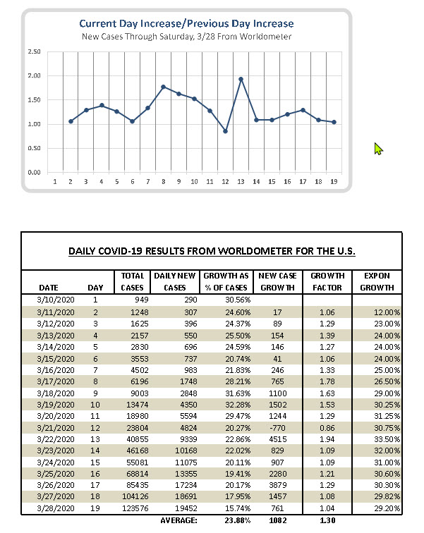
Thanks to another Freeper I found the chart at the Financial Times. There is excellent information and charts over there. I'm impressed. But, for the most part, in my mind the chart posted here is useless. Here's why. Based on yesterdays data at Worldometer we had 378 cases per 1,000,000 souls. Compare us to Italy with 92,000 cases.. They stand at 1,541 cases per million. That is over four times our rate of cases. Something close to that ratio will hold pretty much across the world. I'm not sure we will get anywhere close to that number.I prefer to follow the gas_dr's numbers and hypothesis. That is, from the time the first 100 cases are reported the curve will flatten at between 15 and 25 days. That is based on China, South Korea and a few other countries. He focuses on the "exponential growth factor" or day over day change of new cases, which makes sense as a leading indicator.
In any event, see my tracking chart and data below. We seem to be moving in the right direction, if we don't get blown out of the water by another NY & NJ. So, maybe our target is 25 days to flatten the curve. Yesterday was day 19 by my count.
I believe it will happen.
Your thoughts and comments are welcome. No snarky, though.
IC Clearly
click on image to enlarge
Data from Worldometer
FreeRepublic.com is powered by software copyright 2000-2008 John Robinson