Have to disagree on the cover style as I mentioned at the time of it's release. The model is Soviet propaganda, the new soviet man, strong, healthy, virtuous with his gaze fixed on the distant horizon of the new socialist/communist world.
Flip through poster archives of that era and you will thousands of the type extolling the virtue of the day, ready to defend to the death the party's position.

The odd thing is that the Soviet images face right conforming to the convention of how the eye travels while viewing. Romney oddly faces left, away from the edge of the page , inviting the flip to the next. Compare your reaction to both images. Take a look a book covers, almost all direct the eye to follow through and turn the page.
Sharp insights! I see your point about Soviet art and it's valid.
On the other hand, reproduction technology to some extent drives all graphic art in a similar way worldwide in each era. Here are some of the Boy Scout repros from the 30s - 50s, and your point is well taken about where the protagonist is looking:

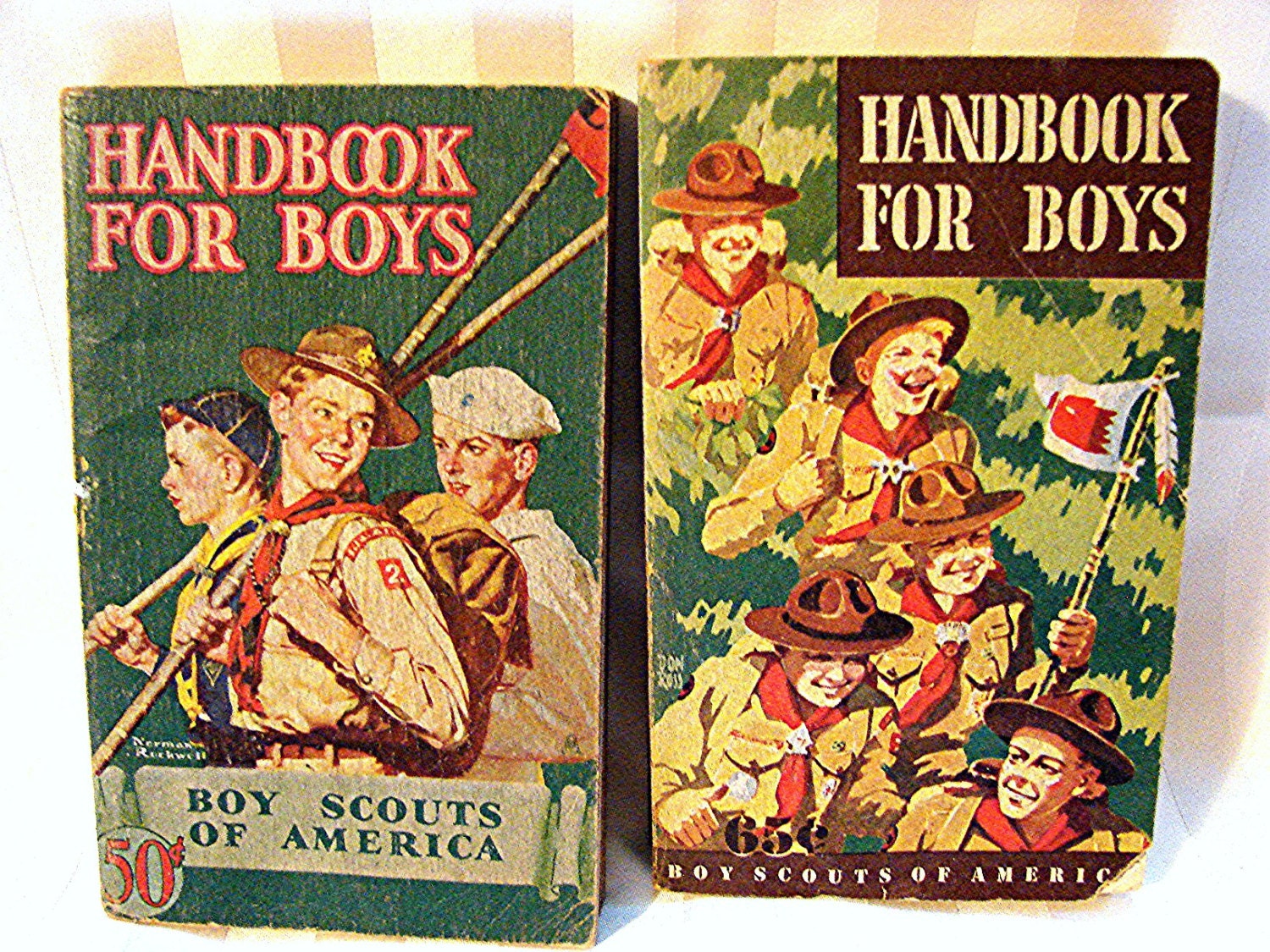


In fairness, the Romney image is looking to "his" right; and the Soviets to "their" left. That's why an art director has to think deeply about imagery, what it actually communicates below the surface to the reader, and as you note, how it functions to compel the all-important "eye-ball hang time."