Sharp insights! I see your point about Soviet art and it's valid.
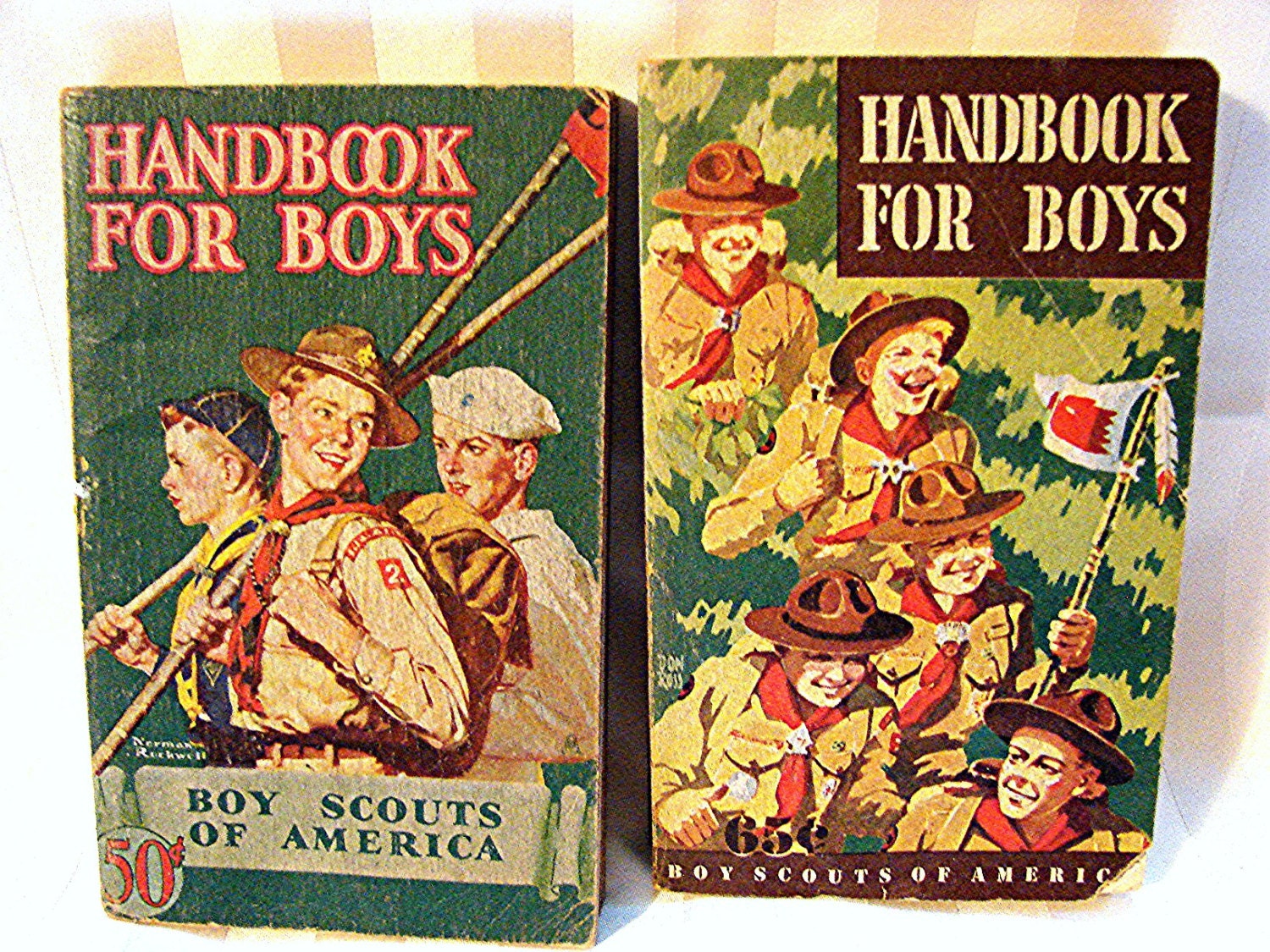
On the other hand, reproduction technology to some extent drives all graphic art in a similar way worldwide in each era. Here are some of the Boy Scout repros from the 30s - 50s, and your point is well taken about where the protagonist is looking:


In fairness, the Romney image is looking to "his" right; and the Soviets to "their" left. That's why an art director has to think deeply about imagery, what it actually communicates below the surface to the reader, and as you note, how it functions to compel the all-important "eye-ball hang time."
Your right about the similar overall graphic style, which of course rules any market place material for a time.
The BSA illustrations are different in that all but two indicate immediate activity, the compass reader showing the path, the general marching with group interaction. The Jamboree poster suggests a greeting just out of the frame. Oddly enough, the one appearing to be by Norman Rockwell most closely follows the Soviet pattern of looking towards a distant future horizon, albeit with different purpose. White propaganda is ours, black propaganda is theirs, mostly...sometimes. ;>)