Posted on 01/27/2013 6:14:57 AM PST by Kaslin
Where do you fit in the 2012 ranking of total money income by age group in the United States?
While we've previously built a tool where you can find out your percentile ranking among all individuals, men, women, families and households in the U.S., we thought it might be fun to break the data for individuals down a little differently - by age group!
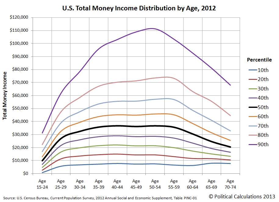
Our chart below reveals what that distribution looked like for 2012, as indicated by the curves showing the major income percentiles from the 10th through the 90th percentile for each indicated age group on the horizontal axis.
The data in the chart represents the income distribution for the estimated 194,271,175 Americans from Age 15 through Age 74. As such, the space between each of the percentile curves on the chart then covers the total money income of some 19.4 million individual Americans.
What stands out most in the chart are the changes in the vertical spread between the 10th, 50th and 90th percentiles by age group, which might be taken as a measure of the relative income inequality for each age group. For example, we see the Age 15-24 group seems to have the greatest income equality, with the least amount of vertical separation between each of the income percentile thresholds. 
We said "seems" for the Age 15-24 group, because believe it or not, this group has the highest income inequality of any age group as measured by the Gini index. The reason why has to do with the high concentration of very low income-earning individuals within this age range (for example, about 50% of all minimum wage earners are found in this age group!), against which a relative handful of very talented young people, including entertainers and star athletes, go straight from their school years to multi-million dollar incomes, often before many of these individuals see their careers flameout before they even make it into the next age group. The same phenomenon isn't true for the older age groups, who all tend to gain in income as they gain greater experience, as their Gini index values do follow the pattern we observe in the chart above.
Speaking of which, one thing that's pretty clear in the chart is that incomes at each major percentile threshold increase across the board as individuals accumulate work experience up through the Age 40-44 group. Above that point, that's would seem to only be true for above-median income-earning individuals.
Going back to the overall patterns we observe in this income distribution visualization, we see that the greatest vertical spread between the 10th and 90th percentiles occurs for the Age 50-54 group, which corresponds to the peak earning years for Americans.
But that vertical spread indicating income inequality diminishes rapidly for older age groups, which is consistent with the transition from earning wages and salaries to only having retirement income. It's especially interesting to see that the peak the retirement-associated decline occurs earlier for the 90th percentile income-earners, while it occurs around Age 55-59 for the lower income-earning percentiles.
The vertical spread between the 10th and 50th percentiles are interesting as well. Here, see see that after rising rapidly for the young, the 50th percentile income level begins to plateau for those around Age 35-39, then holds fairly level through Age 55-59, after which it declines as older individuals increasingly leave wage and salary-earning jobs they've had for years for retirement.
We'll revisit this chart in an upcoming post, where we'll conduct something of a thought experiment....
We took the age-based total money income data presented by the U.S. Census to construct cumulative income distributions for each included age group, then used ZunZun's curve-fitting tools to develop mathematical models for each to calculate the income that goes with a particular income percentile. The indicated incomes in the chart above are typically within a few hundred dollars of the IRS' published data.
As another hint to what's coming soon here at Political Calculations, those mathematical models just might show up in the future as a new tool that you can use to see exactly what your income percentile ranking is within your own age group!
U.S. Census Bureau. Current Population Survey. 2012 Annual Social and Economic Supplement. Table PINC-01. Selected Characteristics of People 15 Years Old and Over by Total Money Income in 2011, Work Experience in 2011, Race, Hispanic Origin, and Sex. [Excel Spreadsheet]. 12 September 2012.
My income puts me way down the list but there is nothing in this chart to figure what I really have. You see, I don’t owe any one a single red cent. My wife and I own our house and the 640 acres it sits on. We have paid in full assets that can be liquidated should we need extra cash. The monthly income without having to make payments lets us live far better than we did when I was working.
Me, too. I don’t fit neatly on that chart, either. Hard assets are the way to go, Baby. As debt free as I can be, all things considered. Just owe a bit on my farm still, but I’m doubling down on that right now. I’m 52. A Dave Ramsey fan, too.
I DO produce taxable income, but that’s a small percentage of what I’m actually ‘worth.’
(And yes, I am currently considering any serious Freeper marriage proposals. Laz doesn’t count, LOL!)
I’m in the same boat. I am retired but own my home, both car and truck, small airplane, have a nice IRA that I don’t need to draw on by the way, and live in a tax friendly state for retirees. The chart would say I am not very high on the totem pole but I feel I am living large.
I own all my assets (sold my plane during a really good sellers market, 2004) and have a small debt on two credit cards to keep my score. One thing bothers me about the percentile rankings....the data was collected via the census.
How many, like me, provided only the number of persons residing at the given address? They didn’t get race, income, household pets, slaves, rounds of ammo, magazines, or capacities, broke down trucks in the front yard...they got nothing.
I don’t fit in anywhere. I’m an individual, not an average number. Statistics compute averages for a large group of people, and so don’t apply to any one individual.
Thomas Sowell’s excellent books on the subject of economics discuss this phenomenon in length.
I find it interesting, because this phenomenon described in this graph demonstrates reality as it should be, and is.
As people enter the workforce, they often have little real experience or little real skill in a given area, so consequently, their income will not be great. It is one of the wonderful mechanisms of capitalism that as people develop skills and acquire education and experience in a given field, their value increases (if, of course they are in the correct field) and their income increases as they age.
It is one of the most wretched and irritating aspects of the minimum wage acolytes that they see this as somehow an unfair discrimination against people working in low income jobs.
If one takes the time to look at the situation, most low-paying jobs are not meant to have people stay in them for their entire career, or to try and support a family off of them. Those low-paying jobs should be portals for people to be able to gain experience and “personal capital” that will enable them to make a jump upwards.
That mechanism works both for employees and the employer, as it rewards those who are willing to work hard to get ahead, and rewards the employer by providing them with experienced workers who have the necessary skills and talents to execute a job or service.
Liberals completely don’t get this. They view this income disparity as being unfair. When you come right down to it, this particular difference in outlook, in particular, may be one of the reasons that industry is tanking in this country.
Ha ha! And what do you have against Lazamataz?
(I think he's the one on the left…:)
This applies to all except those that have been duped, manipulated or deceived to perceive themselves as victims.
Is that really Laz?
Smart woman. That Laz has been rode hard and put away wet a few too many times.......
Well, I was knocked from the tenth percentile to almost the sixtieth in one fell swoop back in 2008, and still there. Thank goodness I wasn’t carrying much debt. It’s tight but servicable. For now. Sounds like another round of selling stuff might be looming, though. Couple hundred less per month starting at the first of the year, who knows how much with health insurance. It can be depressing if you dwell on it. Only debt I’ve got is the note on the house, less than $50k to go, might have to respread the note or sell. Heck if I know at this point. Increasing income hasn’t been in the cards since this all came down, but I’ll keep trying.
Well, 90th, lol. Whoever colorcoded that graph could use some pointers.
I have been told that the gentleman on the left is Laz, and the fellow on the other side is humblegunner.
Looks like a good time...:)
Yep. That’s him, LOL!
That ‘income equality between 15-24 year olds’ is because most of them who are working are only making MINIMUM wage, and many are grossly overpaid at that rate!!!
Ping
Humblegunner is on the left and Laz is on the right.
Here’s the thread with all the pictures;
http://www.freerepublic.com/focus/news/2939985/posts?q=1&;page=51
Laz;
http://www.freerepublic.com/focus/news/2939985/posts?page=752#752
humblegunner;
http://www.freerepublic.com/focus/news/2939985/posts?page=768#768
LOL...thanks, potlatch!
Sigh, my brain is so undependable these days, I hope I didn’t slander poor Laz by mixing him up the wrong way...:)
Lol, that’s funny.
I only knew because I had read through that thread when it was happening and I had bookmarked it. They had a fun time!
Disclaimer: Opinions posted on Free Republic are those of the individual posters and do not necessarily represent the opinion of Free Republic or its management. All materials posted herein are protected by copyright law and the exemption for fair use of copyrighted works.