Posted on 10/26/2011 8:57:23 AM PDT by Kaslin
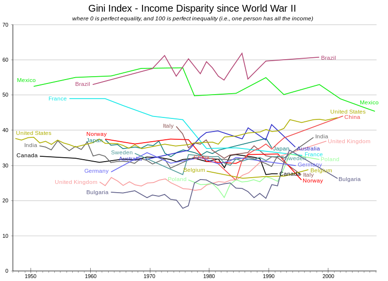
Perhaps the most common measure of income inequality in a nation is the Gini Coefficient (aka the "Gini Ratio"), which ranks the amount of inequality there is in a country on a scale from 0, which represents perfect equality, where everyone would have an equal share of the nation's income, to a value of 1, which represents perfect inequality, where one person would have all the income, but everyone else has none.
So now, thanks to so much media attention being focused on the Occupy Wall Street "movement" (aka "politically-oriented publicity stunt"), where many activists (aka "not-too-bright people") appear to be upset at "the Top 1%" (aka "really high income earners"), who they claim have "gotten too rich" (aka "earned a high income by doing things that satisfy other people's needs"), we thought we'd use the "Gini coefficient" (aka "a well-established mathematically-based method for measuring inequality") to find out how out of whack things have become in the United States over the years.
Or more specifically, the years from 1994 through 2010, for which the U.S. Census has published detailed data related to the incomes earned by Americans based on their annual surveys of the U.S. population. Our chart showing the trend in income inequality for all individuals as measured by the Gini ratio for these years is below: 
We were shocked to see the overall trend from 1994 through 2010 take the path it has, because it's so completely contrary to what we keep hearing in the news.
We only ask that someone ask the media for their reaction to this disturbing data!
I am shocked!
Flat line.
So this begs the question: what did it look like pre 1994, but probably similar.
More importantly, what does this look like in say Sweden where government is even a larger presence than here?
Sorry, but when I see data displayed like this I generally think there is some kind of feedback loop “buffering” the data. Please show your work...
In addition, I reject the entire concept.
Let’s say you are a Section 8 welfare recipient, receiving free rent, free income, raising a family, you are a drug addict, you are protected by a multitude of anti-discrimination rules pertaining to welfare and Section 8....
And you do not one damn bit of work ever - Now where on the scale do we adjust for this “inequality” running the other way???
If capital gains and bonuses were taxed as individual income, the graph would look much different. Many of the high rollers have very modest “individual income”.
that’s beautiful! great find~!!
It is a perfect example of the media and the 3 types of lies: “Lies, Damned Lies, and Statistics”
Lets say I make 100,000 and someone else makes 50,000 and an average house costs 100K. I make exactly twice as much and I can afford to buy one house with my 100K.
Then let’s say that over 20 years the cost of living and inflation raises everything by 100% so that 100K house now costs 200K and we will be making 200,000 and 100,000 respectively.
I still can buy only one house, and I still make exactly twice as much.
Even though the situation is essentially exactly the same, the media will say “You used to make 50K more, and now you make 100K more- so you got richer”
Lies. Damned lies. Statistics.
The data simply proves that larger amounts of income are not trending towards the fewer and wealthier, at least not in the last 17 years.
Idiot protesters will contend that the “99%” are being drained more and more, year over year while the “1%” keep gaining more and more of the nations income, year after year.
The government’s own data negates the lies of the left.
Most of the money that is earning capital gains has either previously been taxed as income or will in the future.
It seems to me that if 50% of the people have 100% of the income, and 50% have zero income, then the graph would be right in the middle as it is in the article. So .... the graph doesn’t really tell us much.

I’m not making an argument for or against a capital gains tax, or saying capital gains are wrong but capital gains are indeed income... particularly for fund managers that make a living off them. Just saying that the income disperity would be much larger if included.

The most serious inequality we suffer from is work ethic.
This is the kind of statistic the think tank guys ponder.
If the GIRI is too high, you risk political upheaval based on envy. If it is too low, then, you risk discouraging the wealth creator class and everyone is poor. Assuming you have a Democracy.
There are plenty of high GIRI countries in Africa where there is no Democracy and dissent is not possible.
So it looks like the US is right where it belongs, but perception is everything; and the media controls it.
Meaningless without honest error bands, which I suspect are moderately thick.
If welfare checks, food stamps, subsidized housing/electric/child care, etc., were classified as income, the graph would also look very different.
Disclaimer: Opinions posted on Free Republic are those of the individual posters and do not necessarily represent the opinion of Free Republic or its management. All materials posted herein are protected by copyright law and the exemption for fair use of copyrighted works.