Free Republic
Browse · Search
News/Activism
Topics · Post Article

To: All

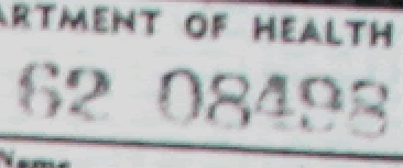
The curved vertical 'stick' on the "4" should be straight, not curved, and more or less the same width from top to bottom.

Barry's "4" is very wide in the top half because it is covering up a lot of the former "3".

Plus look how wide the serif is at the bottom of Barry's "4". WOW! That is much too wide because it was taken from a "1".

The bottom serif on the 4 should be about half as wide as the letter "4".

The horizontal 'stick' mid-way up the "4" should be LONGER on the right side, than the bottom serif on the "4".

But in Barry's forgery, those are opposite. For example, look at this "4" from a 1962 use of that same stamper...


74 posted on 07/13/2011 2:01:29 AM PDT by Future Useless Eater (Chicago politics = corrupted capitalism = takeover by COMMUNity-ISM)
[ Post Reply | Private Reply | To 72 | View Replies ]


To: Future Useless Eater

Exactly. The real 4 fits within the space whereas the fake 4 is too close to the 6 that the left part of the point had to be eliminated. My cat could make a better forgery. But I still think the crappy quality is intentional in that if there was one or two “fixes” then they might be detected but if the entire thing is “fixed” then we don’t know what needed fixing. Yeah, I know, the whole thing needed fixing because there wasn’t one in the first place - smoke and mirrors, primrose path, don’t look at the hand behind the back, wild goose chase, distraction, etc.


93 posted on 07/13/2011 6:11:28 AM PDT by bgill
[ Post Reply | Private Reply | To 74 | View Replies ]

Free Republic
Browse · Search
News/Activism
Topics · Post Article


FreeRepublic, LLC, PO BOX 9771, FRESNO, CA 93794
FreeRepublic.com is powered by software copyright 2000-2008 John Robinson