Skip to comments.
What font says 'Change'?
Boston Globe ^
| January 27, 2008
| Sam Berlow and Cyrus Highsmith
Posted on 01/28/2008 9:29:01 AM PST by forkinsocket
click here to read article
Navigation: use the links below to view more comments.
first 1-20, 21-37 next last
.
To: forkinsocket
I think Obama’s text and graphic look really classy.
2
posted on
01/28/2008 9:31:30 AM PST
by
Tax-chick
("Gently alluding to the indisputably obvious is not gloating." ~Richard John Neuhaus)
To: forkinsocket
Can’t believe it took 2 people to write this - I wonder if they take turns using the one brain cell they own between them.
To: forkinsocket
Back when I was in the ad biz, we called stuff like this "overthink".
4
posted on
01/28/2008 9:33:04 AM PST
by
okie01
(THE MAINSTREAM MEDIA: Ignorance on Parade)
To: forkinsocket
5
posted on
01/28/2008 9:34:09 AM PST
by
mrsmel
To: forkinsocket
Irony:
Insisting that each election year sees office-holder-wanna-be’s sticking with the same theme of “change”
6
posted on
01/28/2008 9:35:36 AM PST
by
Southack
(Media Bias means that Castro won't be punished for Cuban war crimes against Black Angolans in Africa)
7
posted on
01/28/2008 9:35:54 AM PST
by
evets
(beer)
To: Tax-chick
I don't like it. I think it looks like a tourist agency's logo. McCain's looks like a car company logo to me.
To: forkinsocket
I note that they describe Romney’s, but don’t actually show it. What’s up with that?
9
posted on
01/28/2008 9:38:52 AM PST
by
RosieCotton
(A place for everything and everything in its place - 2008 Resolution #1)
To: forkinsocket
Actually, webdings does, but very few would be able to read it.
10
posted on
01/28/2008 9:43:09 AM PST
by
Just another Joe
(Warning: FReeping can be addictive and helpful to your mental health)
To: forkinsocket
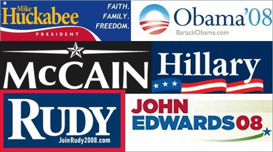
Hillary’s and Huckabee’s are almost identical.
11
posted on
01/28/2008 9:46:54 AM PST
by
Always Right
(Was it over when the Germans bombed Pearl Harbor?)
To: forkinsocket; Tax-chick
It does look a bit tourist agency, but I still kind of like it.
I think Huckabee’s is the worst. As they said, it’s cluttered, and it also varies too much from element to element. Looks very thrown together.
12
posted on
01/28/2008 9:48:00 AM PST
by
RosieCotton
(A place for everything and everything in its place - 2008 Resolution #1)
To: Some Fat Guy in L.A.
Graphic designer circle jerk alert!
To: forkinsocket
My question is Change from WHAT to WHAT? Has anyone ever asked any of these advocates for CHANGE, just exactly what they would like to change? That might give us a clue as to their intentions. Just change for change sake may NOT be in our best interests. It might be from democracy to socialism for all we know. It might be from self reliance, and the American spirit of the rugged individual to government dependency, more welfare, assimilation of illegals into our society. It's just something to think about.
14
posted on
01/28/2008 9:53:36 AM PST
by
rtbwood
To: Just another Joe
To: gunservative
If the writer of the article knew what they were talking about, they would know that McCain is in the typeface called Optima and it is a sans serif font. There is no such thing as an in between.
To: forkinsocket
Obviously, the default MS Word font changed the entire CBS News Organization!
-PJ
17
posted on
01/28/2008 10:00:36 AM PST
by
Political Junkie Too
(Repeal the 17th amendment -- it's the "Fairness Doctrine" for Congress!)
To: Long Island Pete
Actually, it might be Zapf Humanist Bold. (The joke being that they are pretty much the same typeface.)
18
posted on
01/28/2008 10:06:42 AM PST
by
Dr. Sivana
(Not a newbie, I just wanted a new screen name.)
To: forkinsocket
All of these logos look like they were generated in 8th grade detention using MS Word
Huckabee - We don’t need his first name; the swoosh wastes space
Obama - Looks like a box for a curative for hemorrhoids. Indecisive colors, lower case, lacks confidence. Web address looks like an afterthought
McCain - Optima typeface, very 1986. The star graphic lockup says ‘military’; black and white says MIA flag. Call Ross Perot, John
Hillary - Can’t say Clinton, 3 stars unfurling on a toiletpaper flag, which about sums up her view of the constitution
Rudy - Bold, Big R for Republican, if in name only.
Edwards - First name separates him from all the other Edwards who are running. Lopsided, waste of space, meaningless (green for AlGore?) swoosh and star.
Political advertising.
Yuck.
19
posted on
01/28/2008 10:06:55 AM PST
by
IncPen
(Elect Barack and it's an Obama-Nation !!)
To: forkinsocket
I wonder about the significance of the three stars and three stripes. A third term?
Perhaps it's the number of states that will be left in the Union after 4 years of Hillary.
20
posted on
01/28/2008 10:12:12 AM PST
by
Arkancide
(www.arkancide.com)
Navigation: use the links below to view more comments.
first 1-20, 21-37 next last
Disclaimer:
Opinions posted on Free Republic are those of the individual
posters and do not necessarily represent the opinion of Free Republic or its
management. All materials posted herein are protected by copyright law and the
exemption for fair use of copyrighted works.
FreeRepublic.com is powered by software copyright 2000-2008 John Robinson
