Free Republic
Browse · Search
News/Activism
Topics · Post Article

To: Enduring Freedom
from junkscience.com...

This is a temperature chart for Central Park, NY. It gets a lot of play in the press as a "common sense" proof of global warming, and comes right off the NASA climate site:

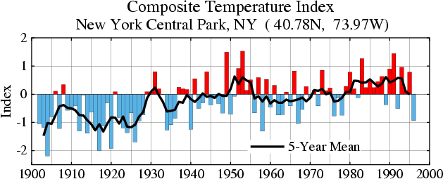
Now, lets ignore the fact that urbanization could be causing a local temperature increase that does not reflect a general climate trend. Lets, however, select our time frame a little differently. Lets take the whole data set, which goes back further, rather than this set chosen by activists to make their point. The same data over a longer trend looks like this:

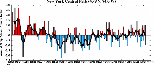
OOPS! Gee, I am not sure Central Park looks much warmer. In fact, you could argue it is cooler. Hmmmm. Ask yourself if you really think it was an accident that the year with the single lowest temperature in the middle of the second graph was used as the starting point for the first.

30 posted on 03/24/2007 6:15:12 AM PDT by Enduring Freedom (what does al qaeda and bush have in common? caves)
[ Post Reply | Private Reply | To 19 | View Replies ]


To: Enduring Freedom; palmer
The same data over a longer trend looks like this:

OOPS! Gee, I am not sure Central Park looks much warmer.

---<>---<>---<>---<>---

Neat! I never saw that expanded graphic! LOL...

160 posted on 03/24/2007 3:09:53 PM PDT by AFPhys ((.Praying for President Bush, our troops, their families, and all my American neighbors..))
[ Post Reply | Private Reply | To 30 | View Replies ]

Free Republic
Browse · Search
News/Activism
Topics · Post Article


FreeRepublic, LLC, PO BOX 9771, FRESNO, CA 93794
FreeRepublic.com is powered by software copyright 2000-2008 John Robinson