Skip to comments.
A room full of violence, and the silence of death: Tate unveils new Rothko Room
Telegraph.co.uk ^
| 05/06/2006
| John Banville
Posted on 05/08/2006 6:05:20 AM PDT by Republicanprofessor
As Tate Modern unveils its new Rothko Room, Booker Prize-winning novelist John Banville reveals the story behind the paintings it contains, and reflects on one of the most compelling experiences to be had in any gallery in the world.
In 1959, while travelling in southern Italy with his family and that of magazine editor, John Hurt Fischer, Mark Rothko discovered a surprising classical precursor to his contemporary art…
A room full of violence, and the silence of death (Filed: 06/05/2006)
As Tate Modern unveils its new Rothko Room, Booker Prize-winning novelist John Banville reveals the story behind the paintings it contains, and reflects on one of the most compelling experiences to be had in any gallery in the world
In 1959, while travelling in southern Italy with his family and that of magazine editor, John Hurt Fischer, Mark Rothko discovered a surprising classical precursor to his contemporary art…
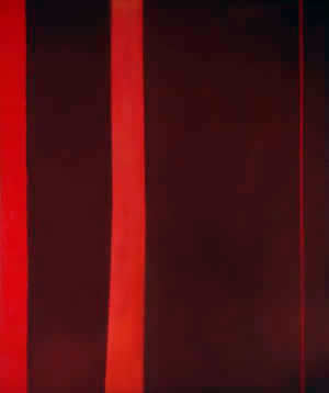
Red on Maroon (1959) by Mark Rothko, who said: 'I hope to paint something that will ruin the appetite of every son of a bitch who ever eats in that room'
On the journey down from Naples the party had fallen in with a couple of Italian youths who offered to act as guides. At Paestum, where the odd-assorted little band picnicked at noon in the Temple of Hera, the young men expressed their curiosity as to the identity and occupations of the Americans. Fischer's daughter, who was acting as interpreter, turned to Rothko and said: "I have told them that you are an artist, and they ask whether you came here to paint the temples," to which c replied: "Tell them that I have been painting Greek temples all my life without knowing it."
The set of colossal canvases housed in Tate Modern's Rothko Room originated, as every art-aware schoolboy knows, in a commission for the Four Seasons restaurant in the Seagram Building on New York's Park Avenue. The commission, one of the more remarkable instances of incongruity in the history of art patronage, was for 600 square feet of mural-sized paintings to decorate the walls of the restaurant - "a place," according to Rothko, "where the richest bastards in New York will come to feed and show off " - although it is not clear if Rothko realised from the outset that his paintings were intended as a backdrop for fine dining. The architect Philip Johnson, who assisted Mies van der Rohe in the design of the building and who was chief commissioner of the Rothko murals, always insisted that the painter knew that they were to be hung in the restaurant.
Great art can be fitted into the oddest places - on a chapel ceiling, for instance, or in a millionaire's bathroom - but it does seem remarkably brave on Johnson's part to call on Rothko, one of the most uncompromising of the Abstract Expressionists (a label Rothko vigorously rejected), to soothe the savage breasts of New York's richest bastards and their mates.
Rothko himself was straightforward, at least in private, about his motives in taking on the Seagram commission. He told John Fischer: "I accepted this assignment as a challenge, with strictly malicious intentions. I hope to paint something that will ruin the appetite of every son of a bitch who ever eats in that room. If the restaurant would refuse to put up my murals, that would be the ultimate compliment. But they won't. People can stand anything these days."
Back in New York, Rothko and his wife went to dinner at the Four Seasons, and in the spring of the following year he returned Seagram's $35,000 fee and withdrew from the commission. One supposes that his experience that night of the restaurant and its rich and powerful diners turned his artistic stomach. Eventually, he decided instead to donate the paintings to Tate.
This transaction was also to prove fraught, for Rothko, despite, or, as is more likely, because of the great critical and commercial success that had come to him in the 1950s, tended to detect slights and veiled insults at every turn. After a visit to London in 1966 to discuss "the gift of some of my pictures to the Tate", he wrote in icy fury to Norman Reid, the Tate director: "Your complete personal neglect of my presence in London, and your failure to provide adequate opportunities for these discussions, poses for me the following question: Was this simply a typical demonstration of traditional English hospitality, or was it your way of indicating to me that you were no longer interested in these negotiations?" Reid himself said that he had been waiting for Rothko to approach him, worrying that otherwise he might put off the notoriously prickly artist by seeming too eager.
Compression: rehanging Tate Modern's new Rothko Room
In the end, as we know, artistic feathers were smoothed and the Rothko Room opened at Tate in 1970. Rothko knew exactly in what way he wanted the pictures hung and lit. In a list of "suggestions" to the Whitechapel Gallery for a 1961 show of his work, he had stipulated how the walls should be coloured - "off-white with umber and warmed by a little red" - and said the pictures should be hung "as close to the floor as possible, ideally no more than six inches above it" in a room with ordinary daylight, since it was in daylight that they were painted. As we can see in the Rothko Room, the Tate Gallery and now Tate Modern followed these instructions to the last detail.
The room is one of the strangest, most compelling and entirely alarming experiences to be had in any gallery anywhere. What strikes one on first entering is the nature of the silence, suspended in this shadowed vault like the silence of death itself - not a death after illness or old age, but at the end of some terrible act of sacrifice and atonement. In the dimness the paintings appear at first fuzzy, and move inside themselves in eerie stealth: dark pillars shimmer, apertures seem to slide open, shadowed doorways gape, giving on to depthless interiors.
Gradually, as the eye adjusts to the space's greyish lighting - itself a kind of masterwork - the colours seep up through the canvas like new blood through a bandage in which old blood has already dried. The violence of these images is hardly tolerable - as Rilke has it: "Beauty's nothing/ but beginning of Terror we're still just able to bear."
Here we are in the presence not of religion, but of something at once primordial and all too contemporary. On a notecard from the 1950s, Rothko had written, in his usual clotted style that yet makes his meaning entirely clear:
"When I say that my paintings are Western, what I mean is that they seek the concretization of no state that is without the limits of western reason, no esoteric, extra-sensory or divine attributes to be achieved by prayer & terror. Those who can claim that these [limits] are exceeded are exhibiting self-imposed limitations as to the tensile limits of the imagination within those limits. In other words, that there is no yearning in these paintings for Paradise, or divination. On the contrary they are deeply involved in the possibility of ordinary humanity."
In a way, the murals would have suited the Four Seasons, one of those modern-day temples and Houses of Mysteries where the sons of man - and sons of bitches - feed daily upon the blood sacrifice of their own ferocious, worldly triumphs.
TOPICS: Culture/Society
KEYWORDS: art; modernart; rothko; seagrams; tate
Navigation: use the links below to view more comments.
first previous 1-20 ... 61-80, 81-100, 101-120 ... 141-150 next last
To: atlaw
I would go so far as to say that expanding visual associations on repeated viewings is what sets apart the successful work from the poseur. Well said.
To: Republicanprofessor; atlaw
I guess, to be fair, I'll have to go and actually see some of the guy's work in RL. For the moment, I'm accepting some purely abstract sculpture and architecture as "great," but not purely abstract drawings and paintings. I do think the greatness has to be present in the actual work, not just the emotions that went into its making.
I'm sufficiently convinced that Rothko and Pollock were not poseurs! Whether their stuff is great or not is the question for me. But I agree that time is the test.
However, I believe that people can find expanding visual associations in some of this art more because of what they find within their own minds than because of what is actually in the art. For this reason, I don't think I accept such a thing as expanding visual association as a valid means of separating the work of poseurs from the work of the greats. People are told to *find* something in the art, so they do. Only it is in themselves.
82
posted on
05/08/2006 9:53:29 AM PDT
by
Sam Cree
(Delicacy, precision, force)
To: Republicanprofessor
Artists don't always write well about their work. That doesn't necessarily detract from the art, however. But it's de riguer. Frankly, I think the more pretentious and obfuscating the commentary, the more contentless the actual art is. When an artist needs to explain his art using verbiage that looks like it was lifted from a PhD. thesis in Ethnic Studies, you know it's just density for the purpose of obscurity.
Barnett's stuff is just bad copies of bad art by Rothko. You can argue about how well their respective techniques handle edge blending, but when it gets down to brass tacks, they both just painted blocks of color on rectangles. It isn't deep, profound, or spiritual; it's just geometry and color.
83
posted on
05/08/2006 9:57:48 AM PDT
by
LexBaird
(Tyrannosaurus Lex, unapologetic carnivore)
To: atlaw; Republicanprofessor
His rantings properly ignored, his work stands on its own and has a peculiar ability to work on the imagination. A visit to the Rothko Chapel in Houston, with its imposing silence, natural light, and wall covering murals that seem to open into galactic depths, will persuade you that your own commentary is both uninformed and ill-considered.Maybe Rothko wasn't so much as an easel and canvas painter and more as a creator of environments, or his work at least had tendencies in that direction. Getting the whole experience of a building or room may give much more than what one painting on a museum wall offers. What he and other abstractionists are "trying to say" may be closer to what people get from architecture or music than from literature or traditional canvas painting. If so, is this an indication of a fault in modernism, or in painting as a 20th or 21st century art?
84
posted on
05/08/2006 10:05:03 AM PDT
by
x
To: prion
By the way --
Someone -- I forget who -- once said that atonal music is very expressive; unfortunately, the only thing it can express is anxiety. I'm with you all the way on this one. I understand the exercise intellectually, but it is still deeply annoying.
85
posted on
05/08/2006 10:05:53 AM PDT
by
atlaw
To: atlaw
I see nothing in any of his work that would prevent it. At least none of the works he is known for. Perhaps when young he drew and painted actual things in a conventional manner and that I could not reproduce. But the blobs and smears why not?
86
posted on
05/08/2006 10:06:14 AM PDT
by
justshutupandtakeit
(If you believe ANYTHING in the Treason Media you are a fool.)
To: LexBaird

Newman, Rothko respectively.
I tried to find similar pieces. I really do feel more power before an original Rothko than before a Newman. Perhaps Newman reproduces better on line and Rothko worse on line, thus leveling the playing field. I say this because Newman's work is often very flat in the background, but I think the pixels on line tend to make the works look more subtle and less flat. And the reverse is true of Rothko.
http://images.google.com/images?hl=en&lr=&q=+site:www.georgetown.edu+Rothko
That is a good link to see the variety of colors and composition in Rothko (vs. Newman).
Although there was a famous anecdote about Franz Kline discussing Newman's solo show with a furious collector. The upshot is that the number of "zips" (i.e. stripes), colors, directions, sizes, etc. were more varied than one might expect.
To: PBRSTREETGANG
No it's not JUST you. This is some of the most boring cr...... stuff I have ever seen. And yes, I have seen it in person.
88
posted on
05/08/2006 10:17:23 AM PDT
by
Ditter
To: D-Chivas
If you had any knowledge of Rothko's history, you wouldn't make such asinine comments. If you had no knowledge of his history, you would see how empty and meaningless his work is without it. It only has content because critics and art historians have imbued it with Rothko's personal angst. Without that, it doesn't stand on it's own.
It's just blocks of color, done repetitively. Like Jack Nickolsen's character in The Shining typed "all work and no play make jack a dull boy", over and over. In itself, and without knowing that it was created by a madman, the words have no value. So also with Rothko's works.
89
posted on
05/08/2006 10:17:40 AM PDT
by
LexBaird
(Tyrannosaurus Lex, unapologetic carnivore)
To: LexBaird
If you had no knowledge of his history, you would see how empty and meaningless his work is without it. It only has content because critics and art historians have imbued it with Rothko's personal angst. Without that, it doesn't stand on it's own. It's just blocks of color, done repetitively. Like Jack Nickolsen's character in The Shining typed "all work and no play make jack a dull boy", over and over. In itself, and without knowing that it was created by a madman, the words have no value. So also with Rothko's works. Well, that's it then. You're right and I'm wrong. Feel free to burn all the Rothkos because you hate them. Yawn.
90
posted on
05/08/2006 10:21:24 AM PDT
by
D-Chivas
To: justshutupandtakeit
Give it a shot. Not just a copy of a Rothko, although that would be difficult enough, but your own original, abstract work on the scale of Rothko.
This standard refrain ("its just blobs and smears that I could do") is often repeated, but I have yet to see it actually acted upon (then again, maybe it has been acted upon, and the embarrassed critic burned the result after realizing the folly of his pretension).
However, I suspect you haven't really spent any time viewing Rothko's work, and consequently don't know his rather extraordinary use of color (sometimes inexplicable in its execution and effect), and the perspectives and peripheral imagery he created using gradations that change in shape and intensity depending on the light (which is why his work is best viewed in natural light that itself changes in intensity through the course of a day and indeed a season).
It might be a good idea to spend some time studying what you so blithely claim to be capable of reproducing before you commence with your project.
91
posted on
05/08/2006 10:25:08 AM PDT
by
atlaw
To: LexBaird
It's just blocks of color, done repetitively. Perhaps with Newman, you might be able to say that about his zips. But I have never seen two identical Rothkos.
Challenge: find two Rothkos that are EXACTLY alike, and I'll concede you your point that he did just repeat himself. Hit Google, Image, Rothko and see what you get.
To: Your Nightmare
Maybe the artist wasn't making the piece for others, but for himself (and he was probably aware of his own history). That isn't art. That is masturbation. Art is communication.
93
posted on
05/08/2006 10:31:33 AM PDT
by
LexBaird
(Tyrannosaurus Lex, unapologetic carnivore)
To: Republicanprofessor
Rothko's work really can't be photographically reproduced. It is almost entirely dependent on color gradations that seep through like pentimento under varying lighting conditions, and the pigments, layering, and multiple levels of color fail entirely in photographic reproduction.
94
posted on
05/08/2006 10:33:02 AM PDT
by
atlaw
To: Republicanprofessor
I also much prefer the Rothko to the Newman in post 87. OTOH, the Rothko looks pretty much like something you'd see in a body shop where some spot priming is being done, or where the spray gun is being cleaned. I used to run a sign shop, I once took a picture of the back wall where the brushes were cleaned every evening - the drips and spatters were very pretty on some days, especially when we had used purple! *Juxtaposed* with the spigot and nearby tall grass, it was almost artistic! Not great art, though, and fact not even art at all, since it was not put there on purpose.
95
posted on
05/08/2006 10:34:55 AM PDT
by
Sam Cree
(Delicacy, precision, force)
To: Drawsing
Well said! I remember an old saying from art school. "If you can't make it good, make it big. If you can't make it big make it red." Apparently Rothko decided to make it big and red.
96
posted on
05/08/2006 10:40:07 AM PDT
by
Ditter
To: LexBaird
Art is communication.
Really? Says who? And what and how is the artist suppose to communicate? If he's sad is he just to write "I am sad" on the canvas. If he's happy - a big smiley face? What if his understanding of happiness is different from yours? Should he portray his understanding, or yours?
To: LexBaird
You might try some Kinkades. I hear they go well with "sunset gold" wall paint and knotty pine dining room suites.
98
posted on
05/08/2006 10:41:21 AM PDT
by
atlaw
To: x
If so, is this an indication of a fault in modernism, or in painting as a 20th or 21st century art? Actually, I would view it as a continuation of a long association between visual arts and architecture. Much of Rothko's work is inseparable from the viewing space (and much of it suffers greatly when lodged in certain spaces or improperly lit), but this has been true of many paintings, and especially sculptures, which were intended to enhance or be viewed in conjunction with specific architectural settings (churches, public squares and buildings, private and public landscapes, etc.).
99
posted on
05/08/2006 10:50:12 AM PDT
by
atlaw
To: atlaw
You might try some Kinkades. I hear they go well with "sunset gold" wall paint and knotty pine dining room suites.
DAMN!!! I have oak! And I really wanted a Kinkade (the Painter of Light). He makes me feel all warm and fuzzy inside and we all know art should make you feel warm and fuzzy.
Any ideas for "art" that goes with oak?
Navigation: use the links below to view more comments.
first previous 1-20 ... 61-80, 81-100, 101-120 ... 141-150 next last
Disclaimer:
Opinions posted on Free Republic are those of the individual
posters and do not necessarily represent the opinion of Free Republic or its
management. All materials posted herein are protected by copyright law and the
exemption for fair use of copyrighted works.
FreeRepublic.com is powered by software copyright 2000-2008 John Robinson