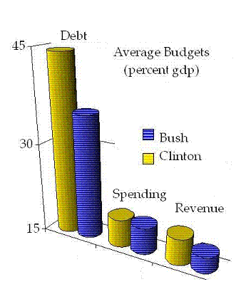
You did, and I erred by trying to go too fast. Give me another chance and I promise to hold back a bit. Deficits being difference between spending and revenue, had to be estimated using the graph. Then again, the graph did show how even when the average deficit went up from Clinton to GW Bush, the debt went down.
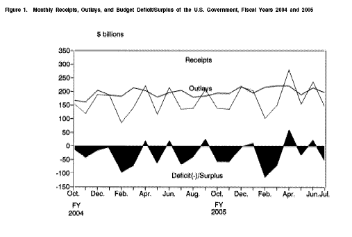 |
Just to show how my heart's in the right place, here's a deficit graph from the Treasury Dept. report that the Market Watch article was featuring.
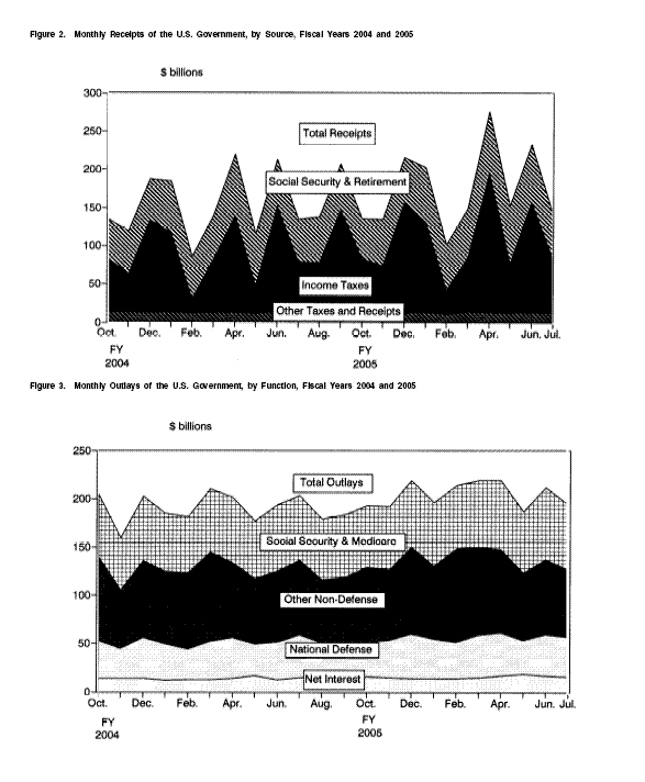
Also, check out revenue and spending (click here). What impressed me is how much better off we'll be once we chuck that stupid Social Security. I don't remember the Union Democrats pushing that solution.