The rest of this page was posted on another thread, but it has been updated since then.
Posted on 09/10/2004 2:10:04 AM PDT by VisualizeSmallerGovernment
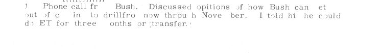
update: I dragged my Executive up from the basement, it's not working too well...but I did type some of the 19 may 72 memo. It doesn't fit on the page using a real vintage proportional spacing typewriter...and it looks different.
(Excerpt) Read more at selectric.org ...
The rest of this page was posted on another thread, but it has been updated since then.
lol way to many hits
http://www.selectric.org/selectric/index.html
Sorry, but due to excessive hits, this page is temporarily out of service.
Please check back after the election.
For those who want my opinion...the documents appear to be done in Word, and then copied repeatedly to make them "fuzzy". They use features that were not available on office typewriters the 1970s, specifically the combination of proportional spacing with superscript font. The IBM Executive has proportional spacing, but used fixed type bars. The Selectric has changeable type elements, but fixed spacing (some models could be selected at 10 or 12 pitch, but that's all). The Selectric Composer was not an office typewriter, but apparently did use proportional spacing. These were very expensive machines, used by printing offices, not administrative offices.
Here are scans of the Courier 12 font, and the Prestige Elite 72 font. Both were commonly used, and are sort of close to the font in the documents, but not quite. Notice that they are not proportionally spaced, so the typing looks very different from that on the memos. There is a superscript available for numbers, as used with footnotes, on the Symbol type balls. These balls were generally used for academics, such as preparing scientific and mathematical papers. I can find no "th" superscript in any of the IBM literature I have.
These are scans from a mid-1970s IBM Selectric Typewriter Type Styles brochure, IBM publication G542-0053-7, which does not appear to be explicitly copywrited.
update: I dragged my Executive up from the basement, it's not working too well...but I did type some of the 19 may 72 memo. It doesn't fit on the page using a real vintage proportional spacing typewriter...and it looks different.
At least my low opinion of TV news remains intact.
They (Dems) can get some of their crap by, but they can't think of everything. The Clinton era stuff commonly had little inconsistencies or flaws, too.
Part of the power of Free Republic is the wide range of fields represented here (with that huge collective experience/knowledge base) and conglameration of raw, cooperative intelligence found here when we are in attack mode.....
Absolutely. Back in the Paleolithic Era, frequent hyphenization was common in typed documents, and a typist was always mentally calculating which upcoming words could be hyphenated.
Large spaces at the end of a line were considered bad form, so hyphenating words was common.
I can't believe how quickly this story took hold. 'We have the technology'

You don't need a copier to make them fuzzy. Photoshop filters get the job done- including the distortion of the letters.
Have you ever tried to center proportional font on a manual typewriter? I'd rather poke out my own eyes with a stick.
Beg to differ. All you need is a Word processor to type out what you want, a printer to print the word processor document, a scanner to scan in the printed document, and image editor with proper filters and plug-ins to make the scanned image seem like it's aged over time typed from a typewriter.
I used IBM Selectric typewriters in Typing I and II in high school in the early 1980's, and no matter how hard I would try, it would never come out center proportioned, whether I used the 10 pica or 12 pica typeset. It would never come out center proportioned, but nonetheless it would be centered on the page.
Someone brought up the differences between what a typed document would look like ...
Another really interesting tidbit that someone else brought up on another thread was that double spacing at the end of a sentence was ''the Rule'' at the time the so-called ''documents'' were supposedly created vs. the current single-space at the end of a sentence. The example in Post #1 clearly demonstrates the double-space. OTOH, the ''documents'' certainly appear to be single spaced. I can vouch for the double space practice because that is what I was taught when I learned to type in HS in the late sixties.
Alrighty, Mister. Just what have you been up to lately?
This whole story is just so juicy! I got excited at the possiblity of JFK's medal paperwork being forged, but this is a 100 times better.
I hadn't thought of that, but you are right. The single end of sentence space is a more modern affectation. BRavo!
I still use a Selectric. I have a SelectricI bought from the DOD in the late 1980's. People are saying some high end typewriters could do some of these things in the '70's but it sure wasn't the DOD's. I was shocked when I went to my first goverment auction at how ancient the equiptment was.
 I can vouch for the double space practice because that is what I was taught when I learned to type in HS in the late sixties.
 That's not standard any more? I still do that (and just did).
You can't see it ... it's Selectric! Boogie-woogie-woogie-woogie!
Re double spacing at the end of a sentence. I still do it, that is when I write in complete sentences which is rare on FR. Am I dating myself. As I type this now I am unsure. Did anyone else love typing in high school? I mourned the loss of typewriter and to find one now is almost impossible. I had a Royal,,,
That's not standard any more? I still do that (and just did).
Not anymore. Old habits die hard...I still dbl. space, too, but I think that most word processing programs change it automatically to single space. I didn't realize that it had changed either til I went back to school in the late '90's.
Is somenone looking at the Kerry citations as we speak? That would be huge! I think I am single spacing at the end of the sentence. Mrs. Graves, my typing teacher, would be in shock but she is long dead. This story is having wonderful de ja vous for me.
It was printed out and rescanned. There are slight differences between the typed font and the printed font, such as the superscripting. On-screen, the superscripting is set a bit lower than the final printed superscript.
Disclaimer: Opinions posted on Free Republic are those of the individual posters and do not necessarily represent the opinion of Free Republic or its management. All materials posted herein are protected by copyright law and the exemption for fair use of copyrighted works.