To: SunkenCiv
No discussion about the medieval times, particularly events that are "erased" from history, is complete without talking about how the political control of "science" has erased the medieval warm period. It's part of their way of making us think the Modern Warm Period is somehow new.
Until the 1990's they (including NASA) used to produce graphs like this showing the Modern Warm Period in context with the Medieval, Roman, and Minoan Warm Periods. If you love history, research what life was like in the warm periods with higher crop yields, more predictable rain patterns and less deaths by plague. Then contrast it with life in the cool periods (opposite on crops, etc.) and how many atrocities were committed during those periods as many, many nations/tribes got desperate for survival (and more willing to do bad things to others).
After Clinton/Gore started requiring the desired results for "researches" to receive funding, global warming charts look like this (with virtually no ups and downs for thousands of years):

7 posted on
08/25/2023 1:51:55 PM PDT by
Tell It Right
(1st Thessalonians 5:21 -- Put everything to the test, hold fast to that which is true.)
To: Tell It Right
Not content with mere cherry picking, they have descended to outright fabrication. Today’s climate data is as believable as 2020 election numbers.
8 posted on
08/25/2023 2:02:52 PM PDT by
ComputerGuy
(Heavily-medicated for your protection)
To: Tell It Right; SunkenCiv
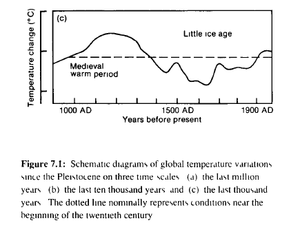
Figure 7.1 is taken from Climate Change:
The IPCC Scientific Assessment (1990) Chapter 7: Observed Climate Variations and Change.
Over the last two million years, glacial-interglacial cycles have occurred on a time scale of 100,000 years, with large changes in ice volume and sea level. During this time, average global surface temperatures appear to have varied by about 5-7°C. Since the end of the last ice age, about 10,000 BP, globally averaged surface temperatures have fluctuated over a range of up to 2°C on time scales of centuries or more. Such fluctuations include the Holocene Optimum around 5,000-6,000 years ago. the shorter Medieval Warm Period around 1000 AD (which may not have been global) and the Little Ice Age which ended only in the middle to late nineteenth century. Details are often poorly known because palaeo-climatic data are frequently sparse.
https://archive.ipcc.ch/ipccreports/far/wg_I/ipcc_far_wg_I_chapter_07.pdf
Those were the days...
9 posted on
08/26/2023 12:29:49 AM PDT by
AdmSmith
(GCTGATATGTCTATGATTACTCAT)
FreeRepublic.com is powered by software copyright 2000-2008 John Robinson