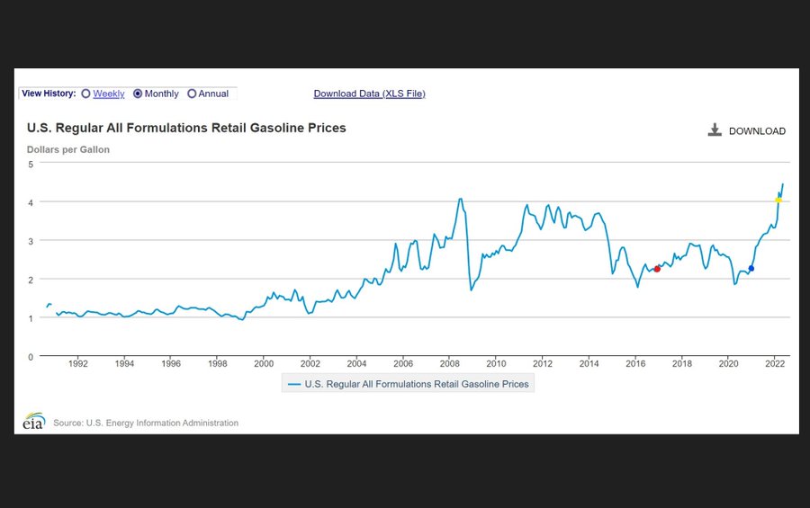
Red dot = When Trump took office
Blue dot = When Biden took office
Yellow dot = When Putin invaded Ukraine https://t.co/8UQBjcDodq pic.twitter.com/lvFBpCTYVz— Ryan Saavedra (@RealSaavedra) June 22, 2022
Red dot = When Trump took office
Blue dot = When Biden took office
Yellow dot = When Putin invaded Ukraine https://t.co/8UQBjcDodq pic.twitter.com/lvFBpCTYVz— Ryan Saavedra (@RealSaavedra) June 22, 2022
Great graph. I’m saving it.
That’s why nobody is buying the “Putin Price Hike” nonsense. Gas was already skyrocketing long before the Russian invasion and everybody knows it.