Posted on 10/17/2020 11:25:29 AM PDT by Kaslin

Since the overwhelming majority of Americans have proven time and time again that they prefer traditional architecture, why do government agencies force ugly buildings on the American people?
A new study finds 72 percent of Americans prefer traditional architecture for U.S. courthouses and federal office buildings, including majorities across political, racial, sex, and socioeconomic categories. The survey was conducted by The Harris Poll on behalf of National Civic Art Society and polled more than 2,000 U.S. adults.
These findings come in light of the possibility of a Trump administration executive order, appropriately named Make Federal Buildings Beautiful Again, that would require that new office buildings in Washington, D.C. be classical in design. Among other things, the order would revise the 1962 “Guiding Principles for Federal Architecture,” which forced modernism to be the official government building style. In response to the leak of the potential order, a bill entitled the “Democracy in Design Act” was proposed by House Democrats to overturn it.
However, based on the study, it appears Trump’s potential executive order would be happily received by a majority of Americans, with traditional architecture the clear winner for all demographic groups, including sex, age, geographic region, household income, education, race/ethnicity, and political party affiliations.
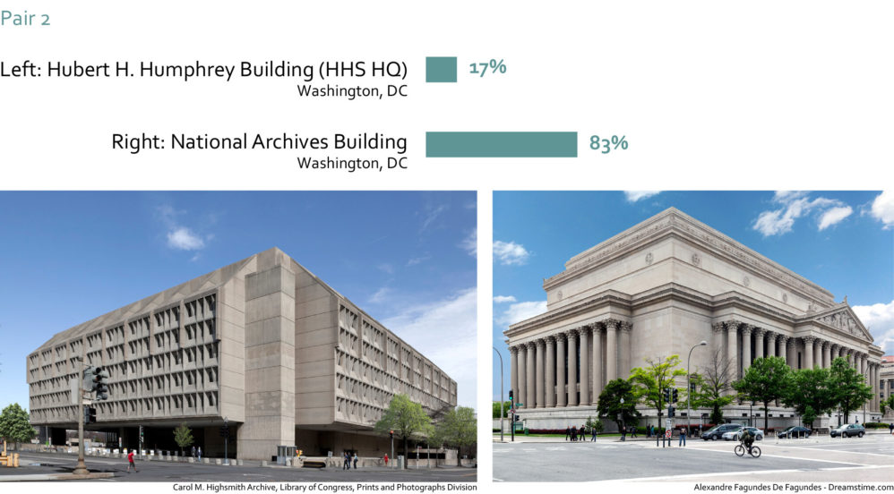
The study showed participants seven pairs of images depicting U.S. courthouses and federal office buildings. Each pair presented one building in a traditional style and one building in a modern style. For each pair, the survey question was: “Which of these two buildings would you prefer for a U.S. courthouse or federal office building?”
The selected images were edited to ensure fair comparisons. Factors such as sky color, angle of photo, light conditions, distance from building, weather conditions, and the like were all controlled either perfectly (e.g., sky color) or as perfect as possible via “careful photo selection and editing.”
Below is an example of one of the survey’s image pairings:

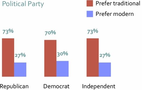
The resounding preference for traditional design was soundly bipartisan, being favored by 73 percent of Republicans, 70 percent of Democrats, and 73 percent of independents.

Preference for traditional architecture is shared across generations, being the top choice of 77 percent of those aged 65 or older, and 68 percent of those aged 18-34.

Both men and women prefer traditional architecture, but women are more likely than men to want U.S. courthouses and federal office buildings to be traditional, at 77 percent versus 67 percent, respectively.
My favorite scene from Hannah and her sisters is Woody Allen’s comment on the architecture in New York with an obvious statement regarding modern architecture:
https://m.youtube.com/watch?v=VPzGI26Sivw#searching
Because it is a Communist goal to replace all aesthetic beauty with ugliness. It is all part of a plan to demoralize the American people.
Sort of. But in comparison to what today's post-modernist "starchitects" are doing, the brutalism of the 1960s and 1970s seems drab and functional. Architects then may have thought that they were being daring and path-breaking, but their stuff doesn't impress at all now.
I think so as well. I saw a documentary on FLW which said he thought his building was better than anything hung on it’s walls.
It wouldn’t take much.

On the other hand London is still full of those awful 60s buildings, no imagination at all, just square blocks.
I think “Modern” is just a style that succeeded more classic architecture. I’ve noticed the segmenting of modern into sub periods and styles (ie. mid-century modern).
I see it most obviously on college campuses.
Some time between the early 1930s and the late 1940s, Americans went from building strong, beautiful buildings of stone and slate on the exterior, with wood finishings and interiors, to ugly cement / steel boxes with nondescript and ugly interiors.
It is like a switch was flipped. No doubt the ideology and morality of the country began to flip at that time as well.
Construction quality went down when slavery ended.
 it's not architecture, it has no esthetic value, it is simply construction
Frank wanted his buildings to be part of it’s surroundings, and make use of the native, local materials as much as possible.
Falling Water is a good example of that philosophy.

We did the tour there a few years back, it’s...different.
I have nothing against Canada, but I find this to an extreme there. I was in Montreal recently. Anything outside the city center is cheap box architecture, with a few cheesy “modern" adornments. Its soviet architecture softened slightly for a mass-marketing and commercial purpose. America has the same, but they are further down the soul-destroying path of post-modernism and phony collectivist- materialism than we are.
One of my colonial ancestors built a house in New England that is still standing, in great shape, and sadly not for sale. It’s beautiful. I’d live in that in a heartbeat.
That said, I will still put in a plug for my favorite movie discovery of recent years: Columbus (Kogonada, 2017). The film is not "about" architecture, exactly, but it uses the modernist architecture of Columbus, Indiana to great effect. An architectural exploration becomes an important narrative prop in an unlikely emergent friendship (John Cho and Haley Lu Richardson, both excellent), and modernism becomes a metaphor. It is very well done. The film itself is an exploration of family, loss, loneliness, relationships and moving on. It is contemplative; there are no zombies, aliens, explosions, terrorists, sex scenes or car chases, and nobody dies. It is brilliantly acted and beautifully shot. It starts very quietly and builds; give it 15 minutes for the story to come to you, and you will be hooked.
The Columbus architecture story is worth knowing. J. Irwin Miller was for many years president and then chairman of Cummins, a big company that stayed home in Columbus, Indiana. Somewhere along the line, Miller got interested in modernist architecture. Under his guidance, the Cummins Foundation offered to pay the architectural fees for any Columbus institution willing to invest in a prestige building designed by an architect drawn from an approved list. As a result, Columbus has an astonishing collection of buildings designed by the top modernist architects of the mid-20th century. I had the opportunity to drive through Columbus earlier this year. The modernist buildings there are moderately scaled, in a way that is appropriate for a smaller, low-density midwestern city. At this scale, good landscaping makes a big difference and they blend very nicely with their more traditionist neighbors. (The biggest and ugliest modernist building, not surprisingly, is a school, which the film mocks as "brutal.") Anyone who wants to hate on modernist architecture should visit Columbus and see what can be achieved if done right. At larger scales, however, massive concrete, steel and glass buildings that can't be balanced by landscaping turn me off.
That building, the Guggenheim, is not only hideous, its interior is vertigo-inducing as you walk the tilted corridors, and the curves were made without benefit of modern computer imaging and have gross imperfections. It is a blot on the landscape outside as well.
Disclaimer: Opinions posted on Free Republic are those of the individual posters and do not necessarily represent the opinion of Free Republic or its management. All materials posted herein are protected by copyright law and the exemption for fair use of copyrighted works.