The painting likely looks more like this:
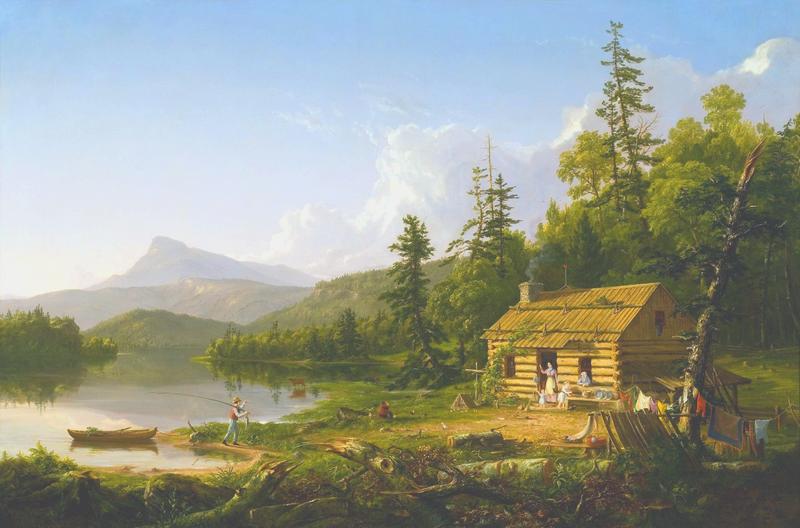
The painting likely looks more like this:
I don't think the original did or does look like that, although I understand why you would think it did. You probably used "auto tone" and "auto color" which adjusted the levels. That's reasonable, assuming Cole did not intend to produce a certain mood with unbalanced tones.
I am very familiar with Cole's paintings "The Voyage of Life" at the National Gallery of Art. Their dramatic and moody tone and their hues very closely resembles the first illustration and not at all yours. What's more, look at the magenta noise in the blue sky and clouds of your retouching. That's what often happens when PhotoShop tries to remove an aged varnish from an old painting through level adjustment, you get disbursed brown, yellow or magenta noise.