.jpg)
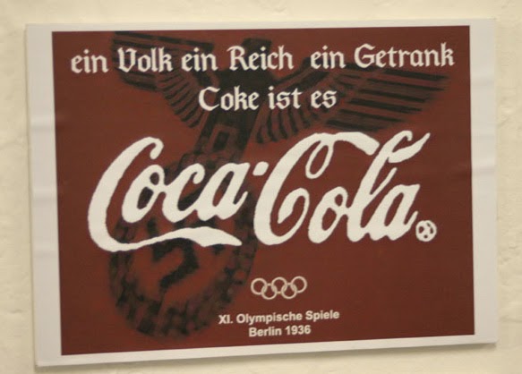
There are other "German" Coca-Cola "ads" at the jump but this is the only image with a swastika.
The Coca-Cola logo/font is very rough. The copyright/trademark notice after it is blurred beyond recognition (and too large for the font on that poster).
The bottom font looks like a Swiss/Helvetica font which I though was more of a post-war European thing.
The whole design looks "off" (the olympic rings in that usage seem more of a post-70s thing).