
Posted on 10/30/2005 10:52:11 AM PST by Republicanprofessor
Art Appreciation/Education: Visit to NY III: Elizabeth Murray: Return to Color and Energy
This is one of the great retrospective shows of the year. And I was lucky. Due to great kindness on the part of members, whom I had just met at lunch at the Museum of Modern Art Café, I was able to get a member’s guest pass to see the retrospective of Elizabeth Murray. I knew her work; I loved her work; I had written about her work for various academic papers and conferences. In fact, I was attending such a conference in NYC, and if I had not gotten in to see the show then, I would have missed it. The Murray retrospective is a wonderful show, with a return to solid form and color that dwarfs the still-popular (and negative) Postmodernism. Perhaps her energy and lively power will bring a resurgence of decent art back to the art world.


Elizabeth Murray at a panel discussion on work after 9/11
You don’t know Elizabeth Murray’s work? She was born in 1940 in Chicago. She grew up in a small Midwestern town and later returned to the Art Institute of Chicago to study art. Her graduate was done at Mills College in California. Her first works are in a minimalist vein, but some show the influence of Cezanne and the portrait of his wife in an armchair. These minimal works are not her best; she has not yet hit her stride. But they do show in inclination for strong shapes that will continue in her work. There is one humorous painting called Mme Cezanne in a Rocking Chair, for which I could find no images online. The blues in this are brighter than some of her more minimalist works of the time and look ahead to the bright colors to come.
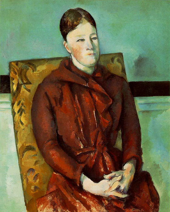
Murray has been influenced by past masters. But instead of quoting them in the clever, non-related ways of postmodernists, she absorbs these influences and builds upon them. Her influences include Cezanne, Braque, Picasso, Miro and even Walt Disney (especially his image of Tweety Bird, which can be seen in many incarnations in her work). This is one of the Mme. Cezanne paintings that may have inspired the one I mentioned above, as well as Cezanne’s still lifes which, by defying gravity, might also have inspired her lively still lifes.


Paul Cezanne’s Mme Cezanne in a Yellow Chair 1888-90 and a still life by him
In Heart and Mind from 1981, Murray takes the angular blue mind and places it in a curved background, with the reverse done with the warm “heart” image. The mind seems like lightening, sparking the curves of the heart. Can you see what this means? We have the rational and emotional aspects of life intermingling and inter-inspiring; the yin and yang of life. She is using what will become her typical shaped canvas. In time, she will work out these complex shapes in clay and then have assistants build the wooden canvas structures upon which she will paint.

Yikes from 1982 is inspired by the cubist landscapes (and dull analytic colors) of Braque and Picasso. Yet it is also a coffee cup, from which steam rises in finger-like shapes. The negative shape framed by the two parts of the canvas is reminiscent of parts of a heart. These multiple levels of meaning are common in great abstraction. Murray did this painting and another similar coffee-cup like image, called Just in Time when she was falling in love with her second husband. To me, they remind me of talking over coffee. Her work is quintessentially domestic, with her own personal perspective. This is not the traditional life of woman, but the life of a woman pushing the limits. And here we see inferred the importance of communication in relationships. 

Murray’s Yikes from 1982 and the influence of Braque’s first cubist works at L’Estaque from 1908
In Sail Baby, below, from the mid-1980s (and not in the MoMA show), she is thinking of a coffee cup and also a paintbrush. But the three yellow figures are also reminiscent of children, and she later realized that they are like children awaiting a school bus. It wasn’t until later that she had the third child foreshadowed here. This is almost a prescient painting; and it almost goes without saying that her color and energy is almost childlike. There is, in fact, a buoyant energy in the entire show which is energizing for the viewers. She breathes a freshness and color into the show and into life that is a refreshing change from postmodern didacticism and hard-core, man-hating feminism seen in the works of Barbara Kruger and the “clever” (but empty) juxtapositions of David Salle.


Unfortunately, the Sail Baby image is very small. I cannot get the image to copy from the Walker Art Center site. But if you do a Google search, you can see a bigger image (even if I can't get it to this essay).
In More than you Know, below, from 1983, she was coming to terms with her mother’s death. This is another painting that works on many levels: the room in which her mother lay dying, the split heart-like chair, the grieving van Gogh- and Munch-like head, the letter that might even derive from Vermeer. The green table, to me, seems to be reaching out to know what happens to us after death. This is a very poignant image (and even more so if one has lost beloved family members). (This particular image is from the cover of her other great show at the Whitney Musuem, a catalogue I do recommend in addition to the MoMA catalogue of the current show.)

There are so many other great images of hers in the show. This one, however, is at the Metropolitan, called Terrifying Terrain from 1991. This title, and the quick-sand like appearance of the work, seems to be what it’s like to be a successful NYC artist. It is indeed a treacherous terrain. If you don’t do work which the gallery can sell, you may be dumped. And in her journal at the current MoMA show, there is a poignant image of a dream where she is snubbed by a socialite. (This just makes me glad that I don’t live in NY.)
.jpg)
The image below, Arm-Ear 1994, is not in the show but captures much of the rich imagery and energy of so many works in the show. On their webside, the Newark museum says: Murray evokes a tense home situation by making a chaotic abstraction in which are jumbled stairs, a chair, a chain for glasses, the sun, and the arm and ear of the title. The border of her painting undulates, the stairs are precariously slanted, and the surface heaves up, barely held down by a large screw. Murray makes paintings in an assured, almost bravura, style with imagery and subject matter that are traditionally thought to be the province of women.

One of my favorites in this MoMA retrospective is Popping Top from 1996, shown below. The colors are amazing in this huge work, which is well over six feet high. How can she create such an inspired work just from a mundane top? Yet she does, and it spins out in a deliciously brightly colored space. The drop of water in the center seems to pop right out, regardless of this rather flat canvas.
Murray’s work is best when the colors and shapes make the three dimensional space resound with energy. Sometimes she works too hard (I think) to create three-dimensional sculptures on the wall, which, when painted, seem a bit dead. Naturally, I can’t find a great example of this on line. And the image below, with Murray to the left, actually seems rather fun.

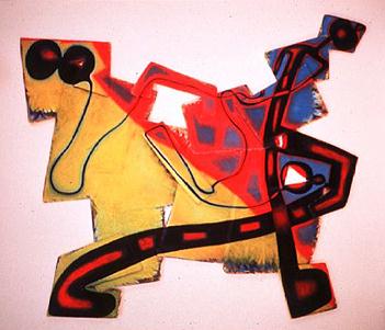
I am also less enthralled with her latest works. In November 2001, she was at a forum on the effects of 9/11, noting that despite her shock, that she was back in her studio and painting in earnest on 9/12. Yet I note that these later works seem rather slick and commercial; they lack her free-flowing energy and painterly flow of color from one part to the other. They are almost like jigsaw puzzles that don’t go together. Like Kandinsky’s later works, they seem more strictly designed. This is true, I think, of Bop, below, from 2002-3. These are fun but more superficial. Actually, I think they would be great designer wallpaper for a kid’s room. And although they have some energy of her earlier work, the color is flatter and less originally blended. Perhaps 9/11 did have an effect upon her after all: could she have closed up a bit and begun to play it more carefully rather than taking the risks we loved to see?

.jpg)
.jpg)
Murray’s Bop and two paintings by Kandinsky: early and late works.
But regardless of my opinions on some of her later works, I still see Murray as one of the essential painters of the end of the twentieth century. Although some may see her as one of the most important “woman painters” due to her restructuring of domestic and personal themes, I would see her as one of the great painters, period. I was hoping, as I saw her art and that of Oscar Bluemner at the Whitney, that perhaps the art world might return to form, color and content in abstraction (instead of clever, but ultimately empty, Postmodernism). But we’ll see.
http://www.artdaily.com/section/news/index.asp?int_sec=2&int_new=15284
This is a rather obtuse review from the Village Voice. Sometimes the critics get so convoluted I lose track of what they are saying. But I make reference to it for those who want as much breadth of opinion on Murray’s work as possible.
http://www.villagevoice.com/art/0543,saltz,69187,13.html
Art Appreciation/Education ping.
Let me know if you want on or off this list.
Also let me know if I have opened your eyes to her work. Do you like it? Why or why not? (Also, keep in mind that the images I post here convey maybe 3% of what the power is like when you see the show.)
Art ping.
Let Sam Cree or me know if you want on or off this list.
thanx for the ping
Do you know the title of that last Kandinsky work (with the bluish/purple background)?
Here's the website where I found it. It's in Spanish or Portuguese or something else I don't understand, and they just title it as Kandinsky.
http://images.google.com/imgres?imgurl=http://amoergosum.blogs.sapo.pt/arquivo/kandinsky-01X%2520(2).jpg&imgrefurl=http://amoergosum.blogs.sapo.pt/arquivo/2004_03.html&h=350&w=480&sz=55&tbnid=lWJ-0onNrwAJ:&tbnh=91&tbnw=126&hl=en&start=9&prev=/images%3Fq%3DKandinsky%26svnum%3D10%26hl%3Den%26lr%3D%26sa%3DN
I can guess that it was done while he was at the Bauhaus between the early twenties and 1933, when Hitler closed it down.
Maybe someone else can be of more help. Do you like it? I love Kandinsky's use of color as well as his creative energy.
Thank you for this contribution, I really enjoyed this. Her work is so playful and dynamic. Those colors must be really intense in real life.
I like Kandinsky. It's the first time I've seen that one, too. I like it a lot.
Thanx for the link, I'll see if I can find out more.
Glad you like the color! You'll have to try to see it in person (it travels next to Spain). (But such color is not what Rembrandt would have used; glad that Rembrandt_fan is not so limited!)
Kruger is more of a designer, but I guess that the points she wins as a feminist give her approval as an artist among the liberal art world. Yes, she makes some good points; but otherwise her work is not so deep. Salle's work is so poorly painted as well as so empty of meaning and so sexist; it's my favorite work to dislike.
Warhol's work does still hold up, especially suicide works and those works done with deeper content (despite his disavowal to the contrary).
Glad you enjoyed the post. The show was most inspiring.
Please include me on your ping list.
You are on both ping lists: regular Art Ping and then my (more special) Art Appreciation/Education list.
However, I confess that I did not have an updated ping list with me at my work for a couple of the most recent art pings. There were about a half-dozen of you that had been added recently.
I will try to rectify that now. Sorry.
Thank you. These threads would make an interesting book.
Book....well, I am in the process of working with a publisher on a book on explaining abstraction. Haven't gotten very far yet, but it will be fun when I have enough time to do it.
Disclaimer: Opinions posted on Free Republic are those of the individual posters and do not necessarily represent the opinion of Free Republic or its management. All materials posted herein are protected by copyright law and the exemption for fair use of copyrighted works.