
Posted on 08/22/2005 8:22:58 AM PDT by Republicanprofessor
It is now time to try to wrap up these small “lectures” on the history of art. Today is the tough day: Jackson Pollock, Mark Rothko, etc. I have to admit that I did not “get” these works until I was well within graduate school. For Pollock, it took the documentary by Hans Namuth in which I saw him painting. His work is not just a bunch of random splatters; instead, Pollock carefully dances around the canvas, and you can see the evidence of the “dance,” if you will, on the canvas. (This is the same time that Martha Graham is dancing, and the time of improvisation in jazz, to which Pollock listened a great deal.)


For Rothko, it took a visit to his retrospective at the NYC Guggenheim. At first my reaction was “oh no, this block guy.” But I wanted to see the architecture of the Guggenheim, so I walked to the top and studied the works on the way down. I was quite moved by the works, especially at the end, when his work became darker and darker. He was suffering from depression, and his dealer was ripping him off, and he ended up committing suicide, even before his chapel in Houston was complete.
Many of these artists died tragically: Pollock and David Smith, the sculptor, in drunk driving accidents; Rothko and Arshile Gorky committed suicide. It was a tragic but also a heroic time.
Now there are several ways to think about the visuals of these works, and their content. Yes, there is deep meaning in all of these works, much deeper than the works that follow them (in Pop Art and Minimal Art). Visually, these artists combine so much of what I’ve already discussed: the color and painterly brushwork (often seemingly messy) of the Expressionists (like Matisse, Kandinsky and the other German Expressionists); the broken planes and flat tensions of Cubism; and the reliance upon inner subjectivity, if not the direct dreams, of Surrealism.
In addition, these artists were reacting against the destruction of WWII. They were not very political, although many of them did come from somewhat socialist backgrounds (and many worked for the Federal Art Project of the Works Progress Administration). But one of their goals was to dive within themselves and to create art that would be understood by the world over, without a knowledge of Greek mythology, history or whatever narrative often controls the painting. They wanted to create a primitive, world-wide communication that would draw people together in understanding. (Now, I’m not saying they succeeded in being instantly understood. My father, who loved New England landscapes with white houses, red barns and mountains, would never have understood a Pollock, no matter how hard I tried.)

Now, can you see what Adolphe Gottlieb (1903-1974) is communicating in this basic pictograph? Can you see the male and female and other symbolic forms? The style is reminiscent of cave paintings, and the piece I wanted to show is called Male and Female, where the male is goggling at a well-endowed woman. Isn’t that a timeless theme? In his later works, his “burst” series, he created opposing circles that could represent heaven and earth, sun and ground, etc.

There are three groups of Abstract Expressionists: the gestural, the color-field and the combined styles. Gottlieb is often one of the latter, because he does use great, emotional gestures in the bottom figures, while his upper levels deal with pulsing colors.
Okay, time to move on to Pollock, (1912-1956). Pollock was also influenced by Carl Jung, a student of Freud, who developed the idea of the collective unconscious: that we all share certain basic, primeval feelings, ideas, dreams. Pollock was a patient of a Jungian psychologist and early in his life executed drawings for his therapy sessions. There is also an element of Existentialism in Abstract Expressionism. This is a pretty complex philosophy (which is not my specialty), but in its essence it has to do with making our own actions and thus our lives. We need not rely upon others, or use others for our excuses, thus complaining that “I wasn’t allowed to go to college” or other whining that doesn’t excuse our responsibility for our actions. In terms of painting, the large, powerful strokes exemplify Existentialist action.
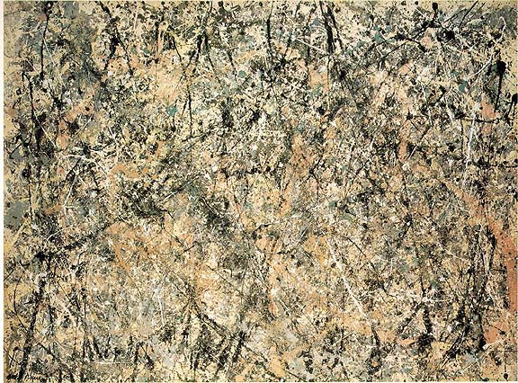
Pollock epitomized Action Painting. Now there is a great deal of art theory at this juncture; there is even competition between the theories of Harold Rosenberg and Clement Greenberg. But I will spare you those details. Meanwhile, check out Lavendar Mist and Autumn Rhythm from 1950.


Are these painting shallow or deep? As one can tell from the Namuth documentary and in the Ed Harris’ Pollock movie (which I highly recommend), Pollock he was “in” the work as he created it. He was thus into that other, “surreal” frame of mind as he created his works.
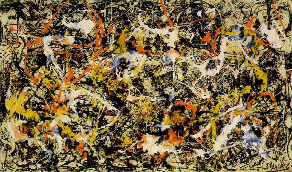
Also note that in his work, there is an obliteration of distinction between line and shape. For centuries, a line always outlined a form, but Kandinsky began to erase this distinction, and Pollock went even further. Find a strong drip, and note how it goes from a thick line into a shape and then back into a line again. These lines are also reminiscent of trees, capturing the energy and web-like quality if not realism per se. Pollock was very inspired by nature, especially after his move to Long Island.


A Kandinsky from the 1910’s and Pollock’s Convergence from the 1950’s. Note how Pollock took Kandinsky’s ideas a step further.
There is also a great tension or play of flat planes in Pollock’s work. I see the paintings as deep, but they can also be seen as simple flat planes layered upon each other. Clement Greenberg (the “Clem” in the movie) was the great critic of the age. He saw Pollock’s work as creating a new kind of oscillating depth. I like the way he phrased this, and Greenberg’s criticism in general has opened my mind a great deal for how to look at abstract paintings.
Pollock’s paintings can also be seen as showing both microscopic and macroscopic view. These are almost as abstract as looking through a microscope and seeing those textured vision of the world from above. One could say of Pollock that his abstract view is equivalent to how Einstein redefined the world in his abstract terms of relativity; (the only equation I know of Einstein is E=mc squared). Pollock is defining line and shape in new ways; he is also defining gesture in a new way. His paintings reflect his effort and gestures as he danced around the canvas and layered the paint.
Lavendar Mist from around 1950 was actually named by Clement Greenberg. I see it as similar to the mood of a foggy day with melted snow producing that fog. There is no actual lavender in it, but the other colors make it seem like a lavender mist. Many of Pollock’s works are like the late waterlilies of Monet. (Greenberg did not appreciate the late works by Monet, created in 1926, until after he had seen Pollock’s drip paintings from around 1950).


For the record, Pollock was an alcoholic, mostly because his father got him drunk while he was still a child (and before his father ran out and left the family). But Pollock was on the wagon for the two years, 1950-52, during which he painted his most famous drip works. The scene of when he went off the wagon, after Hans Namuth was filming him (in a seemingly artificial way), is well shown in Harris’ Pollock.
-painting-number2.jpg)
Franz Kline Painting no. 2 1954
The Abstract Expressionist whose use of gesture I first “got” is Franz Kline (1910-1962). He uses black and white paint with housepainter-sized brushes and large dynamic Existentialist brushstrokes. The white sometimes paints over the black “figure” confusing figure and ground. His work has a great deal of power (just try to paint his gestures yourself: you need a large, strong stroke to do so). Sometimes his works look like close-ups of bridges, cranes, etc. One also sees these paintings as a whole image all at once, not as small parts that make up a whole.
The last gestural painter that I need to mention is Willem de Kooning (1904-1997). The action of de Kooning’s brushstrokes are certainly the epitome of Action Painting. He creates painterly cubist abstractions, especially seen in the Woman paintings. For often his planes are flat, but there are very painterly edges. And his primitive quality comes from an old goddess, the Venus of Willendorf from about 15,000 B.C. which may have inspired his works.


Woman I 1950-52 shows a primeval image of woman as goddess (not as sex goddess by which women have been shown since Venetian painting of the 16th century). Note that she is strong and powerful, with what I see as “bowling ball breasts.” De Kooning saw these works as humorous, especially their smiles. It has always amused me that one of this series is in Iran; I’m sure it’s hidden in the basement of some museum, shrouded since the downfall of the shah.
The second main group of the Abstract Expressionists is the Color Field painters. Mark Rothko is certainly the best of these.


(Please note that with Rothko, a small image on a computer with (very) inexact colors is nothing like standing before the real painting. I am very dissatisfied with the reproductions available today for this “class.” Most of his works are quite moving in person. Other works reproduced today are also unsatisfactory; the large, life-size works are much more powerful in person.)
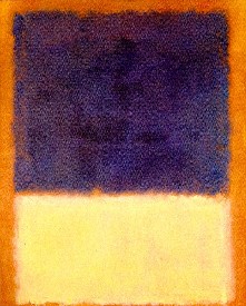
In the 1950s, Rothko wrote a short blurb about his works, with Gottlieb and others as co-authors. One thing that was stressed was that their works dealt with “tragic and timeless” forms, depicting moods of mythology without the literary story. Rothko’s mature works often show large black forms like graves. There is a story, which may or may not be true, but is one that he repeated (and thus it is a story that must have hovered in his mind). Rothko came from Russia to the US at a young age (his name then was Marcus Rothkowitz). At the end of the 19th century, it was said that the czar’s soldiers came into the (Jewish) town where Rothko’s ancestors lived. They were taken to the edge of town, where they dug a large grave, into which they were thrown after being shot. I think this grave-like image not only haunted him but formed the basis for his vision of the afterlife, the “doors” of which pulse like his blocks.
In his paintings, the large dark forms float unexpectedly, much like the graves that may have been in his mind. Note that in normal designs, a black form would sink to the bottom, but here the heavy forms seem to float. There is a great range of color depicting a similar range of mood. The forms are mostly horizontal forms and thus seem similar to the shape of traditional landscape. Yet the frame is vertical (like figurative paintings) thus blurring the distinction between figure and ground, figure and landscape. When one looks at a Rothko, it is a very different experience from that of a Pollock. In front of a Pollock, I tend to move and twist and follow the lines and drips, almost recreating their energy. In front of a Rothko, I stand still and become more meditative, as the blocks seem to pulse before me.
Rothko’s paintings are meant to be seen up close so that they are intimate, so that they are the only thing around you as you look. They are carefully layered, again often confusing figure and ground. With the idea that these might represent graves (in Rothko’s unconscious if not literally in his paintings), I see them as pulsing doors to the beyond, with great atmosphere created by the subtle layering of his colors.

Later in his life, he created the Rothko Chapel in Houston, TX with large single paintings and triptychs (3 part paintings) that are more monochrome in tone than his other works. The deep purples and colors verge on black. These works lack much of the subtlety of his other works, perhaps because the lighting in NYC, where he worked from a model of the chapel, is more subtle than the bright light of Texas.
Rothko committed suicide before the chapel was finished and open to the public (but after he had finished his works for the chapel).
Barnett Newman is another color field Abstract Expressionist, and I often think his work makes Rothko’s look good. He has written volumes about his work, but I don’t think that they help with understanding his work.

If you are looking at this work and just see stripes, you are WRONG! They are called zips. (Yeah, right.) Does the painterly edge along his zips create the tragic feeling he sought? He did indeed claim tragic and mythic importance for these minimal pieces.
His work was often done with masking tape. There was a series of 15 paintings of the 14 stations of the cross (plus Be, the final painting) done for the National Galley of Art in D.C. My students seem to have trouble seeing the 14 stations in these black and white zips on unfinished canvas. Does his flat work make Rothko’s seem richer?


Newman’s first and third Stations of the Cross.

He's in another league altogether . . . maybe in a league of his own. I'm just shagging fly balls in the Industrial Association (a rough league, if you remember it. I knew a fellow who was a Texas Ranger and an Industrial League umpire -- said the latter job was far more dangerous.)

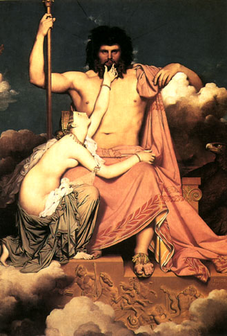
You hardly know where to begin, but Thetis's neck is the obvious starting point . . .
That's because the proportions are wrong.
I was astonished when art historian and nun, Sister Wendy Beckett, postulated the idea of why Ingres distorted the lower backs of his nude women. I had thought the same thing for years. She thought it was because that was the part of the female body that he thought was most exciting. I agree: he's not into Rubenesque buttocks (who is nowadays?), but he did like that long, flat lower back.

What I'd also heard was they he was a bit dense and never really realized the extent of his distortions. But compared to Delacroix, he was quite a "realist."
I don't know Pascal's work, but Eakins is definitely a realist. I've never seen him called a classicist, although some of his works, like the swimming hole below, do have a classical feeling to it. He was aware of classicism, since he taught at the Penna Acad of Fine Art, but I see his work as too dark to be truly classical.

That's an interesting hypothesis. That Ingres peculiarity should be contrasted with Bouguereau's depiction of the Nymphs with Satyr.

That one on the bottom right is going to get a sunburn if she isn't careful!
Looks like she's already got the beginnings of one . . . a little pink around the edges, at least on my computer.
As the Frenchwoman said to the flasher, "But, M'sieur, won't you catch cold?"
Oh how I have missed our art appreciation threads this hot August summer. This thread I thought would bring out all the naysayers about modern art but instead it has brought a great discussion about classical art, hmmm. I love this place!
I can't believe I had never seen that "strategic" bit of cloth before. My eyes always go to the bottom of the girl on the "bottom."
And I know this painting well. I have seen it since I was little at the Clark Art Institute in Williamstown, MA (a wonderful museum, with many Renoirs, Monets, Sargents, Homers, etc.). The photographic realism always blew me away: especially the "special effects" of the satyr. That was before I grew up and saw the sexism of the whole thing. (Yeah, I know; I'm not a strong feminist, but this does indeed portray women as only sex objects....)
Yes, I wonder why the naysayers didn't come out more. I was also expecting that. But any intelligent discussion of art is awesome, so I'm not complaining.
Thank you, Professor!
Well, I have tried to appreciate abstract art, but I was never able to cross-over. I do believe it is successful in its interpretation, because the purpose is to make the audience react. I find some of it disturbing, some of it soft, but mostly I find it makes me anxious and annoyed. Just my personal (learned, probably) taste is to seek art that brings me joy, makes me contemplate (which is why I like portraits), or appears to have somber or mysterious qualities. Abstract does not do any of that for me.
Some of the difficulty perhaps lies in definitions. I see abstraction as any work that moves away from complete realism to stress other qualities, like simplified shapes, brighter colors, messier brushwork, etc. I feel you might be talking about non-objective art, which has no basis in reality (and may see more distant and less mysterious).
See, now I like abstraction because I see it as more mysterious, often more joyful, and because it causes me to think within more levels of meaning.
For pure joy, I can't beat Matisse's cutouts. Because I see some plant-like forms, I don't see it as completely non-objective (although nearly so).

And Picasso can be very mysterious in his abstraction.

And I have always been entranced by Sean Scully's paintings: they are non-objective, but I think they are quite mysterious. They are beautifully painted, with layers of glowing color, and they are also richly textural and asymmetrically composed. The internet does not do them justice.

Wow! Quite a tour. I’ll definitely check out some of your other threads.
Thank you so much.
Now here is a ping....
Disclaimer: Opinions posted on Free Republic are those of the individual posters and do not necessarily represent the opinion of Free Republic or its management. All materials posted herein are protected by copyright law and the exemption for fair use of copyrighted works.