

Posted on 08/22/2005 8:22:58 AM PDT by Republicanprofessor
It is now time to try to wrap up these small “lectures” on the history of art. Today is the tough day: Jackson Pollock, Mark Rothko, etc. I have to admit that I did not “get” these works until I was well within graduate school. For Pollock, it took the documentary by Hans Namuth in which I saw him painting. His work is not just a bunch of random splatters; instead, Pollock carefully dances around the canvas, and you can see the evidence of the “dance,” if you will, on the canvas. (This is the same time that Martha Graham is dancing, and the time of improvisation in jazz, to which Pollock listened a great deal.)
For Rothko, it took a visit to his retrospective at the NYC Guggenheim. At first my reaction was “oh no, this block guy.” But I wanted to see the architecture of the Guggenheim, so I walked to the top and studied the works on the way down. I was quite moved by the works, especially at the end, when his work became darker and darker. He was suffering from depression, and his dealer was ripping him off, and he ended up committing suicide, even before his chapel in Houston was complete.
Many of these artists died tragically: Pollock and David Smith, the sculptor, in drunk driving accidents; Rothko and Arshile Gorky committed suicide. It was a tragic but also a heroic time.
Now there are several ways to think about the visuals of these works, and their content. Yes, there is deep meaning in all of these works, much deeper than the works that follow them (in Pop Art and Minimal Art). Visually, these artists combine so much of what I’ve already discussed: the color and painterly brushwork (often seemingly messy) of the Expressionists (like Matisse, Kandinsky and the other German Expressionists); the broken planes and flat tensions of Cubism; and the reliance upon inner subjectivity, if not the direct dreams, of Surrealism.
In addition, these artists were reacting against the destruction of WWII. They were not very political, although many of them did come from somewhat socialist backgrounds (and many worked for the Federal Art Project of the Works Progress Administration). But one of their goals was to dive within themselves and to create art that would be understood by the world over, without a knowledge of Greek mythology, history or whatever narrative often controls the painting. They wanted to create a primitive, world-wide communication that would draw people together in understanding. (Now, I’m not saying they succeeded in being instantly understood. My father, who loved New England landscapes with white houses, red barns and mountains, would never have understood a Pollock, no matter how hard I tried.)

Now, can you see what Adolphe Gottlieb (1903-1974) is communicating in this basic pictograph? Can you see the male and female and other symbolic forms? The style is reminiscent of cave paintings, and the piece I wanted to show is called Male and Female, where the male is goggling at a well-endowed woman. Isn’t that a timeless theme? In his later works, his “burst” series, he created opposing circles that could represent heaven and earth, sun and ground, etc.

There are three groups of Abstract Expressionists: the gestural, the color-field and the combined styles. Gottlieb is often one of the latter, because he does use great, emotional gestures in the bottom figures, while his upper levels deal with pulsing colors.
Okay, time to move on to Pollock, (1912-1956). Pollock was also influenced by Carl Jung, a student of Freud, who developed the idea of the collective unconscious: that we all share certain basic, primeval feelings, ideas, dreams. Pollock was a patient of a Jungian psychologist and early in his life executed drawings for his therapy sessions. There is also an element of Existentialism in Abstract Expressionism. This is a pretty complex philosophy (which is not my specialty), but in its essence it has to do with making our own actions and thus our lives. We need not rely upon others, or use others for our excuses, thus complaining that “I wasn’t allowed to go to college” or other whining that doesn’t excuse our responsibility for our actions. In terms of painting, the large, powerful strokes exemplify Existentialist action.
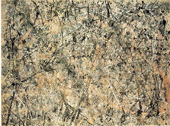
Pollock epitomized Action Painting. Now there is a great deal of art theory at this juncture; there is even competition between the theories of Harold Rosenberg and Clement Greenberg. But I will spare you those details. Meanwhile, check out Lavendar Mist and Autumn Rhythm from 1950.

Are these painting shallow or deep? As one can tell from the Namuth documentary and in the Ed Harris’ Pollock movie (which I highly recommend), Pollock he was “in” the work as he created it. He was thus into that other, “surreal” frame of mind as he created his works.
Also note that in his work, there is an obliteration of distinction between line and shape. For centuries, a line always outlined a form, but Kandinsky began to erase this distinction, and Pollock went even further. Find a strong drip, and note how it goes from a thick line into a shape and then back into a line again. These lines are also reminiscent of trees, capturing the energy and web-like quality if not realism per se. Pollock was very inspired by nature, especially after his move to Long Island.

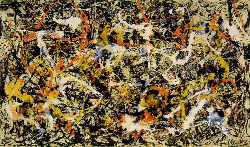
A Kandinsky from the 1910’s and Pollock’s Convergence from the 1950’s. Note how Pollock took Kandinsky’s ideas a step further.
There is also a great tension or play of flat planes in Pollock’s work. I see the paintings as deep, but they can also be seen as simple flat planes layered upon each other. Clement Greenberg (the “Clem” in the movie) was the great critic of the age. He saw Pollock’s work as creating a new kind of oscillating depth. I like the way he phrased this, and Greenberg’s criticism in general has opened my mind a great deal for how to look at abstract paintings.
Pollock’s paintings can also be seen as showing both microscopic and macroscopic view. These are almost as abstract as looking through a microscope and seeing those textured vision of the world from above. One could say of Pollock that his abstract view is equivalent to how Einstein redefined the world in his abstract terms of relativity; (the only equation I know of Einstein is E=mc squared). Pollock is defining line and shape in new ways; he is also defining gesture in a new way. His paintings reflect his effort and gestures as he danced around the canvas and layered the paint.
Lavendar Mist from around 1950 was actually named by Clement Greenberg. I see it as similar to the mood of a foggy day with melted snow producing that fog. There is no actual lavender in it, but the other colors make it seem like a lavender mist. Many of Pollock’s works are like the late waterlilies of Monet. (Greenberg did not appreciate the late works by Monet, created in 1926, until after he had seen Pollock’s drip paintings from around 1950).


For the record, Pollock was an alcoholic, mostly because his father got him drunk while he was still a child (and before his father ran out and left the family). But Pollock was on the wagon for the two years, 1950-52, during which he painted his most famous drip works. The scene of when he went off the wagon, after Hans Namuth was filming him (in a seemingly artificial way), is well shown in Harris’ Pollock.
-painting-number2.jpg)
Franz Kline Painting no. 2 1954
The Abstract Expressionist whose use of gesture I first “got” is Franz Kline (1910-1962). He uses black and white paint with housepainter-sized brushes and large dynamic Existentialist brushstrokes. The white sometimes paints over the black “figure” confusing figure and ground. His work has a great deal of power (just try to paint his gestures yourself: you need a large, strong stroke to do so). Sometimes his works look like close-ups of bridges, cranes, etc. One also sees these paintings as a whole image all at once, not as small parts that make up a whole.
The last gestural painter that I need to mention is Willem de Kooning (1904-1997). The action of de Kooning’s brushstrokes are certainly the epitome of Action Painting. He creates painterly cubist abstractions, especially seen in the Woman paintings. For often his planes are flat, but there are very painterly edges. And his primitive quality comes from an old goddess, the Venus of Willendorf from about 15,000 B.C. which may have inspired his works.


Woman I 1950-52 shows a primeval image of woman as goddess (not as sex goddess by which women have been shown since Venetian painting of the 16th century). Note that she is strong and powerful, with what I see as “bowling ball breasts.” De Kooning saw these works as humorous, especially their smiles. It has always amused me that one of this series is in Iran; I’m sure it’s hidden in the basement of some museum, shrouded since the downfall of the shah.
The second main group of the Abstract Expressionists is the Color Field painters. Mark Rothko is certainly the best of these.

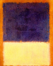
(Please note that with Rothko, a small image on a computer with (very) inexact colors is nothing like standing before the real painting. I am very dissatisfied with the reproductions available today for this “class.” Most of his works are quite moving in person. Other works reproduced today are also unsatisfactory; the large, life-size works are much more powerful in person.)
In the 1950s, Rothko wrote a short blurb about his works, with Gottlieb and others as co-authors. One thing that was stressed was that their works dealt with “tragic and timeless” forms, depicting moods of mythology without the literary story. Rothko’s mature works often show large black forms like graves. There is a story, which may or may not be true, but is one that he repeated (and thus it is a story that must have hovered in his mind). Rothko came from Russia to the US at a young age (his name then was Marcus Rothkowitz). At the end of the 19th century, it was said that the czar’s soldiers came into the (Jewish) town where Rothko’s ancestors lived. They were taken to the edge of town, where they dug a large grave, into which they were thrown after being shot. I think this grave-like image not only haunted him but formed the basis for his vision of the afterlife, the “doors” of which pulse like his blocks.
In his paintings, the large dark forms float unexpectedly, much like the graves that may have been in his mind. Note that in normal designs, a black form would sink to the bottom, but here the heavy forms seem to float. There is a great range of color depicting a similar range of mood. The forms are mostly horizontal forms and thus seem similar to the shape of traditional landscape. Yet the frame is vertical (like figurative paintings) thus blurring the distinction between figure and ground, figure and landscape. When one looks at a Rothko, it is a very different experience from that of a Pollock. In front of a Pollock, I tend to move and twist and follow the lines and drips, almost recreating their energy. In front of a Rothko, I stand still and become more meditative, as the blocks seem to pulse before me.
Rothko’s paintings are meant to be seen up close so that they are intimate, so that they are the only thing around you as you look. They are carefully layered, again often confusing figure and ground. With the idea that these might represent graves (in Rothko’s unconscious if not literally in his paintings), I see them as pulsing doors to the beyond, with great atmosphere created by the subtle layering of his colors.

Later in his life, he created the Rothko Chapel in Houston, TX with large single paintings and triptychs (3 part paintings) that are more monochrome in tone than his other works. The deep purples and colors verge on black. These works lack much of the subtlety of his other works, perhaps because the lighting in NYC, where he worked from a model of the chapel, is more subtle than the bright light of Texas.
Rothko committed suicide before the chapel was finished and open to the public (but after he had finished his works for the chapel).
Barnett Newman is another color field Abstract Expressionist, and I often think his work makes Rothko’s look good. He has written volumes about his work, but I don’t think that they help with understanding his work.

If you are looking at this work and just see stripes, you are WRONG! They are called zips. (Yeah, right.) Does the painterly edge along his zips create the tragic feeling he sought? He did indeed claim tragic and mythic importance for these minimal pieces.
His work was often done with masking tape. There was a series of 15 paintings of the 14 stations of the cross (plus Be, the final painting) done for the National Galley of Art in D.C. My students seem to have trouble seeing the 14 stations in these black and white zips on unfinished canvas. Does his flat work make Rothko’s seem richer?


Newman’s first and third Stations of the Cross.
Is this the Light of the World to which you refer?
 I think I agree with you, although there may other works that are more maudlin. I like the comment about Santa Claus too.

Maybe it was the setting (in a dark vaulted space), maybe it was the fact that the picture itself is rather dark (it was REALLY lit up for this photo), but it didn't seem sicky-sweet to me. Now, you want sicky-sweet. . .

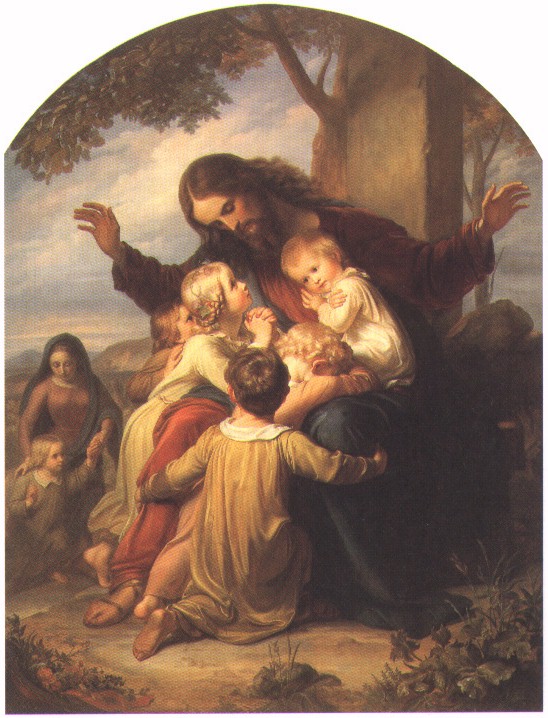
B. Plockhorst, "Christ Blessing the Little Children"
V. Vogelstein, "Suffer the Little Children"
(You can always count on sentimental artists to paint THAT Bible verse . . . just google it and you'll go into immediate hyperglycemia . . . )
And the Kincaid reference is a really low blow. Has that charlatan ever actually painted a human figure in any of those tacky things of his?
But you do like the "Magdalen Tower", don't you? The sky is a tour de force. (I guess you might extend your strictures on cherubs to choirboys, though?)
That's the one. I remember reading that 'Light of the World' was unveiled to the public with great acclaim at the turn of the century.
I guess my dislike of Holman Hunt and company seems odd, given how much I love 'realistic' artists who capture texture, like Rembrandt, whose painted jewelry, for example, looked real enough to steal. I guess because I'm drawn to figurative works of power and depth. Rembrandt's oil portraits (and figurative renderings in any medium) literally pulsed with life and insight. Hunt and company's people looked posed and affected: "Still Life with Humans".
Jesus as Santa Claus--it fits! These paintings wear me out. I think they are probably technically drawn perfectly but there is just something I don't like about this era. I know Van Rox will post his favorite website with all those women and cherubs but I get tired just gazing at them. However, the Pollocks and Rothko's are so soothing to me. I know that the Pollock's are frenetic but somehow they really aren't, to me. I just don't get tired looking at them and find something new everytime I see them. Same for Rothko and his color blocks. Just me and my unsophisticated taste.
Republicanprofessor, this is slightly off topic, but would you be willing to offer a definition for the term "classical art?" There is a discussion/argument going on over at wetcanvas.com RE that subject and I'd be interested in hearing your insights.
My personal opinion is that classical art can include all the stuff starting with the classical Greeks, Polyklitos et al, and continuing up through the academics of the 19th century, but not including the impressionists. Including though Norman Rockwell, Andrew Loomis, Harold Speed, etc. And also I believe that some comic book art can be included in the classical tradition, superheroes, etc. "Modern" art is a conscious effort not to follow in the classical tradition, I think.
I think of the sky in that painting as a sort of Rococo homage,
Do you ever see the evening sky as Rococo sometimes? I love to connect what I see in nature to what I know of art history: the storm skies of Ruisdael, the fluffy Rococo skies, etc.
Re Rembrandt: his work is always awesome. I don't think anyone has surpassed the depth of emotion and power of love in his works. I love the Prodigal Son particularly. I've had only one student who did not like the work. She had an issue with prodigal children, since one person in their family had dissed the rest and left the nest. I forget the rest of the story; I just remember she had an aversion to the painting. But forgiveness is essential. And I don't think anyone has done more powerful religious (i.e. Christian) paintings than Rembrandt. Again, forgiveness and love is all.

Kmiller: you do yourself a great injustice. I think your taste, and insight into these artists, is quite sophisticated. Again, different tastes abound out there. You are so right about Pollock: there always is something new to see in his works. The same is true of Rothko (although I think some of his color sings more than others). It takes a lot (of knowledge, of open minds, of patience, etc.) to appreciate these artists; and I would say that sophistication is what you have.
A simple question, a longer answer. Okay, this is what I've absorbed: classical can be defined on various levels. First, High Classical Greek Art is that of the Parthenon, the work of Phidias, such at the Three Goddesses below. Note how the drapery flows with great beauty, enlightening certain parts of their bodies while hiding others. They have a grace and dignity that is very classical; their postures even suggest their ages as in the prime of life (although Time has lost their heads). 
Then there is Late Classical Art, when we get to the softer work of Polykleitos., on the left, whose work is not nearly as militant as (my favorite) the Riace Bronzes. These are the men I want battling on my side. 

An even wider definition of classical art would include Roman works as well, although many of them are derivative of Greek work. Where the Romans excelled (in addition to architectural developments like domes etc.) is in portraiture. Marcus Aurelius is a fine example of that.

In the Renaissance, there is a revival of classical interest. So, in an even wider definition, Renaissance can be included as classical art. There is more inner intensity with Michelangelo than with the more distant Greek works. His David is a great example of this.

Then there is the Baroque. There are three styles in the Baroque: the naturalism of Caravaggio, the dynamic illusionistic style of Rubens, and then the classicizing style of Poussin (who initiated the French Academy of Art and all the rules from which the Impressionists later broke away).


Notice how down-to-earth Caravaggio is (complete with horse’s rearend, bare feet and all…..how the church loved these images! Not!). See how pompous and busy Rubens is: here the fiancé of the King of France, Marie de Medici, is arriving, and she has the grand gods and nymphs greeting her (but her husband is at a chateau with his mistress…nice, eh?) Finally, see how Poussin is reviving classical simplicity, form and balance. Here the shepherds are examining a sarcophagus in the middle of Arcadia. Anything with classical garb (i.e. togas) is usually classical to a degree. Also, they usually have strong outlines and perfected detail. They are not interested in the sweeping brushstrokes and color that we get with Rubens.
In the early nineteenth century, we have a revival of classical art again in the work of David and Ingres, often called Neoclassical Art. They were rivals of the Romantics, who followed the sweeping brushstrokes, emotion and color of Rubens. Interestingly enough, the classicists were called Poussinistes, and the Romantics were called Rubenistes. (Now you’ve just added some big vocabulary words to your repertoire.)

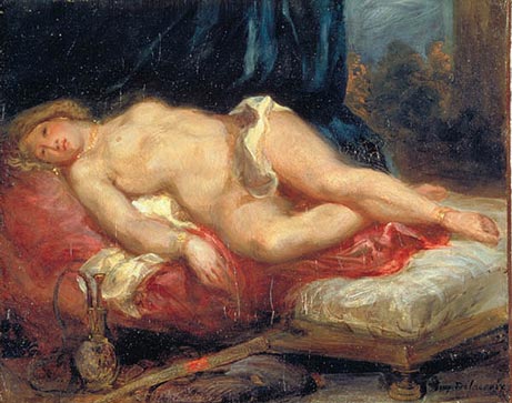
Both of these works are called Odalisques, or ladies of a Middle-Eastern harem. I hope you can guess which is by Ingres, the neoclassicist, and which by Delacroix, the romantic. Can you see different stages of a story in these works? (This is usually when I probably bring too much sex into the classroom……but, sex is an inspiration for art, as well as music, movies, is it not?)
I usually stop defining classical at this point, because once Modernism begins (probably with the Impressionists), issues change. It is not only the amount of detail in a work, but the references to the values of ancient Greeks and Romans: valor, balance, courage, morality, etc. We just don’t see a great deal of that nowadays. So, off hand, I would not add Rockwell or comics to the classical tradition. I would call them realists, yes. But that is different from classicism (as the discussion of Pre-Raphaelites would show). The Pre-Raphaelites were dealing with a kind of realism, or as someone aptly noted, super-realism. But they were not dealing with classical themes at all. Their work is almost more illustrative instead, often of the Bible or other historical themes. Just because they do a few images of ancient Greece doesn’t make them classical. Their work is also too busy to be classical.
Now to throw in a completely different kind of idea: some would call Minimalism a classical kind of art. This is not because it relates to the content, or even the form, of typical classical art. But they call it classical because it has a dignified, "classical" simplicity and power. Maya Lin’s Vietnam Memorial might be called classical.

LOL! You have some strong feelings about Rossetti, don't you? ;-) The truth is, however, that the pre-Raphaelite paintings in the Delaware Art Museum have been in Delaware since the 1800s, not long after they were actually painted. Samuel Bancroft, whose family owned a textile mill near Wilmington, DE (and not much more than a stone's throw from where the museum is now), bought the paintings during his trips to England, and they were donated to the museum in 1935. I personally like many of the pre-Raphaelites, particularly the ones that had Christian (Anglo-Catholic, even just plain Catholic) themes. The Holman Hunt painting of the Holy Innocents is pretty weird, and isn't among my favorites. However, there are others that I find to be outstanding. For example:

James Collinson - The Renunciation of Queen (St.) Elizabeth of Hungary

James Collinson - The Holy Family

Dante Gabriel Rossetti - The Girlhood of the Virgin Mary
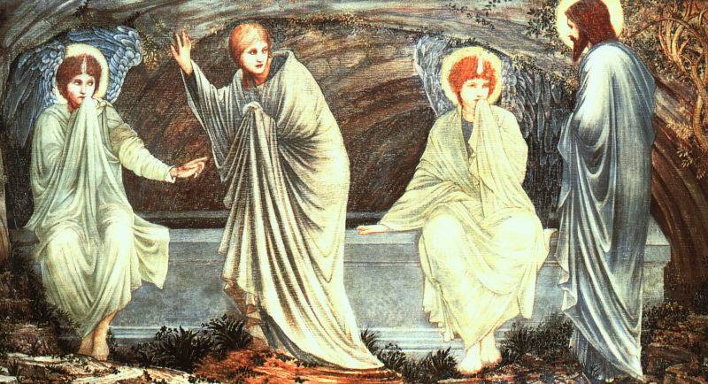
Sir Edward Burnes-Jones - The Morning of the Resurrection
There are also non-religious paintings by the pre-Raphaelites and related artists that I find appealing. Such as:

Arthur Hughes - Ophelia (1865)
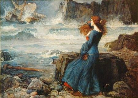
John William Waterhouse - The Tempest (Some consider Waterhouse to be influenced by the pre-Raphaelites, while others think otherwise.)

Dante Gabriel Rossetti - Lady Lilith
As for the French and Watteau in particular, I find them in general sort of niminy-piminy (but that may just be because he's French, and I'm visiting the sins of his putative descendants on his head.)
If we're going to backtrack into the 18th c., Hogarth is more my speed, especially his immensely perceptive portraits.

But ya gotta admit that's a rotten painting (Rossetti abandoned it when he realized he had botched the composition and perspective.)
I enjoy looking at the Pre-Raphaelites, though I do get frustrated with Rossetti -
It's ok. :-) As you may or may not know, I grew up in Delaware, and the Art Museum is practically in the neighborhood I grew up in.
I did not know you were a Delawarean. It's a great museum.
Well, currently, I live in northern Virginia, but I live 23 out of 25 years of my life in Delaware, so go figure. :-)
Thanks for the thoughtful reply on classicism.
I like the Caravaggio alot, it has an almost 19th century look to it. Rubens' drawings knock me out more than his paintings do. I don't know if I think his stuff is pompous, though, too full of movement maybe. Agreed that all the flourishes are.
The Ingres odalisk has always looked out of proportion to me, although I believe only her torso is too long. I much prefer the Delacroix, or even that Manet Olympia one that you guys had up a while ago.
I had put Rockwell and the comic artists in the classical category because they continue to follow, or at least be aware the old Greek canons of proportion and at least their own interpretations of what comprises beauty. They draw well, IOW. But I guess if you don't consider realists to be in the classical tradition, you would not include folks like Thomas Eakins or Pascal Dagnan-Bouveret?
Now there is a clear sign of someone who is no longer a leftist!
Disclaimer: Opinions posted on Free Republic are those of the individual posters and do not necessarily represent the opinion of Free Republic or its management. All materials posted herein are protected by copyright law and the exemption for fair use of copyrighted works.