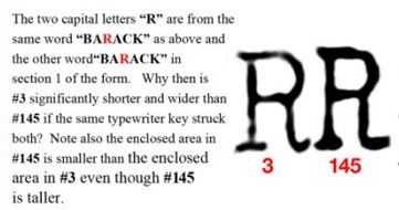
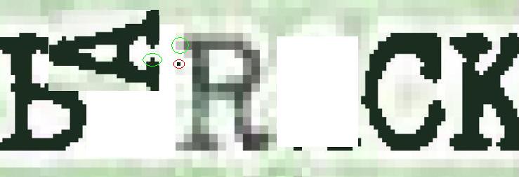
You're kidding, aren't you?
Let's look again:
#3 is shorter. It has a long flat serif. The serif on #145 is short and stubby. The cross stem on #3 thickens toward the right; the one on #145 thins toward the right. The framed areas are completely different as pointed out by the caption here and by moi at post #38 on this thread. The downstem on #145 looks like a little 'L'; the one on #3 looks like an backwards 'J'.
Anyone who asserts that these two 'R's were typed on the same machine is either a White House flack or delusional.
ML/NJ

