What a

Posted on 06/16/2010 7:33:35 PM PDT by The Looking Spoon
As a graphic designer this is a subject that has been interesting and frightening to me for a long time now. Check out this fascinating and important video on iconography from Bill Whittle of Pajamas TV its 8 minutes long, but its so good it feels like 30 seconds. (This video is embedded at the original post which can be seen here or view it at YouTube here)
This inspired several pieces I've done (and can be found on my art page) since viewing it...(there is a "slide show" of specific examples at the original post)
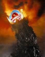
Obama puts that logo on EV-ER-Y-THING......I'm not that old but I'm pretty sure we haven't seen narcissism like this out of a political leader in this country, like, ever.
I can hear the libs now...saying all I want to do is tear down the president rather than try to build up the country with him. Thats precisely what the problem has been with his campaign to be president all the way up until today. The Obama presidency has not been about a legacy for America. The Obama presidency has been by, for, and about Barack Obama.
This idea can't be better demonstrated than at 2:35 into the video when Whittle shows an Obama campaign poster where Obama's logo actually comes front, center, and superseding all the other American icons, which are faded to background status.
The Looking Spoon is a conservative humor/satire/art/commentary blog, visit www.thelookingspoon.com to see more posts and art
(Excerpt) Read more at thelookingspoon.com ...


OUTSTANDING! HOORAY Bill Whittle! Thanks very much for posting.
Very nice! BTTT!


bttt
Ping.
The whole color-coordinated thematic logo thing is really bizarre and, to use one of Obama’s favorite words, unprecedented in American politics as far as I know. In fact, the last ruling clique I can think of that had its own symbology and color scheme is the Nazis. Actually I guess FDR had some logos for some of its new New Deal bureaucracies, like the NRA (National Recovery Administration) logo with the blue eagle claws and the gears. I’m guessing the Obama crew had FDR in mind rather than the Nazis when they came up with their theme, but of course as Jonah Goldberg has documented in his book, the basic impulse is fascistic. What is amazing (or rather, typical) is that liberals aren’t bothered one bit by the administration’s use of symbols/logos. Can you imagine if Bush had had a logo and a color scheme? They would have been crying fascism till their vocal chords shredded.

Great video, posted it on my facebook page.
In fact, the last ruling clique I can think of that had its own symbology and color scheme is the Nazis.
Agree. I was unnerved the first time I saw the "O" symbol. It immediately reminded me of the Nazis' use of the swastika. For the life of me, I can't recall any politician in American history who had his own iconic symbol, and who made it a ubiquitous feature of his entire campaign for office.
Unfortunately for Zero and his minions, they aren't bright enough to have foreseen how the right would use that symbol to poke fun at Obama, and to make editorial comment about him.

Yeah, it’s typical for a candidate to have a logo during a presidential campaign, but once in office that logo is scrapped and the presidential seal is used. But not Obama. Just like the Nazis, his regime has its own iconography apart from the nation’s traditional iconography. It’s really pretty surprising that more hasn’t been made of it. The narcissism of it is incredible. In his case I think it’s as much about his ego as it is about ideology.

FIrst, that WAS wierd how that 8 minute video flew by.
Second, “More cowbell” Obama poster made me laugh until it hurt!
“Agree. I was unnerved the first time I saw the “O” symbol. It immediately reminded me of the Nazis’ use of the swastika. For the life of me, I can’t recall any politician in American history who had his own iconic symbol, and who made it a ubiquitous feature of his entire campaign for office.”
Not just during the campaign, but now on all government material! It’s on the “Healthcare Reform Act”, it’s on many other items and all over GOVERNMENT websites.
That’s what makes this scary.

You got a huge LOL! for that one P.L.!
Obama’s use of NLP (Neuro Linguistic Programming) techniques in his speeches and his use of logos to separate himself from all the prior presidents seems to me to be the way a narcissist with totalitarian aspirations would try to get the people to worship and follow him separately or apart from the traditional office. It’s like he created his own brand and that brand was not American and therefore the presidential seal was ‘not needed.’
So that voting for Obama was not supposed to be seen as elevating him the the traditional office with traditional constitutional limitations but more along the lines as an iconic leader who leads us ‘beyond’ (i.e. away) from the constitutional concept of president. I wonder if this is how Caesar and Napoleon rolled.
Disclaimer: Opinions posted on Free Republic are those of the individual posters and do not necessarily represent the opinion of Free Republic or its management. All materials posted herein are protected by copyright law and the exemption for fair use of copyrighted works.