THE OTHER BIRTH CERTIFICATE
Not surprising, considering the document was typed in March of 1980.
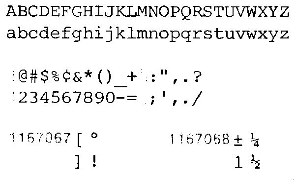
In Mother and Father Birthplace the font is courier12 ( http://www.selectric.org/selectric/fonts/courier12.gif )
Why is there no artifacting on those letters?
Why are they more clear than other characters in doc?
Why are they a different typeface than other characters in the doc?
Courier is a monospaced slab serif typeface designed to resemble the output from a strike-on typewriter. The typeface was designed by Howard “Bud” Kettler in 1955
See here: http://en.wikipedia.org/wiki/Courier_(typeface)
http://en.wikipedia.org/wiki/Courier_(typeface)#Applications
12 point Courier New was also the U.S. State Department’s standard typeface until January 2004, when it was replaced with 14 point Times New Roman.
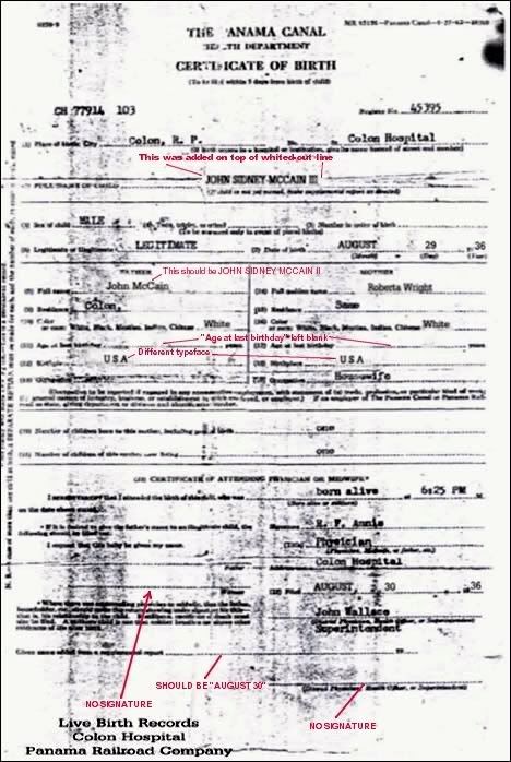
The type is different on the number “2” (Notice the difference in the arc and the radius) under “Date of Birth” and “Regristration Number”. Also, the type is more prominent under “Regristration Number” and very much less so under “Date of Birth”.
Why?
If this document was typed at the facility, on the same day, using the same machine you would expect consistency in the typeface, sizing, prominence, etc.
They are very different and I would not think they were typed using the same machine. They are just to different.
Again, the difference in type shows up when looking at Sex, Place of Birth, Name of Child, Fathers name, Mothers Maiden Name.
Look again at the narrow radius of the “a” under “Sex” and compare it all other “a”’s in the document. They are different fonts and show up again, as more prominent type than all other “a”’s in the document.
There are three typeface’s on this document and they were produced at different times. The lighter colored typefaces are consistent with each other while the more prominent typefaces under Father’s Birthplace, Mother’s Birthplace, Sex and Birth Registration Number are completely different.
Even here we have inconsistency, in that the typeface for Mother and Father Birthplace is completely different from the typeface found at “Sex” and “Regristration Number”.
That is my 10 minutes of work and that doesn’t count all the artifacts of previous document use that I can see plainly.
As far as the cross hatching, I think I have seen that on another document, from a state here in the USA. I will look for it.
There looks to be two, maybe three lines, of written something under Mothers Birthplace and a handwritten notation.
To the right of “Canal de Panama” there is a handwritten notation. What is it and why is it obfuscated?
Across the entire top of the document there is writing, in hand. What is it and why is it obfuscated?
In name of child there is some handwriting and all across it and there is a small “v” next to III.
Ditto for father and mother. In fact, under mother, next to her first name, it looks like someone used, maybe, Microsoft Paintbrush to “spray” and obfuscate whatever is there, so it no longer visible.
Where is the whole document? There is something odd about this to my naked eye.
Means nothing. The leftward serif at the top of the capital A is characteristic of the Courier font, which was developed in 1955. This document is dated 1980, by which time Courier was found on most office typewriters.
Post 1980? That document is supposed to be the equivalent of the CoLB, IOW, an abstract, made in 1980. Which of course brings up the interesting question of where a 1980 abtract of McCain's birth record would have been found, if not provided by McCain, or one of his family members.
Of course none of that explains the "artifacts" in the document, such as the ghost line, different typefaces, etc.