In this instance, though, I think the author would have a stronger case if he’d done a similar analysis on an authentic birth certificate of that time as a control (the BC of those twins born about the same time?). He’s the expert, but I would be happier with evidence that at least some of those discrepancies aren’t just an artifact of the xeroxing process.
I agree with everything you said here. I was so intrigued by this analysis that I spent part of the morning doing my own on some old Xerox copies of text typed on (presumably) 60s era typewriters. One of the typewriters was my own so I know it was a vintage 1960s manual with a cloth ribbon. The other one was just something I found that someone else typed in 1970 +/- one year. I was interested in observing the consistency or lack of it in characters typed on the same machine, and how different the characters on two different typewriters might be.
First I'll present my samples and then I make some observations.
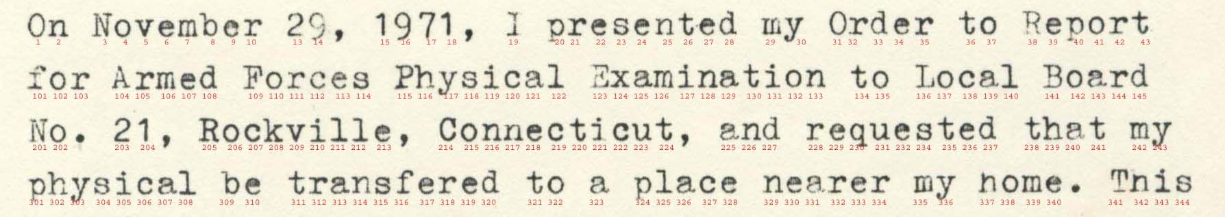
Here's the raw sample from my typewriter:
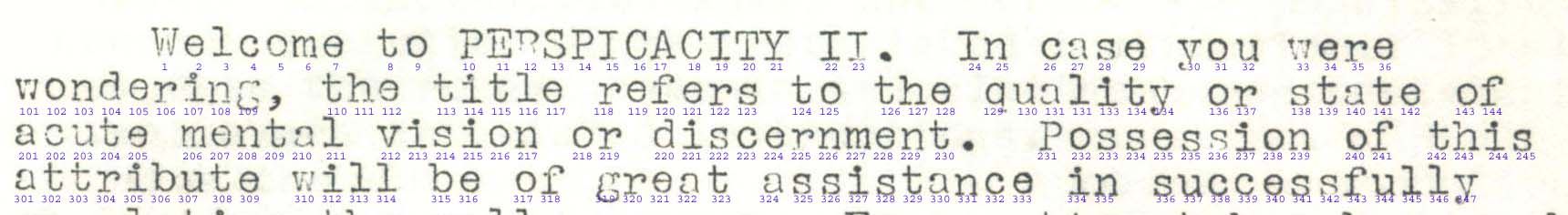
And here's the raw sample from some other typewriter:
Next I present side-by-side a few letters from both samples which might allow one to make some observations about consistencies and differences:
Two of the things that I was really impressed by in the Irey/WND analysis were the n's of different sizes, and the 'A' where one cross staff isn't horizontal. But now I'm not so sure. If you look at the double-n in 'Connecticut' at positions 216 & 217 in the sample from my typewriter, the 'n' at 217 appears smaller than the one at 216. I know Irey's example is somewhat different, but this was my observation. As for that non-horizontal cross staff in the 'A', I'm looking at the i's in both of my samples and also position 58 & 63 in Irey's document and then isolated letters. And I see the same things in the i's at 131 & 343 from my typewriter; and 237 from the other guy's typewriter. Note that the h's are out of sequence because I thought the variations in my type sample were interesting.
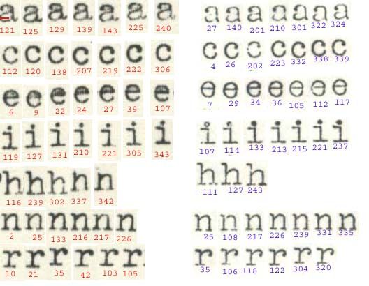
The most obvious differences in my samples are the thickness of the letters (thicker from my typewriter) and the curl in the right tip of the 'r'. Also the 'e' on the other guy's typewriter looks more like a Greek theta. (My 'e' is also filled in up top.)
I'm less sure what to think about all this than when I started.
ML/NJ