I'll link you to an image that SOHO made today:
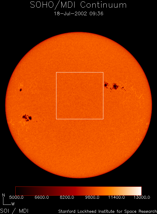
Yes, that's a temperature chart at the bottom. The white outline I'm not sure about.
Maybe it marks the area where a coronal mass ejection would be heading in our general direction. < /wild guess >
Yes, that's a temperature chart at the bottom. The white outline I'm not sure about.
Maybe it marks the area where a coronal mass ejection would be heading in our general direction. < /wild guess >
Well, in case it goes down again, you have an image. 