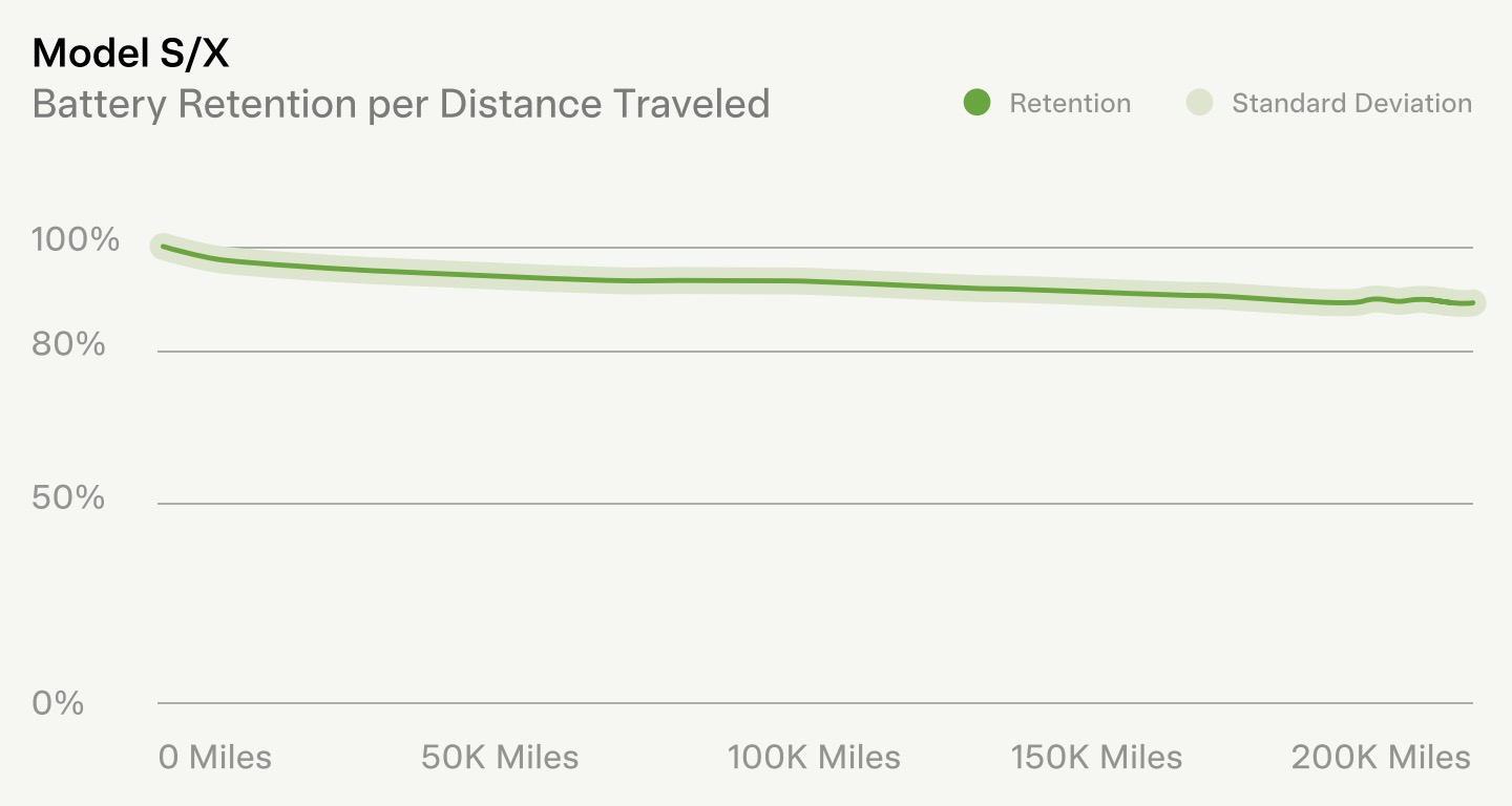
Without a lot more info on how that graph came about, I’ll say it was made on a rolling road in the Tesla labs under perfect conditions. And not over a 10+ year period either.
Circumstances (and sources) matter.
That graph reminds me of the phony graph that global warminst hoaxers used to claim that the globe was warming. Remember the hockey-stick graph? They dropped it from their claims because their data and studies and conclusions were phony as hell.