
*note: Temperatures are referenced to different bore hole locations. The variations are the important point.
*note: Temperatures are referenced to different bore hole locations. The variations are the important point.
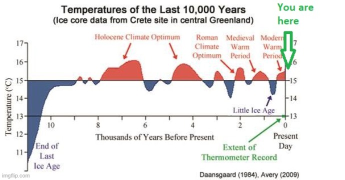
I love charts and graphs. The axes can be stretched or shrunk to make the tiniest of things look dramatic. The last one makes the previous 10,000 years look like dramatic swings but the lowest to highest is only 1 degree C.
I challenge anyone to be able to tell a 1 degree difference in air temperature.
It is of note to see that the warmer periods were the better periods for plants and animals. Only academics seemed to suffer then.
EC

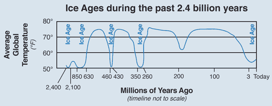
Notice the pattern. Brief warm periods followed by deep glacial periods.
What if we were overdue for a glacial and our CO2 was the only thing holding it off?