To: grey_whiskers
Food for thought on wealth inequality in the US. This is an eye-opening article, GW.
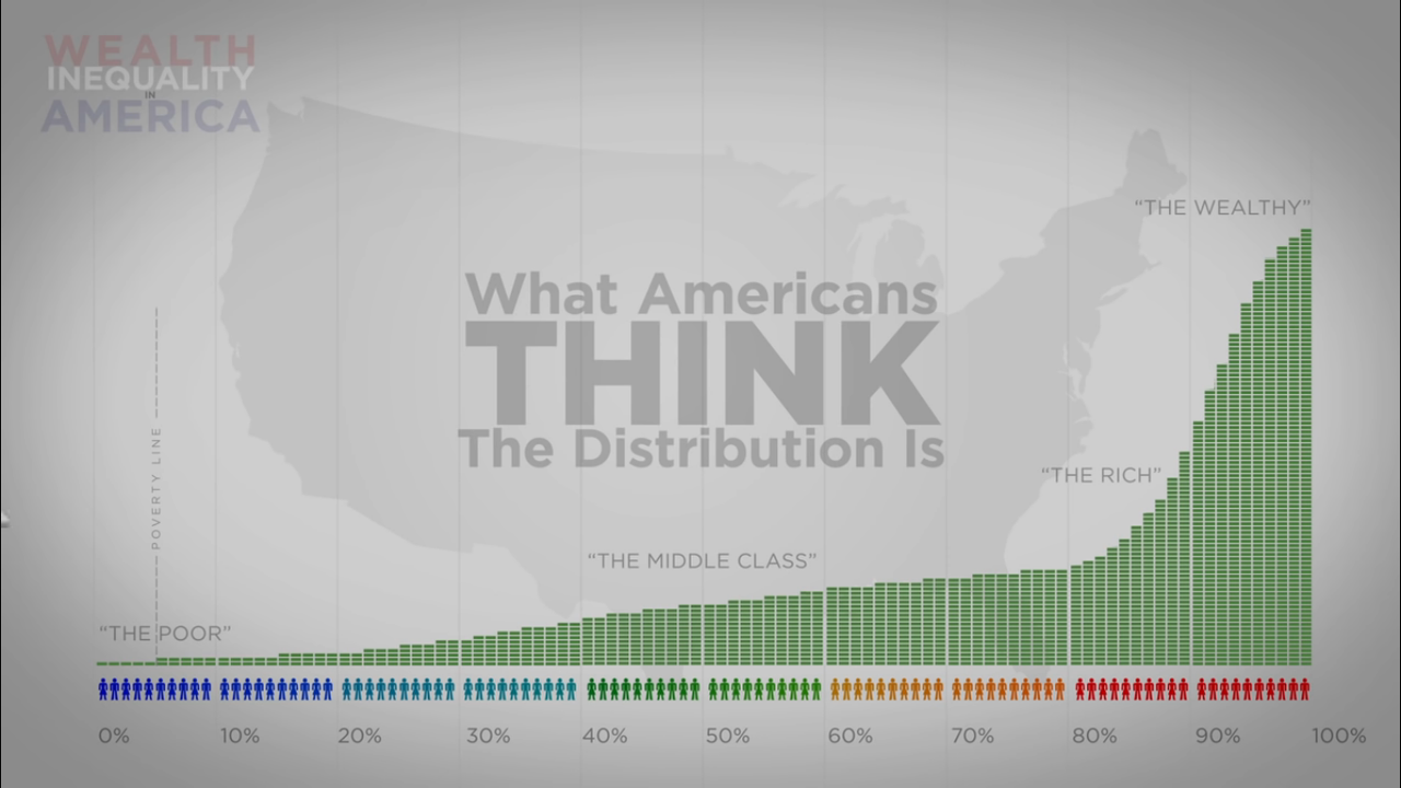
What Americans THINK the wealth distribution in the US is.
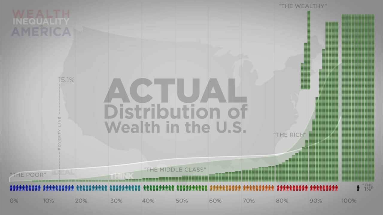
The following chart shows the ACTUAL wealth distribution. The three columns sitting out there in space by themselves, actually sit on top of the last 3 columns in the 90% section to the right of them.
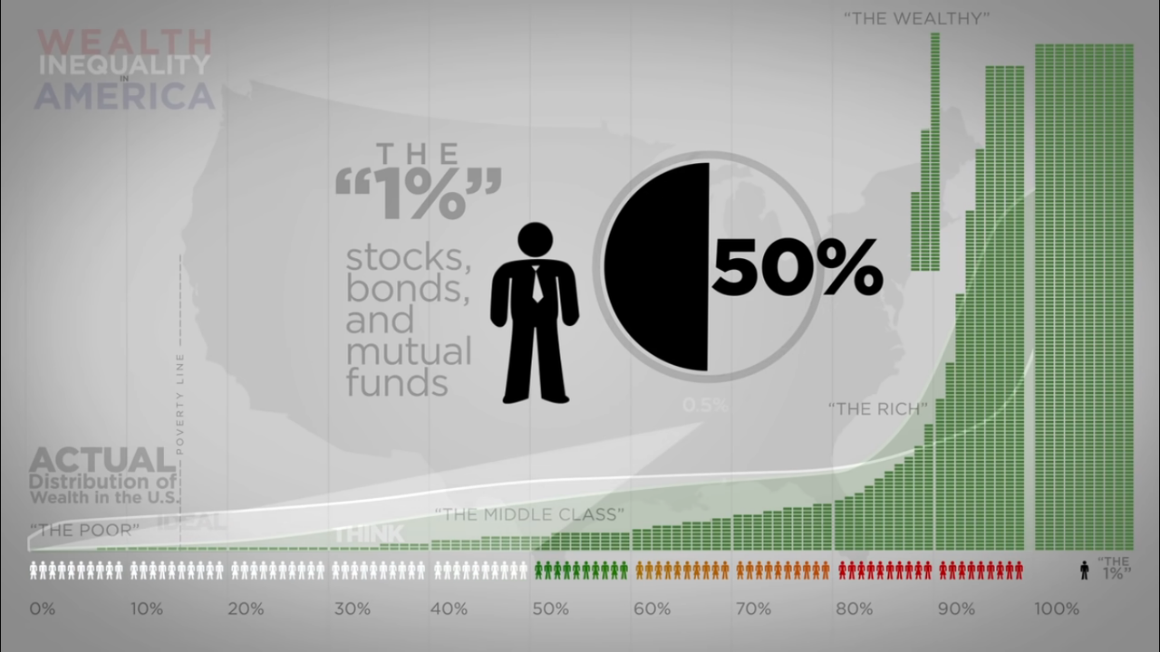
The top 1% own 50% of all the stocks, bonds and mutual funds in the US. The bottom 50% of the population own 1/2 of 1%
649 posted on
07/30/2022 1:08:39 PM PDT by
Larry - Moe and Curly
(America was not designed for people to be SAFE. It was designed for people to be FREE.)
To: Larry - Moe and Curly
Just posted on twtter. Interesting.
651 posted on
07/30/2022 1:13:01 PM PDT by
little jeremiah
(Never worry about anything. Worry never solved any problem or moved any stone.)
To: Larry - Moe and Curly
737 posted on
07/30/2022 8:53:30 PM PDT by
Melian
( Unity is all. )
To: Larry - Moe and Curly
The “stocks, bonds, and mutual funds” is kind of disingenuous because it doesn’t represent wealth at all, it represents potential buying power based upon a collective perception of the certificates value.
The sale of any meaningful amount of those certificates would crater the aggregate value in a heart beat. It’s only through a shared interest in maintaining the high value that the jenga stack stays up. All involved can enjoy the fruits of the high value, and through aggregators like Vanguard and BlackRock can continue to amass the assets claimed to support it.
When that stack crashes, IN TOTALITY, then the average person in the 10-80% range will be able to afford a house on a 1 income family, or save enough to start a small business in a reasonable amount of time without the encumbrance of crushing debt.
882 posted on
07/31/2022 11:38:00 AM PDT by
Axenolith
(WWG1WGA!)
FreeRepublic.com is powered by software copyright 2000-2008 John Robinson
