Give up while you're behind, Mojo.

Here is more:
According to this (arguably dated) Wikipedia breakout of the UK population (ca. 2011) into 5-year age bands, the "older people" are roughly uniform in breakout to the rest of the population.
| Ages attained (years) | Population | % of total |
|---|---|---|
| 0–4 | 3,914,000 | 6.2 |
| 5–9 | 3,517,000 | 5.6 |
| 10–14 | 3,670,000 | 5.8 |
| 15–19 | 3,997,000 | 6.3 |
| 20–24 | 4,297,000 | 6.8 |
| 25–29 | 4,307,000 | 6.8 |
| 30–34 | 4,126,000 | 6.5 |
| 35–39 | 4,194,000 | 6.6 |
| 40–44 | 4,626,000 | 7.3 |
| 45–49 | 4,643,000 | 7.3 |
| 50–54 | 4,095,000 | 6.5 |
| 55–59 | 3,614,000 | 5.7 |
| 60–64 | 3,807,000 | 6.0 |
| 65–69 | 3,017,000 | 4.8 |
| 70–74 | 2,463,000 | 3.9 |
| 75–79 | 2,006,000 | 3.2 |
| 80–84 | 1,496,000 | 2.4 |
| 85–89 | 918,000 | 1.5 |
| 90+ | 476,000 | 0.8 |
Are the "older people" those in the 55-59 band? Do you fellow FReepers who are 55-59 think of yourselves as "older people" yet?
Are we going to start calling those in the 50-54 band "older people" too?
According to the above table, the "older people" in the 55-59 band make up 8.7% of the population of 10-59, the smallest of the 5-year bands between 10-59. Assuming that not all of them were vaccinated, are we really to believe the implication of the footnote that less than 8% of the data is skewing the rest of the chart?
I conclude that the footnote 9 overstates the influence of "mortality rates for older people" on this data.
-PJ
Give up while you're behind, Mojo.
The absolute mortality rate for a particular age band isn't important for this analysis. What matters is the all-cause death rate increases with age. I didn't research the UK but here's the US chart:
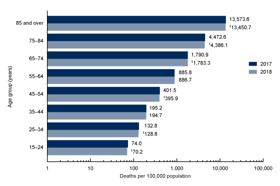
A population with a higher average age, like the vaccinated in this study, will have a higher mortality rate.
Is anything about that really controversial?
Face it, Berenson blew it here. If you're charitable you can say he's a very sloppy journalist. I'm a little more cynical.