
Figure 1: Climate model driven only by solar radiation, with no warming due to carbon dioxide. Predictions shown by dotted lines. See Post VIII for explanation and context.
Posted on 07/05/2014 5:41:12 PM PDT by Ernest_at_the_Beach
Funny things happen on the Internet sometimes. Rather spectacular claims were made that 900 days of data “were fabricated”. This claim was described as not just speculation, but “a demonstrable fact”, and worse, the crime was apparently even “admitted to” by the man himself! Except that none of it was real, and three tiny misunderstood dots were not fabricated, not data, and not important. Welcome to a Bermuda-Triangle-moment in blog-land, where facts vanish, ships full of misquotes appear from nowhere, and ghosts-of-malcontent and misunderstanding roam freely. This post here is to slay the last loose ghosts, lest anybody think they might still have life in them, or indeed, think they ever did.
Usually a live debate is a brilliant way for spectators to learn. But in that particular science thread, the main lesson is not science but manners. Common courtesy may seem a quaint anachronism, but without it, logic and reason die on the sword of uninformed passion. A simple polite email and an open mind could have saved the world from a cloud of nonsense.
Thanks to the many valiant souls who fought for common sense.
It’s rare in a complex situation that the answer is so simple. (You won’t believe how small and irrelevant it all was.) The short answer is that the 900 days of fabrication was a fuss about three dots covering three years of data at the end of a 400 year graph. The tiny blue dots were described on the graph as “assumed as average” and added to the end of a solid red line. In other words, they were obviously not actual data, the description made it clear they were estimated, they were colored differently, and nothing was hidden. What’s more, their presence or absence made little difference to the arguments or the predictions. (So there was no incentive to fake them up.) It was kind of like a handy-hint was misinterpreted as a constitutional law and the trial went on for days before anybody noticed. Time for a cup of tea instead, then? We think so.
In round one, Leif Svalgaard said Evans was “blatantly wrong” about the big TSI drop (Willis Eschenbach said “wildly incorrect”) — so we explained how the fall was 11 year smoothed and was right there even in Leif’s own data. Both men read our reply (citing it here or on WUWT) and both men can comment freely here.Yet neither was willing to admit they were wrong, apologize, or correct their claims. Does accuracy matter? It does to us. This is round two, where their second mistake is as wrong as the first. We remain baffled at their behavior. We can but point to the data.
If you’ve come here for the science, the graphs and details of datasets come first. If the bloodsport competition is more your thing, the accusations and “highest” criticisms of our critics are printed at the bottom. You won’t want to miss those.
– Jo
———————————————–
Dr David Evans, 4 July 2014
We need to clear up some confusion over TSI data and the Solar Model. Sorry, there is no big new “News” here, but the details matter and allegations as serious as fraud or fabrication deserve a proper response. Plus there’s a sort of useful lesson in how a silly mistake can get magnified and live on for days. Much of what follows will be obvious or covered previously. (An early reviewer said it cemented some things in his mind and he liked that anyway). We’d rather be pushing the scientific ideas forward. Soon.
1 The Context: Why there is a fuss over a fall in TSI?
The notch-delay solar model predicts a sharp global cooling and the turning point is soon (see Post VIII). It’s widely known the current solar cycle is a lot lower than the one before, but the notch-delay model predicts a sharp turn. An obvious question arises: is there some other way, apart from using the model, to see there is going to be a sharp cooling soon? (Assuming the notch-delay theory is right.)
Figure 1: Climate model driven only by solar radiation, with no warming due to carbon dioxide. Predictions shown by dotted lines. See Post VIII for explanation and context.
The model includes a delay, a low pass filter, a notch filter, and parallel paths. For a move as gross as the projected imminent cooling, we can dispense with the subtleties of the last three elements and just focus on the dominant driving element—the delay. This is just a simple check. The model is of course very “aware“ of the sunspot cycle, so any corresponding fall in TSI is not of the usual sunspot cycle variety, but is a fall after taking into account the usual ups and downs of the sunspot cycle.
The obvious and simplest way to remove most of the sunspot cycle and reveal the underlying trend is to apply an 11-year smoother to the TSI. The sunspot cycle varies from 8 to 14 years, but averages 11 years. The goal is only to crudely mimic the model’s behavior in order to get more understanding of why it predicts an imminent cooling.
2 TSI in Post VIII
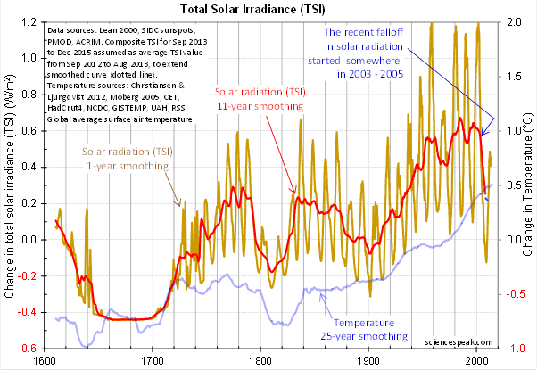
Here is the TSI graph presented in Post VIII: [Jo says: look out, this is the graph that generated the Bermuda-Triangle moment.]

Figure 2: The recent fall in TSI is the steepest and one of the largest ever recorded (records go back to 1610). (There is a trivially different original before the PMOD data was updated a few days ago, linked to in Post VIII.)
Which Lean 2000 dataset was that? It’s reasonably clear:
This TSI graph shows the composite TSI data used in our project, which is described in its bare bones on the graph itself (top left). Direct measurements of TSI only started in late 1978, by satellite. The reconstruction used for most of the data in Figure 2 is from Lean 2000, which is the main, standard reconstruction. Anyone familiar with the TSI datasets can also see that the Lean 2000 data used here is the newer version with the Wang, Lean, & Sheeley background correction (2005), because the level during the Maunder Minimum is about one W/m2 below the average level since 1940, whereas in the original Lean 2000 data the difference was over two W/m2—see the first graph here.
We did mention that smoother in Post VIII: “We put an 11-year smoother through it to give us the red line, which shows the trends in solar radiation.” We then commented on the three big falls in the red line, and made the point that the third fall, which started around 2004, will lead to a corresponding fall in temperature sometime around 2014 to 2017 (but more likely 2017) according to the notch-delay solar theory.
Notice the blue dotted line (circled) at the end of the red line. Here it is, blown up:

Figure 3: Enlargement of the fall in the 11-year-smoothed TSI around 2004, in Figure 2 above.
The text on Figure 2 explains the dots: “Composite TSI for Sep 2013 to Dec 2015 assumed as average TSI value from Sep 2012 to Aug 2013, to extend smoothed curve (dotted line).” That period is roughly 900 days.
The extension was made to give us an idea of where the TSI fall might bottom out. If the data stops in August 2013, as in Figure 2, then the 11-year-smoothed values stop 5.5 years earlier, in January 2008.* We are close to a solar maximum in sunspots now, so the values of TSI for the rounded top will probably be about the same. You could reasonably disagree with that extrapolation, but the method was stated clearly on the graph.
The extension was noted in the explanatory text, dotted, and a different color to the data. It is described as assumed and used to extend. It is difficult to confuse with the data. (Apologies for stating the glaring obvious. It’s odd having to point out things this simple. We describe the fracas below. Who would have thought?)
The same dots are more obvious (and useful) on a close-up graph:

Figure 4: As per Figure 2, but from 1950. Notice how the extension of the data shows that the fall in 11-year smoothed TSI will likely end soon, and thus indicates the size of the fall in 2004, so it can be more easily compared to the falls in the 1600’s and in Napoleon’s time.
TSI measurements come from satellite-based instruments. There are three main datasets. PMOD starts in late 1978, is the dataset Judith Lean used to reconstruct TSI back to 1610 from the sunspot data, and is the dataset we use predominantly. ACRIM had some troubles in the 1980s, but we use it from 1992. SORCE started in 2003. See footnote.**
Lief Svalgaard made it clear that he prefers his own reconstruction and the SORCE/TIM reconstruction (a reconstruction until 2003, then the SORCE/TIM data) to PMOD/Lean-2000:

Figure 5: The SORCE/TIM and Svalgaard reconstructions both show the three big drops in their 11-year-smoothed curves, including a recent fall. Compare to Figure 2.
Their 11-year smoothings both show three sharp declines – in the 1600’s, in the time of Napoleon, and recently — just like our composite TSI in Figure 2. However the timing of the most recent fall is different:
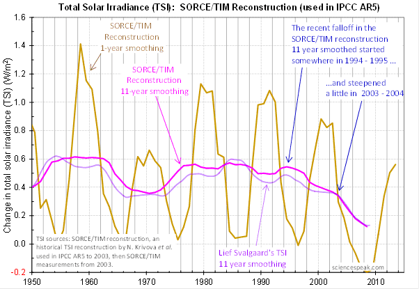
Figure 6: The start of the recent fall in the 11-year-smoothed trends of the SORCE/TIM and Svalgaard reconstructions occur earlier than in the PMOD/Lean 2000 data. Compare to Figure 4.
If the SORCE/TIM and Svalgaard reconstructions are to be believed, the recent fall in TSI started back in 1995. This is a significant difference. If TSI fell from 1995 then the corresponding fall in temperature should have been evident from about 2006 — but since it didn’t happen that would mean the solar influence is weak. (Toss out that theory eh?) But if the sharp fall started around 2004, the corresponding temperature drop is yet to impact Earth.
See the graph posted and discussed here. It shows that all the TSI estimates show a recent fall in their 11-year smoothed trends, and all the falls are of a similar magnitude. All show a TSI peak in about 1986. The only substantial differences (relevant to this work) are in the timing of the start of the recent fall.
Basically it comes down to a choice between the sunspots and reconstructions based on those sunspots, or the measured TSI. As Svalgaard himself said, “All so-called ‘reconstructions’ of TSI are Guesses. Most of them bad.” The only measured data covering the relevant period from the late 1980s (required to construct an 11-year mean of the early 1990s) to the current day is PMOD.
Comments below come from the post “A Cool Question, Answered?” (which turned out to be a Hot Question, Unanswered). Don’t Svalgaard and Eschenbach protest just a little bit too much?
There are basically three accusations that Svalgaard and Eschenbach repeat over and over:
They argue against a straw man, as if I had claimed that monthly or daily TSI readings have dropped since 2004. However Post VIII , linked to in the article at WUWT, makes it abundantly clear that I was talking about the trend, as established explicitly by 11-year smoothing and implicitly by the filtering action of the notch-delay solar model. See Figures 2 and 5 above. Svalgaard links to a graph or the SORCE/TIM measurements since 2003 as support for his position that there is “no such drop” — but his graph is of TSI, not ll-year smoothed TSI or any trend measure of TSI. They never acknowledge either that there was a recent fall in the 11-year smoothed TSI or that I was referring to it.
Svalgaard repeats his misunderstanding here. He links here to the Figure I used in Post VIII, which is labelled “Solar radiation (TSI) 11-year smoothing“. Here Eschenbach even pastes our graph of 11-year smoothed TSI estimates, and attacks our use of 11 year smoothing! So they knew. I talked about three big falls — which are clearly visible in the 11-year-smoothed red line, but not the brown line of 1-year smoothed TSI with many falls. It is hard to explain how they missed it.
Note that this is a separate issue from Svalagaard’s position that all the past reconstructions and recent measurements are wrong except his reconstruction and the SORCE/TIM measurements from 2003, which he explains here and here.
The extension is not data. I described it as an extension on the graph itself : “to extend smoothed curve (dotted line)”, the method used to obtain it is given on the graph and that makes it clear that is not data, it is presented in a different color from the data, and is dotted, not solid, like the data. See above. The general principle is you can put anything on a graph, so long as you explain what you are doing and it is not deceptive. The extension isn’t so useful on the 400 year graph, but on the 60 year graph (Figure 4 above) it shows the likely extent of the fall.
A reminder of what we said in the introductory post: “All the data, model, and computations are in a single Microsoft Excel spreadsheet. It runs on any pc with Excel 2007 or later; it runs at least partly (and maybe fully) on any Mac with Office 2011 or later. This is completely open science—every bit of data and every computation is open for inspection. We will be releasing this towards the end of the series of blog posts.” The reasons for this—so as not to preempt the blog posts, and to engender a more focused conversation with useful feedback –were given several times, and elaborated upon here. The spreadsheet would already have been released by now, but some people prepared to comment publicly on it still don’t know the basics, and it takes time to correct their mistakes.
Svalgaard 1. “The TSI used by Evans is totally wrong“. | Lean 2000, PMOD, and ACRIM are mainstream datasets. The datasets for the critical period from the mid 1980s on are basically the PMOD and ACRIM measurements. Svalgaard implies these measurements are “totally wrong”, while putting forward only reconstructions to cover the period before 2003. So, this is a case of measurements vs reconstruction.
Svalgaard 2. “The most blatant error is the statement that TSI has had a sharp unprecedented drop starting in 2003-2005 to now. This is complete nonsense. There is no such drop.“ | Straw man. A drop in 11-year smoothed TSI has clearly occurred, even in his own reconstruction (doesn’t he see it?).
Svalgaard 3. “As far as I am concerned, the model is already falsified. Not by the observations but by the [almost fraudulent - as there clearly is an agenda here] use of invalid input to begin with.” | Fraud implies lying with intent to deceive. See Figures 5 and 6: who lied? Svalgaard prefers his own reconstruction or the the IPCC reconstruction that recently replaced the one I used: who’s got an agenda?
Svalgaard 4. “The data is not slightly wrong, but verry wrong, and hence the prediction [...] is wrong, which was my point.” | The prediction is based on measurements of TSI since the mid1990s, but mainly around 2004, made by PMOD and ACRIM. Svalgaard only offers a reconstruction for most of this period. Again, we use mainstream measurements while he uses reconstructions, both of which show a trend drop anyway.
Svalgaard 5. “On the contrary he has shown that Mr Evans used wrong TSI data. This is either incompetence [I will allow for that hence my 'almost'] or a deliberate act [you made that call].” | Again, we use mainstream measurements while he uses his reconstruction.
Svalgaard 6. “The SORCE/TIM data is correct since 2003 and contradicts Mr Evans demonstrably false assertion that there was a sharp drop in TSI in the 2003-2005 time.” | Straw man. See accusation 1 above.
Svalgaard 7. “On the contrary, TSI is now higher than at any time in the SORCE/TIM record, so Mr Evans has spliced the SORCE/TIM data incorrectly to the observations covering 1978-2002.“ | Huh? How would he know? As it happens, I didn’t use the SORCE/TIM data.
Svalgaard 8. “That the 2000 Lean reconstruction is invalid is well-known [even Lean agrees with this] so Mr Evans is either incompetent or deliberately using invalid ‘data’ without having done his due diligence. The Krivova reconstruction suffers from the same problem as Lean’s obsolete one: invoking a background based on the flawed Group Sunspot Number.“ | My prediction of an upcoming fall relies on PMOD and ACRIM data from the critical period from the mid1980s, not from any reconstruction. Perhaps those making claims of incompetence ought first be competent readers?
Svalgaard 9. “Mr Evans made a horrible mistake [deliberately or out of ignorance - your call] making his prediction worthless; one cannot scientifically disagree with such nonsense. Disagreement requires substance and there is none in Mr Evans’ work.” | Straw man. See accusation 1 above.
Svalgaard 10: In response to something Christopher Monckton said, “You are correct that nothing can rest on Mr Evans’ incorrectly doctored dataset.“ | Oddly enough he refers to me as “Mr Evans” but accuses me of doctoring. Funny man.
Svalgaard 11: “I will agree that Mr Evans did not intend to have anybody discover his little ‘trick’. [One is reminded of Mann's 'Nature Trick' of Climategate fame].” | The extension is plain to anyone. There was no “trick”, nor anything to gain from the dots—they limit the downward trend. See accusations 2 and 3 above.
Svalgaard 12: In response to “what’s all the hubub about?” Svalggard says “It is about scientific honesty [or rather lack thereof]“. | Dishonesty? I didn’t misquote Svalagaard or say he did things he didn’t, did I?
Svalgaard 13: “So Mr Evans fabricates out of thin air about 900 days of TSI and tags that to the end of the curve.” | The extension was clearly explained on the graph itself, and is visually very different from the data. See accusation 2 above.
Svalgaard 14: “Both Willis and I have shown that Mr Evans invented the decline of TSI since 2003-2005.“ | All the estimates and datasets show a recent fall in 11-year-smoothed TSI, even Svalgaard’s own reconstruction. See the first figure here.
Svalgaard 15: “And the fabrication [of data] is a fact as I showed above by Mr Evans’ own words.” | It’s a “fact” now? And wait… it’s in my “own words”, but you said I was hiding it? So which is it? See accusation 2 above.
Svalgaard 16: “Even the data he claims is Lean 2000 has been tampered with and doctored into shape.” | The TSI in the TSI graph in Post VIII is a composite of Lean 2000 and other sources, so it will not exactly match Lean 2000. As noted above, anyone familiar with the TSI datasets can immediately see that the Lean 2000 data used here is the version with the Wang, Lean, & Sheeley background correction. Odd that he didn’t notice.
Svalgaard 17: “Mr Evans does indeed fabricate and invent data. End of discussion.” | Since there is no fabrication or invention, where does that put Svalgaard and Eschenbach? See accusation 2 above.
Eschenbach 1: “I begged David Evans, begged him please, please, to release the hidden code, to stop keeping the model equation a secret, to reveal the data, to expose the numbers of tunable parameters, to show the results of the out-of-sample tests that Jo says he’s already done …” | Really? Begged? I don’t recall ever having talked with Willis or exchanging emails with him. And I’ve searched through all the comments Eschenbach left on the blog posts here about the notch-delay solar project…and no “beg”. No asking even. Certainly no “please”. Just lots of repetitive berating for not releasing material immediately, and he did not even address our clearly stated reasons given for introductions-before-material.
So how about you quote yourself Willis: where is this begging you keep said you did?. I’ll quote you — this is what you typically say at the bottom of one of your articles: “USUAL REQUEST: …please quote the exact words you disagree with. That way, everyone can understand your point of reference and your objections.”
Eschenbach 2:“I begged Jo and David to publish, and I got the same answer we’ve gotten from every other pseudo-scientist, that for me to ask was wrong, wrong, wrong, and that they’d publish the code and data and out-of-sample tests when they damn well felt like it … science at its finest.” | Yep, definitely said “begged”; see accusation 3.
[Jo adds: I note that Willis raised the “Mann and Jones” false equivalence on this blog on June 21, and my answer to this was not quite the “same answer we’ve gotten from every other pseudo-scientist”. Willis asked: “And why on earth do I have to ask you pretty please if you’ll release your results as if you were Phil Jones or Michael Mann?” Jo replied: “Because Phil Jones and Michael Mann get your taxes. We don’t. That’s why.” This from the man who insists people quote him exactly?]
Eschenbach 3: “…and admit that (at least according to their graph) they have made a wildly incorrect claim that the TSI has fallen precipitously since about 2004. It is on the basis of this supposed fall that they are predicting falling temperatures.” | Straw man. See accusation 1 above.
Eschenbach 4: “But neither of us owe David Evans an apology. He’s the one that made the horrendous newbie mistake, not us.” | Ummm, you didn’t notice it was 11-year-smoothed TSI and trends in TSI we were talking about?
Eschenbach 5: “That quote from the graph itself clearly says that they have invented the data from March of 2013 to December of 2015, which is the 900 days of data that Leif mentions. Now, I’ve used the word “invented” for that data. The graph itself uses the word “assumed” for that data. And Leif used the word “fabricated” for that data.” | “Invented data” now? Not so. (It’s like Chinese whispers: assumed means invented means fabricated. Go Directly To Jail!). It was clearly explained and marked on the graph itself. See accusation 2 above.
Eschenbach 6: “Next, David Evans has not released the data, the model, the model results, the equations, the out-of-sample tests, or any of the details. This is the same garbage we got from Michael Mann and Phil Jones. And now, here you are cluttering up WUWT with the same kind of garbage. There is no transparency. There is no data. There is no code. In what alternate universe does this pass for science?” | Didn’t read the introductory post perhaps? Don’t believe the answers we gave you? See accusation 3 above.
Eschenbach 7: “Christopher, I have a simple rule that has never failed me. When a man is hiding something, it’s because he’s got something to hide.” | I have a simple rule too: when a man attacks a scientific argument with accusations about motives, there is something else going on. See accusation 3 above.
Eschenbach 8: “I’m sad to see you and David Evans and Joanne taking up the habits of Mann and Jones, David. I’d thought y’all were scientists. Ah, well, live and learn.” | We are sad to see a skeptic taking up the habit of character attacks, as is commonly used by unskeptical people. See accusation 3 above.
And on and on and on.
We are looking forward to releasing the spreadsheet, and are grateful that Eschenbach and Svalgaard have made it clear they have made their conclusions already. ; -)
5 Conclusion
Otherwise, we remain baffled. The comments by Svalgaard and Eschenbach at WUWT are inexplicable. Svalgaard says that “science is a bloodsport”, but Joanne notes that it “doesn’t have to be… You could use logic and reasoning instead.” We offer no speculation on the reasons for their repetitious, tendentious, and aggressive comments. It doesn’t look like truth-finding to us when someone uses fallacies, fails to quote exactly, and fails to acknowledge polite responses pointing out their misunderstandings. We see little hope that their attitude will change, so we expect more of the same as we roll out the project.
A big thank you to Christopher Monckton and the others who objected at WUWT and pushed back. Thank you! They sensed that a crime was being committed and they did what they could. And thank you also to those who have emailed us, or left comments on this blog about the matter, or donated. (BTW Joanne spoke to Anthony Watts at length yesterday in a friendly exchange. He had arrived late at the “Bermuda Triangle”, and did what he could. Please keep comments constructive below. This post is about commenters and a new theory, not Anthony.)
We are still rolling out the introductory blog posts. It is taking much longer than we had anticipated partly because of the need to respond to unwarranted and inaccurate criticisms and statements. We very much want feedback, good and bad, and appreciate the well informed, polite sort the most. We will resume the series as soon as we can, other commitments, notwithstanding.
*As of a few ago PMOD had issued data to the end of 2013, but ACRIM only to about the end of August 2013.
** The SORCE/TIM reconstruction uses the measured SORCE/TIM data from February 2003, but before that it is a reconstruction. The SORCE/TIM reconstruction changed significantly in February 2014—see here, or the blink comparator here. The old reconstruction is very much like Lean 2000—compare it to Figure 2 above. The new/current reconstruction uses a reconstruction by “N. Krivova et al. … which is used in the IPCC AR5 Working Group I’s Assessment Report”—see the SORCE/TIM data home.
It’s not easy to measure TSI exactly. Obviously everything before late 1978 is estimated from proxies. Judith Lean studied the way PMOD and sunspots varied, then used the sunspot data and models of solar behavior to estimate TSI before the satellite era — so the Lean 2000 reconstruction and the PMOD observations agree with each other.
However the PMOD and ACRIM data disagree until the early 1990s. Opinions differ on whether PMOD or ACRIM is more correct, but PMOD fits with Lean 2000 and is the longest measured dataset—running right through from the TSI peak around 1986 to when it started declining. So we effectively went with the PMOD data, by only introducing ACRIM into our composite TSI from the beginning of 1992.
Our composite TSI data from December 1978 through December 2008 is an average of Lean 2000 and PMOD, then an average of Lean 2000, PMOD and ACRIM through December 2008 (when the Lean 2000 dataset ends), then an average of PMOD and ACRIM, using averaging-equalizing offsets and blends at joins to make the composite. We could usefully add SORCE/TIM data from 2003, but haven’t yet because we didn’t find that data useful for analysis (at less than one sunspot cycle, it is not long enough).
In the final analysis we are basically using PMOD data, so the notch-delay solar model is essentially between PMOD-TSI and temperature. It is possible that PMOD somehow measures the components of TSI that predict force X better than other measures of TSI.
More on the TSI Data for the Evans Solar Model
Looks pretty clear from the data. To stop global warming, we need to nuke the Muzzis.
LOL!
Thanks for the synopsis. Too many words and graphs for me to wade through on a Saturday afternoon. Thanks for providing the bottom line.
For special bonus, drop it on the black rock at peak Muslim frenzy.
http://www.satellitesights.com/satelliteimage/Kaaba_Makkah_Saudi_Arabia
And have tried to tag all the articles I have posted on the
Looks like there is going to be a LOT of discussion on IT!
All you need to know is here:
(PhysOrg.com) -- Sunspot formation is triggered by a magnetic field, which scientists say is steadily declining. They predict that by 2016 there may be no remaining sunspots, and the sun may stay spotless for several decades.
The last time the sunspots disappeared altogether was in the 17th and 18th century, and coincided with a lengthy cool period on the planet known as the Little Ice Age....and lasted 400 years.
Good luck surviving with less electricity and GE modified seeds.
Whenever someone suggests nuking Mecca, I’m reminded of the scene in “Pitch Black” where the space Muslims explain that after Mecca was nuked, it was decided that since the dust covered the Earth, the whole planet was now Mecca.
The plot shows a steady decline in the Sun's magnetic field strength since 2000. Do they have data prior to 2000, or was that the beginning of these measurements?
The scary one is this....big drop in world wide grain production....
read it here: Read more at: http://wattsupwiththat.com/2013/09/08/the-climate-grain-production-relationship-quantified/

Thanks Ernest.
Give them time - they will do it themselves...the consequence is - all the fallout will impact the rest of us...none of them can be trusted to do the right thing. They want Mahdi to come back and with the Sunnis on the rise, the Persians will accelerate their nuke program!
Very interesting times we live in...
When they scream like that, you really know you have hit them were it hurts.
I posted tongue in cheek, but am concerned that current trends will bring us to a spiritual war for which Islam is hell bent upon bringing against us, here in the Great Satan. It is not as if we haven’t been warned.
If a clash becomes more tangible, liberals in the west will grow more and more conflicted especially after they realize what Islam will really mean for them when it is their turn to face its Three Demands (convert, submit or die resisting), especially if they are practicing homosexuals.
” It is not as if we haven’t been warned.”
Speaking of being warned.....I had the pleasure of having to fly back from Europe on the 4th, amidst renewed terror warnings. I noticed how few muslims were noticeable (as travelers) in the airport. None on my flight.
So, one does wonder about folks being warned.
Disclaimer: Opinions posted on Free Republic are those of the individual posters and do not necessarily represent the opinion of Free Republic or its management. All materials posted herein are protected by copyright law and the exemption for fair use of copyrighted works.