Some people can say that especially when just comparing two decades before '70 to the four after, but looking at the seven decades before '70 stock index swings look much worse before:
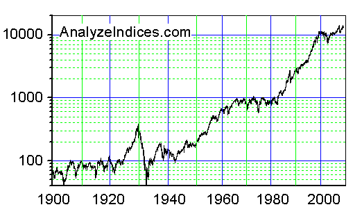
Some people can say that especially when just comparing two decades before '70 to the four after, but looking at the seven decades before '70 stock index swings look much worse before:
How does that graph look with a linear y axis?
About like any other exponential growth pattern. It’d be like plotting the U.S. population, or the amount of written knowledge. Anything that doubles every fixed unit of time will always look like an explosion on a linear plot.