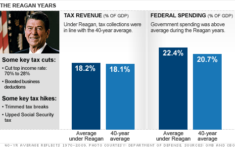
Interesting graph, but possibly misleading (makes me wonder who put that out). A forty year average goes all the way back to 1940. I’d be interested to see the same data in a monthly or quarterly line graph. I think it would tell a more informative story of reversal of a relentless forty-year upward trend in both spending and taxes. Even with all his efforts, because of a Democratic Congress, the best Reagan, an ardent hater of big government, could do was SLOW DOWN the growth of government because of relentless automatic increases in the system.