The first graph shows the long-term average global temperature view of warm periods and ice ages:
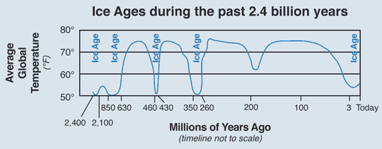
Note that Ice ages vary in length, but 50 million years is pretty typical. Warm periods last much longer than ice ages.
The second graph shows temperature variations for the last 450,000 years in our current Ice Age which started about 10 million years ago, depending on exactly where you want to specify the start temperature from graph 1. (The temperature scale on graph 2 is the average temperature at the Antarctica glacier bore site, not the same as the average global temperature from graph 1):

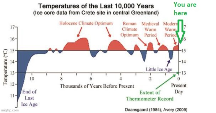
The temperature for the current interglacial warm period from ice core data in Greenland is shown in graph 3. Note that the temperature always fluctuates and that the current temperature is not out of the normal range of fluctuations: